
Random Card of the Day |
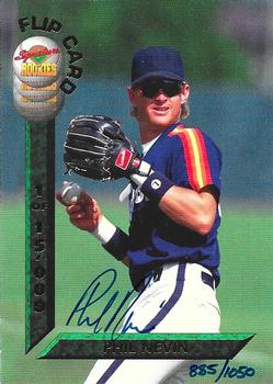
Wednesday, March 10, 2021Set: 1994 Signature Rookies Draft Picks - Flip Cards Signatures (Rate) Card: #NNO Phil Nevin / Paul Wilson “ at first look before scrolling down completely it looked like he was standing by a parking meter. The full image it looks like someone is using a squaring tool to make sure the card was cut precisely. Hey buddy move the "L" square a little more to the left and down some 'Kay? Ugh two players one card, now which is the front and which is the back on this? Slightly annoying. Even if someone wanted both autographs which would you display? Thumbs down. ” -captkirk42
1
“ Oh! I like this very much. No stats, action photos of two different players, signed and sealed. The vertical bar has 1 of 15,000, and the hand written serial number of 1,050. A note of "AU, PR15000, SN1050"? No, of coarse not. Interesting concept none the less. 👍👍 ” -CollectingAfterDeath
3
“ The idea of FlipCards seems good, but without a true back, the card does not seem complete . . . ” -georgecf
1
“ Interesting in that only one side is auto'd. ” -muskie027
|
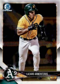
Tuesday, March 9, 2021Set: 2018 Bowman - Chrome Prospects (Rate) Card: #BCP118 Lazaro Armenteros “ Great scan for a Chrome card. Green and yellow are my favorite colors so the uniform looks good to me. ” -Billy Kingsley
3
“ Wow I really like this design. I love it when they add a ton of details without obscuring the photos. ” -pugchump
1
“ In my opinion, 2018 Bowman looked just as good or better than mainline Topps that year. Borders help a lot
Nice looking card, just base chrome ” -mkb
4
“ Cool design for 2018 Bowman, and I have a patch auto of this guy I'm looking to sell *winks* ” -worth_schi
“ OK design. Not a fan of Prospect cards at least this is one connected to a pro team. No idea about this player. Too lazy to look him up just now. Still hate Bowman's numbering system for these sets. Lets see this is a BCP so it is Bowman Chrome Prospect. ” -captkirk42
“ Bowman brings out the anger in me. Hate their numbering especially when they usually have three letters. ” -NJDevils
“ Good action photo on a 99 cent card.
Convinced this was taken during a Beloit Snappers, Low A game in early 2018. He led the minors in strikeouts in 2019. ” -Expos1990
1
“ I wonder how many of the Bowman Prospects actually make it in the end? Seems like whenever I go back and look, I never end up hearing of half these guys. Lazaro is still young enough to be up and coming. ” -muskie027
|
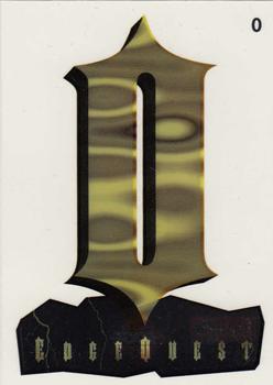
Monday, March 8, 2021Set: 1995 Collector's Edge Excalibur - EdgeQuest (Rate) “ This looks like it might be clear plastic. In that case, cool. ” -Billy Kingsley
“ O ” -YoRicha
8
“ At first glance I thought this was from a "Lord of the Rings" themed set. ” -mkaz80
2
“ I got nothing. ” -rmpaq5
“ O? ” -IfbBirdsCards
1
“ I agree with all the negatives that will be written about this. ” -NJDevils
5
“ I must be slow, as I can't figure this one out. I could make the word "sword" from the letters, but had letters leftover!? Hoping someone explains this subset for me! ” -bkklaos
“ Todays horrible card comment section was brought to you by the letter "O". ” -parsley24
1
“ Uh
It sure is the letter O ” -mkb
1
“ O ” -DarkSide830
1
“ ?Huh? I don't get it. I even looked at the checklist it is for a football set. What? What does it spell?
I was never good at creating anagrams for stuff. OH took using a couple of Anagram maker websites. I guess you need to use the "S" twice to get "Sword & Stone" ” -captkirk42
1
“ O, O! O o o ooo, oo.
0Oo0Oo0Oo...
OOOOOOOOOOOOOOOOO OOOOOOOOOOOOOOOOO! ” -Tanman2001
1
“ Assuming this is a clear acetate card it has at least that much going for it. Beyond that I don't know what this is. Was there a contest to collect the letters to spell different words? ("SWORD" jumped out at me looking at the checklist.) ” -bevans
“ Give me a break . . . ” -georgecf
“ No thank you. ” -Brendan Barrick
1
“ What is this supposed to spell? The checklist doesn't make it clear ” -ketchupman36
1
“ this reminds me of the eye of sauron ” -torald
2
|
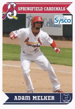
Sunday, March 7, 2021Set: 2013 Grandstand Springfield Cardinals SGA (Rate) “ Learning to play baseball the right way, in the Cardinal farm system ” -abide
4
“ The branding everywhere is kind of lame but it's a nice design for a minor league card either way ” -pugchump
4
“ Cool team logo on the team name bar. The player's position abbreviation inside the baseball icon is smart. Finished off with an excellent choice of the player in game photo, makes this card front pop. The back has a clean look, and the card number inside the baseball diamond is a nice touch. To me, this is an example of a perfect baseball card. ” -CollectingAfterDeath
8
“ Nice sysco block logo must be before the invention of the transparent png file. Really nice back for a minor league card. ” -parsley24
“ Nice Minor League card. ” -captkirk42
“ Great looking minor league card!! ” -mkaz80
“ Love the back. ” -NJDevils
“ Looks like the major card companies could use this as a lesson, sometimes lessen is more. Which Springfield? ” -baseballcardstoreca
“ Why are the last two letters of Adam’s name lowercase? ” -mkb
1
|
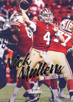
Saturday, March 6, 2021Set: 2019 Panini Luminance (Rate) “ This is a really nice design. I really like it. ” -muskie027
1
“ I don't think Panini understands what the word Luminance means. My autocorrect tried to change Panini to "pain"...well played autocorrect. ” -Billy Kingsley
9
“ It really bothers me that they used the same photo on both sides but they retouched the color on the back only ” -pugchump
3
“ Might as well put his name in comic sans. It would still look better. ” -DarkSide830
“ I like the design of this card. ” -Brendan Barrick
1
“ Wow this card is from 2019? and not the 1990s? ” -captkirk42
|
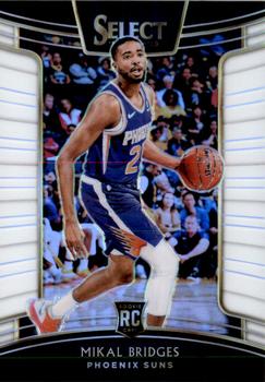
Thursday, March 4, 2021Set: 2018-19 Panini Select - White Prizms (Rate) “ As a continued brand, this set should be listed as Select. ” -Billy Kingsley
2
“ An OK design. I don't "like" it much but it looks good. Don't know what those side panels are supposed to be other than some fancy border for the card (and possibly the part of the card that would be removed for a die-cut version). Back is rather plain. OH I looked at the card "title" again White PRIZMS those are supposed to be prizms, explains why it is a serial numbered version. ” -captkirk42
“ Talk about a mind wrap of a design. Though this design would be a cool base for a dual relic on the sides. ” -OverkillKid
“ Nothing to write home about. ” -Phil
|
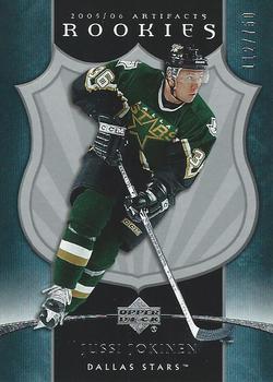
Wednesday, March 3, 2021Set: 2005-06 Upper Deck Artifacts (Rate) “ Yes. Nice card. Rookie way back then and still playing in finnish league this season representing Oulun Kärpät. This is propably his last season though, because he has slowed down quite a lot and his shot is not so threathening for the goalies. But he managed to produce nice penalty shot few days ago. ” -Duke
3
“ I was just getting back into the hobby around this time. I wasn't aware of Artifacts but if I had been I would've bought it. Jussi was one of my Mom's faves when he played for the Flightless Birdies. ” -Gunny
“ Sharp card! It's weird flipping it around and not seeing panini anywhere, lol. Oh the good ole days. Great stuff upper deck! ” -Madden95
1
“ This is a good opportunity to talk about serial numbers, since I don't know anything about hockey or hockey cards. Serial numbered cards have a special place in my heart, it gives me a feeling that I pulled something special, not some manufactured base garbage. The first one I got was a 2019 Topps Advanced Stat Miguel Sano, and I didn't even notice until I logged it to my collection a year later. By then I had already gotten A Big League Baseball Rainbow Refractor /100 and a 2019 Topps Heritage Stamp Relic /50. I don't purchase high end, so these serial number cards are pretty cool when I pull them. ” -NickyCollects
1
“ A great looking hockey card until you flip it over and its the same photo. dang. ” -parsley24
“ Nice looking design, but not for cards. ” -captkirk42
“ This is an ok design. ” -Brendan Barrick
“ Very early #'d card. If only upper deck was allowed more than hockey. ” -OverkillKid
1
“ The first year of Artifacts - very nice cards ” -suomibear8
“ Pretty plain, only 3 colors and they used the same photo on both sides ” -pugchump
|
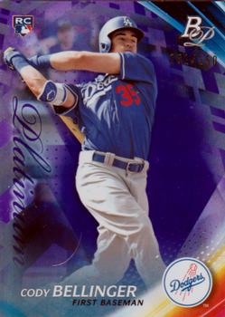
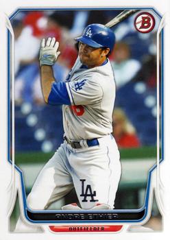
Monday, March 1, 2021Set: 2017 Bowman Platinum - Purple (Rate) “ that's a pretty RC card of the 2019 ML MVP ” -abide
2
“ Bowman Platinum always just looks ugly to me. I don't understand the appeal. It's a low-rent set that is trying way too heard to be upper tier. Hard pass. ” -ketchupman36
2
“ Card doesn’t look too bad.
Nice rookie card of a star. ” -mkb
1
“ A pretty nice card here! Sure it's not exactly cheap, either. ” -IfbBirdsCards
“ Oh dang it is a parallel, I was beginning to think that maybe Bowman Platinum was getting away from the boring silver foil/chrome looks. ” -captkirk42
“ I have been a fan of the various Platinum sets released through the years and I dig this one too. ” -Corky
1
“ Ooh, Bellinger Rookie Card. I like the card art and value is probably great. ” -NickyCollects
“ Love me some Bowman Platinum! Clean and classy in my humble opinion. ” -Madden95
|

")