
Random Card of the Day |
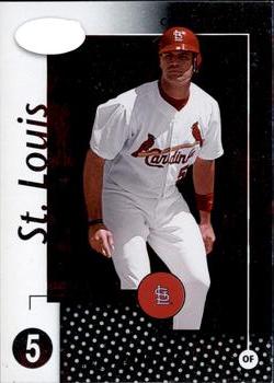
Monday, December 14, 2020Set: 2002 Leaf Certified (Rate) “ I didn't realize the Certified brand had spent time with Leaf. I know it started at Pinnacle, and ended up currently at Panini. It's not a favorite brand of mine. It's always been mirror foil backdrops, edited cutouts of players with no real backdrop, and generally small sets- 3 things I'm not a big fan of. When they are combined together...meh. ” -Billy Kingsley
“ Nice card of a nice guy who is an all-time great baseball player. I hope we can find a way for him to retire as a Cardinal. ” -kents_stuff
2
“ Nice Cardinals card that I need now. ” -switzr1
“ Nice Albert Pujols card when he was a Cardinal, his natural team in my book. ” -captkirk42
1
“ The back is so colorful that it doesnt really go with the stark front. Not a fan. ” -parsley24
“ Cardinals! And a legend at that! First ballot hall of famer for sure, although his injuries may keep him closer to 90% than the 100% he probably deserves ” -Brimose
“ Ugly card. Nothing redeeming about it. ” -georgecf
“ I'm guessing that blank white oval is just the way some foil scanned, but it cheapens the overall look of the card for me. I also don't like when a weird border pattern is given priority over a limb. Back is ok, but would be better with a player photo somewhere. ” -jackal726
“ Seeing Pujols without a beard is so odd anymore. The front is hard to read based on the scan, but I'm assuming the red is foil, which makes it stand out a little more. ” -IfbBirdsCards
1
|
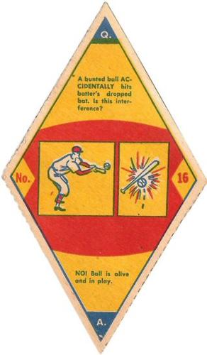
Sunday, December 13, 2020Set: 1949 Smack-A-Roo (R447) (Rate) “ Not sure what this is, but doesn't look like I would collect it, even if it is old. The diamond shape would be annoying to store. ” -muskie027
1
“ Creative use of the square design...thinking outside the box for sure. ” -Billy Kingsley
1
“ WOW! Super nice card. Great condition. ” -cjjt
1
“ My first impression was, that this was a boy scouts badge, or something like that. A card cut from a different sheet, for sure. ” -CollectingAfterDeath
“ Very nice. Probably very few in excellent condition or better. ” -NJDevils
“ If you don't have the original box they came in...what a nightmare to store. Don't know why trivia game cards are even listed here. ” -C2Cigars
“ Very nice vintage non-card piece. Looks like it is felt, but I think they called these things "silks"? I need to look some stuff up then I guess. ” -captkirk42
“ not sure what im looking at but its 71 years old and looks to be in good shape and thats pretty awesome ” -Thunderfoot
“ NEAT ! I have not seen this set before, cool! ” -uncaian
“ Looks like it would be hard to stand upright in a box. ” -switzr1
|
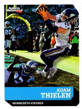
Saturday, December 12, 2020Set: 2018 Sports Illustrated for Kids (Rate) “ Cool picture. ” -muskie027
1
“ Not bad nor great. I have no issues with this card other than Adam scoring a TD against my Panthers. That is a fantastic photo on the front, especially for an SI card. There is enough info on the back to interest a child into reading it too. ” -spazmatastic
2
“ That's a cool photo. I'm glad SI for Kids finally changed designs in 2020, this one was ok but I like the new one more. ” -Billy Kingsley
1
“ Really? It takes a kid magazine to have a great action shot on the front with a different photo on the back....Panini take notice. ” -rmpaq5
“ My uncle named his fantasy football team “Adam Thi-HEE HEE-len” and now that’s all I can think about every time I see Thielen. ” -StarrsCards
“ First--great photo. Second--I generally like sharp angles more than curvy swoops (except in cars...I like sleek car designs). But the inconsistency in the angle cuts on various--but not all--corners is a bit distracting. On the front--are upper right and lower left cuts parallel? On the back--make up your mind already if you're adding a chamfer or not, SIfK. I like the card generally--a lot. But that detail is bothersome to me. ” -kents_stuff
“ Sometimes the Sports Illustrated for Kids cards designs are 100 times better than Topps or Upper Deck or Donruss or Panini or whoever is around at the time. Now if they put some stats on the back... ” -captkirk42
1
“ Didn't expect to see a football scan by Billy, but I guess it is a "multi-sport" release! I wish I had Adam Thielen on my fantasy football team this year! ” -bkklaos
“ I like the picture on the front of the card. Overall this is an ok design. ” -Brendan Barrick
“ This is a great photo. I am glad they didn't edit out his upper hand for the border. ” -Corky
“ FANTASTIC photo. Reminds me of what football cards used to look like back when they were fun to collect. ” -mkaz80
|
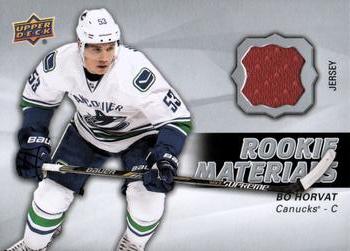
Thursday, December 10, 2020Set: 2014-15 Upper Deck - Rookie Materials (Rate) “ Cool Canucks card. I'm still not sold on trying to own a tiny piece of a shirt some dude got all sweaty in. But it's my favorite team. ” -switzr1
5
“ Maroon on a Canucks card? ” -Billy Kingsley
1
“ Event used. That is interesting. ” -parsley24
1
“ I dislike when a memorabilia card has an image that couldn't possibly match the "player worn' piece included. ” -jackal726
4
“ My collecting tastes admittedly pre-date the jersey swatch/game-used craze. That being said, there's something not right about the swatch color not matching anything on the uni in the player pic. Seems...inauthentic. ” -wjhipwell
“ Is there even a red Canucks jersey? Where did they get this from? ” -Soarin22
“ I like Upper Deck memorabilia cards, and this is no exception. ” -Brendan Barrick
“ why is it red? ” -DarkSide830
“ An OK Hockey Relic Materials Memorabilia card. I really wish cards like this would be serial numbered and cards like the random Star Wars1/1 red variant card that was today's RCotD were NOT. A swatch of cloth is rarer than a randomly created variant for a card only changing the card's background color to make the variant. ” -captkirk42
|
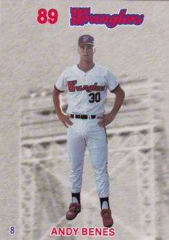
Wednesday, December 9, 2020Set: 1989 Wichita Wranglers Stadium Set SGA (Rate) “ What a strange card. While I normally can't stand a card where the background has been replaced that might not be the case if the players were just magically flying through the air over a bridge for no apparent reason. ” -Billy Kingsley
4
“ Is he levitating? ” -trauty
2
“ +5 internet points for being a MiLB card of a player I remember in the Bigs. ” -jackal726
3
“ Yikes. This looks like a clothing tag from a dime store pair of jeans. Horrible. Only a Score logo would make this worse. ” -parsley24
“ Minor League card of a known player. Neat. ” -DarkSide830
“ This reminds me of the video of Rush's "Time Stand Still." Just floating around for no apparent reason. ” -rmpaq5
“ Interesting a Minor League "stadium giveaway" card/set with blank backs? Nice looking. Wait did they attempt to make these "3-D"? ” -captkirk42
“ I have no idea what I'm looking at here. But he was a Cardinal at one time, and after playing he co-hosted the Saturday morning Cardinals Kids show with Fredbird, so I gotta have this. ” -switzr1
“ I hate it. On every level. The pose, the background the back??? . Just a NO from me. ” -Camstone
“ Interesting concept for the image--floating in the air like that. Not sure how I feel about that, but I think it's more positive than negative. On the other hand I hate the "89" font and dislike the font used for the name. But generally speaking it is always great to see a bona fide MLB star-to-be in his minor league years. ” -kents_stuff
“ Interesting concept. I like it. The back could have been something though. ” -muskie027
“ These are interesting, without holding it in hand, it looks like a sticker. ” -Derek McDonough
“ This is a wonderfully strange card. ” -CollectingAfterDeath
|
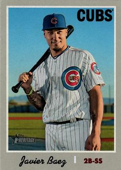
Tuesday, December 8, 2020Set: 2019 Topps Heritage - O-Pee-Chee Backs (Rate) “ In retrospect, learning French through the backs of O-Pee-Chee cards was not the best idea prior to a trip to France. ” -buckstorecards
16
“ Great set, great card, great player. ” -abide
“ Javier Baez, I am sure Chicago sells a few more tickets when hes playing. He has a knack for catching players off guard and taking chances when they are least expected. Always loves this 1970s Card design, one of the few I like that hey are reusing. ” -Derek McDonough
“ Worse that the girl eating ice cream. A Cub. And Baez at that. Terrible. ” -switzr1
2
“ Very nice card! ” -IfbBirdsCards
“ I like Topps Heritage. I like Topps Vintage stuff. I love the early 70s stuff as that was some of the first stuff I collected. I also like OPC stuff. Ugh but I tire of all the variants that Topps makes for everything now-days. ” -captkirk42
“ Am I the only one who thinks that Topps makes too many sets? ” -Phil
“ The perfect sports card may not exist. but with all of the features on this one..It'll do until one comes along ” -Camstone
“ Gotta get in tune with Sailor Moon
'Cause that cartoon has got the boom anime babes
That make me think the wrong thing.
Sorry makes me think of that song every time I see anything of hers ” -Shaw Racing
“ Great, basic design they had back in 1970. I don't think they have to rehash those or any others, though. But it was a great design. ” -kents_stuff
“ Decent card. Terrific set. ” -TonyZ
“ I really wish the O-Pee-Chee were more common. I think they are a nice touch. ” -DarkSide830
“ I originally didn't collect the Heritage stuff, but always liked the look. I converted and started full time collecting these in 2018. Love em! Love the concept and the look! ” -muskie027
|
Monday, December 7, 2020Set: 1994 Cardz Muppets Take the Ice (Rate) “ The Muppets are great! This card is...not. But I'd still happily collect it. Of course I have no idea if I would count it as hockey or Movie & TV... ” -Billy Kingsley
4
“ One of the weirdest NHL licensed sets ever. I have couple cards from this set. You rarely see the puck having own cards. Pro Set did one. Is there others?
"Kermit spends a lot of time handling the puck... not the Pig" :D ” -SharksAttack
“ This is a Muppets card? Would have never known ” -IfbBirdsCards
“ Handling the puck not the pig..... Who writes this stuff? ” -parsley24
“ I'm trying to find redeeming qualities for this card but... ” -Lennoxmatt
“ ? What? Oh Hockey, OH The Muppets. Then the bizarre look is OK. NEXT! ” -captkirk42
“ Umm...I don't see any Muppets. ” -switzr1
1
“ Good to know that the definition of diameter is: across ” -abide
“ It is nice to see the puck receive its own card. You can't play hockey without one. ” -Brendan Barrick
“ I l love cards with animation in them, on them, or they are animation!! That being said, "Can't stand it"! ” -Camstone
“ I think this is one of my favorite puck cards of all time. Great casual locker-room shot--much more relaxed than one of those typical action shots.
Now had NBC (I think!) had a Peter Puck series of cards back in the 70s, that would have been awesome. Anyone else remember Peter Puck fondly? ” -kents_stuff
1
|
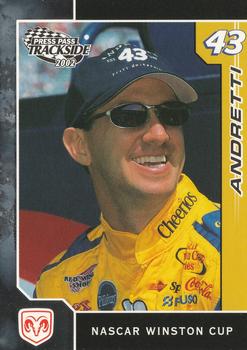
Sunday, December 6, 2020Set: 2002 Press Pass Trackside (Rate) “ A first name might be good for a common last name. Nice card though. ” -switzr1
“ Nice card of legendary Indy car driver Mario Andretti's kid. Not sure why General Mills / Cheerios is prominently sponsoring NASCAR. ” -abide
“ I think for a racing card, it looks cool. ” -muskie027
“ Auto racing needs more Andrettis, period. Indianapolis was awesome in the early 90s (and late 80s?) with John, Michael and Mario all on the track. And if I remember correctly, John was the first to run the Indy 500 in the morning and then head to Carolina or somewhere to run the Coca-Cola 600 that evening. (Is it 600? 500? Carolina? Honestly I'm not sure. I don't follow NASCAR so much, as you can tell. Sorry!) ” -kents_stuff
“ I've never been a fan of auto racing, but I guess this is a pretty decent looking card. ” -Phil
“ Everybody liked John Andretti. Sadly he passed away from colon cancer earlier this year. ” -Billy Kingsley
“ Nice card, though there is enough room to put his first name on the front. You would think an Andretti driving a Petty owned car would have a much better career than he did. ” -jupiterhill
“ This card reminds me of how much I want to see Dodge back in NASCAR ” -IfbBirdsCards
“ Nice racing card. ” -captkirk42
“ I have some racing cards, although I do not collect them. But this is a pretty nice looking card. I like when they include an image of the car the driver races with. ” -Derek McDonough
|

")