
Random Card of the Day |
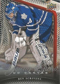
Tuesday, November 10, 2020Set: 2011-12 Upper Deck - UD Canvas (Rate) “ Is everyone really sure that is a picture of Ben Scrivens? I don't see a complete number, a complete name or a face. ” -abide
3
“ While the Canvas inserts generally have photos that are at least as interesting as the ones used on the base cards, that usually doesn't ring true for the Young Guns portion of the set, which is usually pretty generic. This is a nice exception. ” -buckstorecards
1
“ UD Canvas are always fun cards for me to collect. Sometimes the pics they use can be quite entertaining. This one looks like the dear Ben is a bit forlorn. Still a great looking card. ” -Gunny
1
“ First time I've seen the 2011-12 UD Canvas insert. It reminds me a lot of 1995-96 Upper Deck on the front. Back doesn't seem like they put much thought into it...but we all know the UD Canvas insert is photography based anyway. ” -Billy Kingsley
“ Me trying not to touch a public toilet seat. ” -parsley24
3
“ Very plain for a hockey card. Nice front Can read everything that is a good start. Player name should be larger and larger than the UD Canvas brand. Back is OK. I think Player name should be higher and above team logo. Young Guns brand logo is way too big. ” -captkirk42
“ Nice action shot. I like the card stock of the UD Canvas issues. ” -Brendan Barrick
“ Fantastic photo and the card design reminds me a bit of the 1994 design. Only flaw I see is the Young Guns script, which is hard to read, unless it is foil. ” -IfbBirdsCards
1
“ We hardly knew ye. I kind of love this shot though. ” -crushnmove
“ Young Guns seems to work for an offensive sniper, but it seems odd on a goalie card. It just doesn't have the same strength to me as Rated Rookie or Future Star. ” -vanstryland
“ I like it. It's not your usual goalie card. The back is very classy. ” -karsal
“ Real cool photo, with the shadow of the net on the goalie's uniform and pads. ” -switzr1
2
|
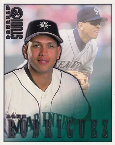
Monday, November 9, 2020Set: 1998 Studio - Portraits 8x10 (Rate) “ Not a bad card, but the double use of the back photo drops it for me. Its a mariner which is a plus, but then its arod, so it drops back again. ” -parsley24
“ OK card. I am not a fan of the Studio sets Portraits or not. They usually don't interest me. I also have difficulty wrapping my head around Alex Rodriguez's early career with the Mariners it just looks odd. ” -captkirk42
“ 8 X 10 format to work with, and yet it is lacking a little variety, imo. The front looks good with the portrait pose over the in the game defense shot. The back could have used an in the game offense shot instead of the same defense pose from the front, but I may be asking for a bit too much. None the less, it is a nice effort by Donruss. ” -CollectingAfterDeath
“ At least they chose a huge format for that awful look on his face. ” -crushnmove
“ If I had a PC of A-Rod, I suppose I might like this, and if I had it, and went to an autograph show to chase down his IP auto, It would be great to get this one autographed, and put in a frame. ” -abide
“ I like the format of this card quite a bit. The pairing of the action shot with the front portrait is done very well. Also, I still love my boy, A-Rod from his days with the Mariners. ” -Camstone
“ He was a great player, too bad he caused so much controversy. ” -muskie027
“ I'm lukewarm on this one. ” -Phil
|
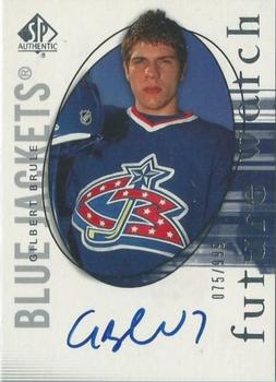
Saturday, November 7, 2020Set: 2005-06 SP Authentic (Rate) “ This is an ok design. The card has nothing much going for it. Not much effort was put into the autograph. This is typical of current players. ” -Brendan Barrick
“ aka Bono's impromptu chauffeur ” -buckstorecards
“ I can only imagine the disappointment when you pull this card and not the set's Ovechkin or Crosby. ” -wjhipwell
“ Placing the player's name in small print inside of the team's name is an interesting look. I really like the back of this card. The layout is very inviting, in such a way, that it seems to be asking to be read, which I did. Very smartly designed, imo. ” -CollectingAfterDeath
“ A bit busy, can't really tell right off who he is or who he plays for. Also never a fan of serial numbers or autographs. Just collection fluff. It is like a neon sign saying this card might be worth something one day, blah. ” -Ragman5
“ I just got this exact card last week in a trade! Mine is #292/999 ” -StarrsCards
“ i can honestly say i've never seen that blue jackets logo before ” -Thunderfoot
“ It's never a good thing when there is so much wasted space on a card. ” -Phil
“ Pretty good-looking card. I remember him getting lots of hype when entering the league, but he unfortunately never blossomed as expected. ” -DanD
“ If this is his signature after 75 cards, I can only image what it looks like by 999! ” -bkklaos
|
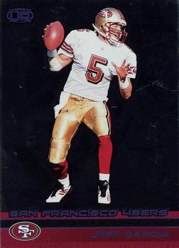
Friday, November 6, 2020Set: 2002 Pacific Heads Up - Blue (Rate) “ I'm a sucker for serial numbered cards, though I do prefer the foil imprinted type of serial number over the ink printed kind like this. Not a big fan of the background. I prefer action shots with action in the background. ” -MTHRILL22
“ It looks like Jeff is doing the Hokey Pokey. ” -rmpaq5
“ proof that alternate football leagues can produce NFL talent ” -DarkSide830
“ OY a set with chrome background you can't see on scans. UGH. One of several reasons I don't like foil/Chrome on cards. They never scan well. Front with the scan you can't read anything SORRY. Back pretty good would prefer more years of stats. Do not like just one year or just career stats, but at least they are there. OH this is serial numbered and what a number 002. Oh right serial numbered cause it's the "blue" version I can see his name and team is in blue foil on the front but can't read it unless I zoom in. ” -captkirk42
“ Not quite at the level of Joe Montana and Steve Young, but he was the 49ers starter for a good 5 seasons. ” -vanstryland
“ Not fond of this card. Hate the design and it looks like Garcia is fixin' to bust a move not play football. ” -Camstone
“ The front is too dark for my liking. I do like the back. ” -Brendan Barrick
“ "The 49ers successfully mined" ... oh how clever ” -abide
“ wish pacific would've been around longer ” -Thunderfoot
“ Are we supposed to guess what dance move he is doing? ” -Phil
“ Something strange about this one. Not sure about the design. ” -muskie027
“ ME! Mine! It is on my trade list if you are interested. Dennis Miller called Jeff Garcia the NAFTA quarterback--played in Canada, traded to USA, Mexican last name. ” -cjjt
|
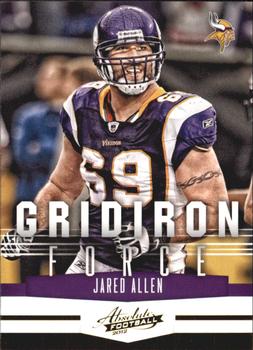
Thursday, November 5, 2020Set: 2012 Panini Absolute - Gridiron Force (Rate) “ was an absolute beast until he got married..... then bam....nothing. ” -parsley24
“ Please tell me this is an insert! On an effort scale from 1-10, these designers gave it a 0 ” -dilemma19
“ OK front but come on man the "Gridiron Force" logo is way way too big. Backside come on man the same dang picture? No stats? ” -captkirk42
“ One of the photos should have been of Jared sacking a QB, preferably the front side of the card. With a set's name of Gridiron Force, I would expect too see some violent collision, but instead it is just two identical mug shots. Card just seems very average, imo. ” -CollectingAfterDeath
“ This is an ok insert. ” -Brendan Barrick
“ Terrible Panini crap. ” -cjjt
“ I like it, even though there's a lot of words. Maybe it's because of the Vikings, but it works. ” -Soarin22
|
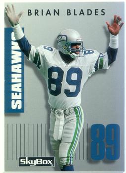
Wednesday, November 4, 2020Set: 1992 SkyBox Prime Time (Rate) “ Blades? He should have taken up hockey! ” -Billy Kingsley
“ The 90s had some interesting designs for cards. Nothing like today but still great designs. ” -MattyIce2014
“ Early youth seahawks legendary wide receiver. ” -parsley24
“ I think this is the first SkyBox card I sort of like! ” -Soarin22
“ Primetime right over Prime Time! ” -vanstryland
“ heck of a name ” -DarkSide830
“ Ah Skybox. I'm not sure what to think about this set. I have traded many of these of the not mine teams, maybe even this card. It is one of those sets I'm not sure if I will ever trull collect the entire set of. Do like the checklists for the set. I might try to insure I have those, unmarked if possible. ” -captkirk42
“ Ok set. Good pictures. Brian looks like he is signaling "Touchdown!" ” -cjjt
“ I like this card. ” -Brendan Barrick
“ Always love to see my beloved Seahawks players featured! I actually grew up a 49ers fan before the Hawks came along, but I been with them ever since! Go Hawks! ” -bkklaos
“ The back displays perfect form for how to execute the face catch. All kids in pop warner pay attention. ” -abide
“ Great looking card! A bit simple for some tastes, I guess, but suits mine just fine. Love the color scheme all over, course being a 'Hawks fan helps! ” -Camstone
|
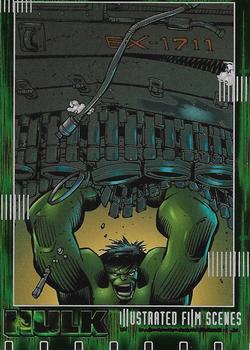
Tuesday, November 3, 2020Set: 2003 Upper Deck The Hulk Film and Comic - Illustrated Film Scenes (Rate) “ I've never seen this movie, but the next Hulk movie after this kicked off the Marvel Cinematic Universe, which has now surpassed the Star Wars movies as my favorite movie series of all time. ” -Billy Kingsley
“ Hulk smash ” -IfbBirdsCards
“ HULK SMASH! ” -captkirk42
“ They should have shown more of the Hulk's body. Don't they think this stuff over? ” -Phil
“ Hulk smash! ” -crushnmove
“ I'm a big fan of the illustrated Marvel cards. Great artists and wild subject manner feed the kid and the adult in me. And the Hulk. A fan favorite! ” -Camstone
“ Not a fan of the drawing and I still am married to a Lou Ferrigno Hulk over the rest of them for the back. ” -muskie027
|
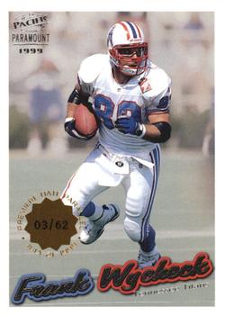
Monday, November 2, 2020Set: 1999 Pacific Paramount - Premiere Date (Rate) “ The front with its action shot, I really like. The serial number section is given a lot of detail. The back with its portrait shot and mini bio looks good. The stat block may be a little too simplified, but I like it as a change of pace. Nice card! ” -CollectingAfterDeath
“ I don't have any of these, but wish I did! I like it! ” -bkklaos
“ Who decides they want to make a serial-numbered card, then chooses to make 62 of them?? ” -Soarin22
“ Wycheck! Music city miracle! Man those Oiler uniforms are sweet. Bring them back! ” -crushnmove
“ I like this card. Pacific produced too many parallels to keep track of. pacific was probably the company that started the parallel craze. ” -Brendan Barrick
“ Legendary Titan. Great on the madden 2000. ” -parsley24
“ Aside from the picture on the front, everything else on the front is abysmal . . . The back is actually kind of acceptable, but on both sides, the name should be presented in an easily-legible font, with less-than-the apparent "glitter" . . . ” -georgecf
“ i've always liked this set, dont ever remember seeing this this parralell, but have seen it in other pacific products ” -Thunderfoot
“ I can't tell if I like it or not. I guess that means it is average, lol! ” -muskie027
“ Nice simple front and back that's colorful and informative. Really everything your classic card should be. I would rather the L/I foil was somewhere else. ” -Camstone
“ Not a bad looking card, but I don't like the stamp on the front. There's enough going on already. ” -Phil
|
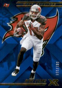
Sunday, November 1, 2020Set: 2018 Panini XR - Blue (Rate) “ Hey, a Buccaneer! I've never seen this set before, but I like this card. ” -switzr1
“ It's not bad, but nothing special. ” -muskie027
“ Not a fan of the front. Really don't like the back. ” -abide
“ Ah, good old Upper Deck X. One of my fav....wait--Panini XR? What the heck is that? Someone tell me that the back doesn't look like 2008 Upper Deck X Baseball. ” -kents_stuff
“ If you're going to remove the background of the original photo, replacing it with team logo is a great choice. ” -buckstorecards
“ It bothers me seeing cards with the same image on both sides. ” -DanD
“ red on blue actually look pretty good together, this has a very absolute feel to it ” -Thunderfoot
“ The back is better than the front. ” -Brendan Barrick
“ Too much going on for me. You have the background photo that is completely shrouded by a weird X design, the Bucs logo, and Evans himself. Not to mention the gold on top and bottom. There's just stuff everywhere. ” -Soarin22
“ I'm a gonna down vote this one. Don't like it. Don't think I've ever seen it. Don't think I want any from my team(s) or players. ” -captkirk42
“ Cool looking card. But same front and back photo ” -parsley24
|

")