
Random Card of the Day |
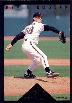
Saturday, October 17, 2020Set: 1993 Fleer - Major League Prospects (Series One) (Rate) “ I'm a sucker for these early 90s inserts, even if they don't look great. ” -switzr1
“ Ah yes, 1990's Fleer, the dark age of baseball cards. Especially with one, I can't even read what's on the bottom! ” -Soarin22
1
“ I'm guessing the bottom is foil? Not a fan of black border cards because they're so hard to maintain. ” -IfbBirdsCards
“ Is Kevin Rogers in the Phantom Zone? ” -DaClyde
“ Seems odd, but that pyramid thing, like it is so big that it draws my attention away from the player in the middle of making a pitch. Flip the card over, and again my eyes are immediately pulled to the pyramid. A form of modern day hypnosis by Fleer, using the Imhotep sleep-temple trance therapy perhaps? 8o) ” -CollectingAfterDeath
“ I'm not familiar with the Prospects set here. Typical of the 1990s I didn't get new baseball since there was no DC team at the time and I was only so-so on the Orioles. ” -captkirk42
|
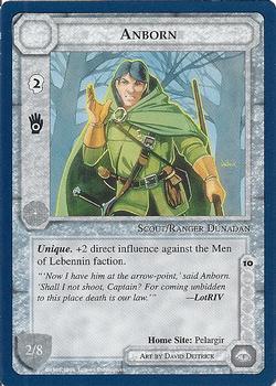
Friday, October 16, 2020Set: 1995 Middle Earth: The Wizards (Rate) “ Interesting CCG TCG card. Hmm just "Middle Earth"? Not a true "Lord of The Rings" set? Anyway typical gaming card NEXT. ” -captkirk42
“ The Yankees literally just lost as I am seeing it so I just feel like saying something negative. I will try to resist and say something positive. Nice gloves. This looks like Link's black haired brother. ” -muskie027
“ Is this a Uriah Heep album? ” -mkaz80
|
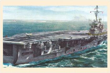
Thursday, October 15, 2020Set: 1960 Revell 50th Anniversary of Naval Flight (UM26-6) (Rate) “ This set features fully painted artwork...I really enjoy the few cards I was able to locate. ” -Billy Kingsley
“ Simply love it....on so many levels! ” -tbshaw
“ Sets like this are just awesome! ” -muskie027
“ I'm constantly amazed at how many really cool sets there are that I'm completely oblivious to... ” -jackal726
“ Amazing!! ” -IfbBirdsCards
“ My brothers used to build the Revell warships, planes, tanks, and sports cars. I never had the patience or the hand skills to do them. Never knew there was a trading card set about these things. ” -bpaul14
“ Usually not a fan of horizontal images, but this card is awesome! I'd love to own a piece (or all) of this set! ” -bkklaos
“ Cool card! ” -Brendan Barrick
“ Oh I like this card a lot! ” -switzr1
“ Beautiful card. I'm not big on military cards, but that one is really cool. ” -crushnmove
“ Love it! Very Patriotic, very powerful! The info on the back is all you would need to know, without buying a book! Great card! ” -Camstone
“ As a kid (mid-70s, not 1960 like this card) I had a Revell model of an aircraft carrier that looked a lot like this one. I didn't realize Revell had a card set(s?) back in the day, too. Neat! ” -kents_stuff
“ Awesome! I used to build Revell models when I was a kid. ” -cjjt
“ Ok. If I were to expand beyond baseball cards, well it would be a disaster, but this might be the set I start with. I love warships and this is a beautiful card. It even has stats on the back. ” -Vvvergeer
|
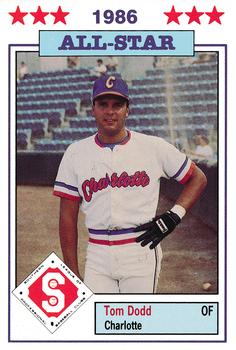
Wednesday, October 14, 2020Set: 1986 Jennings Southern League All-Stars (Rate) “ Hey, our long lost little brothers! Very nice front design. I like the baseball diamond icon. Border to picture ratio is spot on. I give it two thumbs up. Yeah, I gotta say it...Go O's! ” -CollectingAfterDeath
“ This is a great looking card for minor league. Classic. ” -parsley24
“ Well he certainly played like an All Star that year. 100 RBI at the break. I don't remember him in the majors, though. ” -switzr1
“ Nice effort for a minor league card. ” -NJDevils
“ Love seeing the minor league cards come up! Fun stuff! ” -bkklaos
“ Not bad but I like cards where the photo takes up the majority of the space. ” -Phil
“ Nice Minor League card. ” -captkirk42
“ LOVE minor league cards, and an Oriole to boot! Nothing special about this card design, but still like it ” -IfbBirdsCards
“ Love it! Love white border All Star cards! ” -crushnmove
“ I've never seen this set, but this card screams 1980's Minor League to me. But then again, it is a 1986 Southern League All-Stars card. So.... ” -kents_stuff
“ I have a love hate type attitude toward minor league cards. I love that they have them and feel they are important, but I hate the lack of effort on a lot of them, especially the backs. This one has a decent front at least. ” -muskie027
“ Oh. He's not a coach. If you're almost 30 and still playing in AA, you might want to start thinking about other career options. He was a Southern League All-Star though, and I don't recall a huge logjam of outfielders through the mid-to-late 80s in Baltimore, so I wonder what happened to him... ” -dilemma19
“ Sort of a 1988 Score vibe or maybe the Topps All-stars. Pretty cool for a Minor League card. ” -Derek McDonough
|
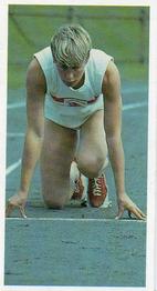
Sunday, October 11, 2020Set: 1992 Brooke Bond Olympic Challenge (Rate) “ Olympic cards are always good in my book. 1992 is when my earliest Olympic memories are from, but it wasn't until 1996 that I became a big fan. Have been ever since. ” -Billy Kingsley
“ Hmmm....not familiar at all with this set. Front is very plain, of course, but a nice, full photo which captures a moment. I like that very much. The back has a good description of her illustrious olympic career--both the ups and the downs. I'm not a fan of the aspect ratio of the card, but overall I'd say this is a winner. ” -kents_stuff
“ There is something awesome about this card. ” -muskie027
“ Kind of a cool card. Is it mini A&G size. sweet ” -parsley24
“ At first I thought this was a boy with no pants, and I was ready to cancel my site membership. Regardless, this is not a card I would add to my collection. ” -switzr1
“ It has to be the lighting on the original photo, but her entire right side of her body looks like she has an enormous bruise on her arms and legs. ” -rmpaq5
|
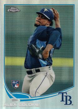
Saturday, October 10, 2020Set: 2013 Topps Chrome - Refractors (Rate) “ nice card, set design is very close to the Nike Swoosh ” -abide
“ All Refractors are awesome! It doesn't matter who is shown on them, it's the technology. ” -Billy Kingsley
“ I'm not a chrome fan Not on cars, not on cards, But it's OK on faucets. ” -kents_stuff
“ Awesome action shot! Perhaps a four-seam fastball? Cool card. ” -CollectingAfterDeath
“ Not as bad as the 2013 topps design. For sure. ” -parsley24
“ 2013 Topps has always been a favorite of mine for recent Topps. Rays colors look good on this card, and you can't go wrong with a RC! ” -Soarin22
“ Always a fan of refractors. Sort of wished Topps would make a set of all refractors ” -IfbBirdsCards
“ Nice set but I'm not a fan of the Chrome as a complete parallel set with it's tons of own parallels. If it were a single inserted parallel I wouldn't mind as much. Still might not like it though. ” -captkirk42
“ One of the better designs of the 2010's. Not too fancy, not too boring. ” -Phil
|
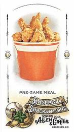
Friday, October 9, 2020Set: 2018 Topps Allen & Ginter - Mini Baseball Superstitions (Rate) “ Wonderful! ” -muskie027
“ I've been in this hobby a long time and I thought I have seen it all. But I would have never guessed I would see a bucket of fried chicken as a card. I wouldn't be surprised if there wasn't a grease-stained parallel of it. ” -DocOso
“ A card of a bucket of chicken?! I want it! Best card ever! I wish this was scratch & sniff. ” -Billy Kingsley
“ I'll take mine extra spicy with a side of buffalo sauce please. ” -koloth42
“ Well, at least it's sort of baseball-related ” -IfbBirdsCards
“ Wow! My trading card dream has come true! FRIED CHICKEN! Oh yeah.....see that stuff in my sleep. The trivia piece on the back is interesting. ” -tbshaw
“ Actually love this card. Wish it was scratch and sniff. ” -parsley24
“ Always love fried chicken, so not bad lol ” -BasketbalHQ
“ I used to love the A&G minis way back when Topps started reviving the A&G brand, but somewhere around 2012-14 or so I got tired of minis. ” -captkirk42
“ I don't collect A&G, and I would never collect these kinds of cards, but when this comes up on the RCOTD, I am a happy camper. ” -bpaul14
“ Give me a break . . . ” -georgecf
“ Awesome card, but it's makin' me hungry! ” -CollectingAfterDeath
“ This website somehow finds a way to extend my definition of a card every RCOTD. Now I'm hungry too... ” -Soarin22
“ I don’t collect Ginter much so I missed these but looks like a fun little insert! ” -BrewerAndy
“ WTF ” -abide
|
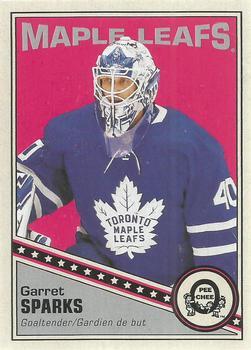
Thursday, October 8, 2020Set: 2019-20 O-Pee-Chee - Retro Blank Back (Rate) “ I don't like the blank back versions, but luckily I have not pulled any. I did pull his blue parallel from this same set, which I like a whole lot more! ” -Billy Kingsley
“ Like the design, but never really been a fan of the blank backs. Though it does leave me with a dumb question - why does the card keep the card number 93 associated with it, when that number doesn't appear anywhere on the card since the back is blank? ” -CrazieJoe
“ Three cheers for the retro design. Infinite jeers for the inane "half-a-card" blank back version. Can't believe Upper Deck thought this was a good idea and has continued making them for over a decade now. (And shouldn't these technically all be NNO?) ” -bevans
“ Cool card! Design is spot-on. ” -CollectingAfterDeath
“ Great card! Now if only Garret Sparks could reach league-level play ” -IfbBirdsCards
“ Maple syrup is a syrup usually made from the xylem sap of sugar maple, red maple, or black maple trees, although it can also be made from other maple species. ” -ganondorf666
“ Great success in the AHL...couldn't deliver the same results in the NHL...kinda like this card. ” -wjhipwell
“ I like the front. I am not a fan of blank backs. It is a waste of space. ” -Brendan Barrick
“ OPC Retro Card. Love it. Not a fan of these blank backs when there really is no reason for them to be blank backed. ” -captkirk42
“ Seems like lots of random OPC retro type cards lately. I like this one--nice design. Very retro. ” -kents_stuff
“ Not bad except that the gray part should be a bit smaller. ” -Phil
“ Great goalie in the AHL. Not so great in the NHL. It might be best his stats are omitted, though he did get a shutout in his first-ever start. I hope he can bounce back with another franchise. ” -DanD
“ Nice card. Hockey gets lots of nice looking cards as RCOTD, and usually I've never seen one like it before. ” -switzr1
“ Great looking retro card. The back needs some work ” -parsley24
|

")