
Random Card of the Day |
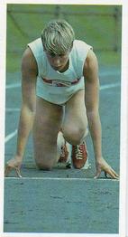
Sunday, October 11, 2020Set: 1992 Brooke Bond Olympic Challenge (Rate) “ Olympic cards are always good in my book. 1992 is when my earliest Olympic memories are from, but it wasn't until 1996 that I became a big fan. Have been ever since. ” -Billy Kingsley
“ Hmmm....not familiar at all with this set. Front is very plain, of course, but a nice, full photo which captures a moment. I like that very much. The back has a good description of her illustrious olympic career--both the ups and the downs. I'm not a fan of the aspect ratio of the card, but overall I'd say this is a winner. ” -kents_stuff
“ There is something awesome about this card. ” -muskie027
“ Kind of a cool card. Is it mini A&G size. sweet ” -parsley24
“ At first I thought this was a boy with no pants, and I was ready to cancel my site membership. Regardless, this is not a card I would add to my collection. ” -switzr1
“ It has to be the lighting on the original photo, but her entire right side of her body looks like she has an enormous bruise on her arms and legs. ” -rmpaq5
|
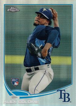
Saturday, October 10, 2020Set: 2013 Topps Chrome - Refractors (Rate) “ nice card, set design is very close to the Nike Swoosh ” -abide
“ All Refractors are awesome! It doesn't matter who is shown on them, it's the technology. ” -Billy Kingsley
“ I'm not a chrome fan Not on cars, not on cards, But it's OK on faucets. ” -kents_stuff
“ Awesome action shot! Perhaps a four-seam fastball? Cool card. ” -CollectingAfterDeath
“ Not as bad as the 2013 topps design. For sure. ” -parsley24
“ 2013 Topps has always been a favorite of mine for recent Topps. Rays colors look good on this card, and you can't go wrong with a RC! ” -Soarin22
“ Always a fan of refractors. Sort of wished Topps would make a set of all refractors ” -IfbBirdsCards
“ Nice set but I'm not a fan of the Chrome as a complete parallel set with it's tons of own parallels. If it were a single inserted parallel I wouldn't mind as much. Still might not like it though. ” -captkirk42
“ One of the better designs of the 2010's. Not too fancy, not too boring. ” -Phil
|
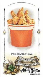
Friday, October 9, 2020Set: 2018 Topps Allen & Ginter - Mini Baseball Superstitions (Rate) “ Wonderful! ” -muskie027
“ I've been in this hobby a long time and I thought I have seen it all. But I would have never guessed I would see a bucket of fried chicken as a card. I wouldn't be surprised if there wasn't a grease-stained parallel of it. ” -DocOso
“ A card of a bucket of chicken?! I want it! Best card ever! I wish this was scratch & sniff. ” -Billy Kingsley
“ I'll take mine extra spicy with a side of buffalo sauce please. ” -koloth42
“ Well, at least it's sort of baseball-related ” -IfbBirdsCards
“ Wow! My trading card dream has come true! FRIED CHICKEN! Oh yeah.....see that stuff in my sleep. The trivia piece on the back is interesting. ” -tbshaw
“ Actually love this card. Wish it was scratch and sniff. ” -parsley24
“ Always love fried chicken, so not bad lol ” -BasketbalHQ
“ I used to love the A&G minis way back when Topps started reviving the A&G brand, but somewhere around 2012-14 or so I got tired of minis. ” -captkirk42
“ I don't collect A&G, and I would never collect these kinds of cards, but when this comes up on the RCOTD, I am a happy camper. ” -bpaul14
“ Give me a break . . . ” -georgecf
“ Awesome card, but it's makin' me hungry! ” -CollectingAfterDeath
“ This website somehow finds a way to extend my definition of a card every RCOTD. Now I'm hungry too... ” -Soarin22
“ I don’t collect Ginter much so I missed these but looks like a fun little insert! ” -BrewerAndy
“ WTF ” -abide
|
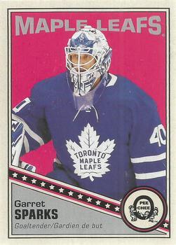
Thursday, October 8, 2020Set: 2019-20 O-Pee-Chee - Retro Blank Back (Rate) “ I don't like the blank back versions, but luckily I have not pulled any. I did pull his blue parallel from this same set, which I like a whole lot more! ” -Billy Kingsley
“ Like the design, but never really been a fan of the blank backs. Though it does leave me with a dumb question - why does the card keep the card number 93 associated with it, when that number doesn't appear anywhere on the card since the back is blank? ” -CrazieJoe
“ Three cheers for the retro design. Infinite jeers for the inane "half-a-card" blank back version. Can't believe Upper Deck thought this was a good idea and has continued making them for over a decade now. (And shouldn't these technically all be NNO?) ” -bevans
“ Cool card! Design is spot-on. ” -CollectingAfterDeath
“ Great card! Now if only Garret Sparks could reach league-level play ” -IfbBirdsCards
“ Maple syrup is a syrup usually made from the xylem sap of sugar maple, red maple, or black maple trees, although it can also be made from other maple species. ” -ganondorf666
“ Great success in the AHL...couldn't deliver the same results in the NHL...kinda like this card. ” -wjhipwell
“ I like the front. I am not a fan of blank backs. It is a waste of space. ” -Brendan Barrick
“ OPC Retro Card. Love it. Not a fan of these blank backs when there really is no reason for them to be blank backed. ” -captkirk42
“ Seems like lots of random OPC retro type cards lately. I like this one--nice design. Very retro. ” -kents_stuff
“ Not bad except that the gray part should be a bit smaller. ” -Phil
“ Great goalie in the AHL. Not so great in the NHL. It might be best his stats are omitted, though he did get a shutout in his first-ever start. I hope he can bounce back with another franchise. ” -DanD
“ Nice card. Hockey gets lots of nice looking cards as RCOTD, and usually I've never seen one like it before. ” -switzr1
“ Great looking retro card. The back needs some work ” -parsley24
|

Wednesday, October 7, 2020Set: 2019 Topps Gallery - Masterpiece (Rate) “ Nice looking card. A bit fluffy, but to be expected from this set. Arenado is a very talented athlete playing in obscurity. Maybe not quite on a HOF track, but he's definitely a player most teams would gladly slot into their lineup. ” -dilemma19
“ Not a bad looking card, even though I am not a fan of drawn cards. Some they do well others not so much. ” -parsley24
“ I'm mixed on the Topps Gallery brand. I like illustrated cards from time to time, but I'm not sure about the fancy frame borders. I guess my point sort of is illustrated cards look pretty cool without borders or borders that don't look like picture frames. Then on the other hand the whole point of the "Gallery" set is to make them look like works of art hanging in a museum. Le Sigh! ” -captkirk42
“ Front of the card is really nice. The back could have been better with a little color. Still a good looking card. ” -CollectingAfterDeath
“ Though I'm a Rangers fan, Arenado is definitely one of my favorite players to watch ” -BasketbalHQ
“ A nice looking card. However, I see this as one of the "too many" products on the market. ” -jayoneill
“ I like artwork oriented baseball cards, but have never found Topps Gallery cards to be very interesting. It's like they try too hard. ” -bpaul14
“ I have a soft spot for artwork cards that started with Diamond Kings and Upper Deck team cards in the early 90's. This is nice and commemorates a good moment for Nado. Overall, I like it. ” -Vonnegut37
“ Pretty cool! Arenado is a fun player to watch. ” -muskie027
“ Nope ” -Derek McDonough
“ I'm a big fan of 2 things: A) Sports Cards and B) Art. So a big fan Topps Gallery. [ in particular 97-98-99 ] Love the museum picture frame concept. Great looking card with the purple background matching the Rockies color scheme, and Nolan making a throw off a green field. ” -abide
|

Monday, October 5, 2020Set: 2007 Bowman Draft Picks & Prospects - Prospects Blue (Rate) “ The back is done well. The front is not. ” -parsley24
“ #BDPP69 is not a number....it's an alphabet ” -NJDevils
“ This reminds me of a cheep minor league card from the 90s. ” -YoRicha
“ LIke the set, for some reason one of my favorite modern Bowman sets. However I have never liked the confusing numbering and confusion about what is the regular set, the drafts set, the prospects set. They all seem to me to be the same set but you have to look at 3 or 4 different checklists to figure out which card you actually have. ” -captkirk42
“ I like this set. I like blue cards. Also, this particular card, good pose for Buchholz, and Team USA uniform instead of Boston minor league team. ” -abide
“ So many different hues of blue on this card that it's starting to give me a headache. At least it's a prospect card of an All-Star, I suppose ” -IfbBirdsCards
“ I like the bowman autograph sets ” -BasketbalHQ
“ I HATE the numbering on these sets! ” -cjjt
|

Sunday, October 4, 2020Set: 1990-91 7th Inning Sketch WHL (Rate) “ I really like how all of hockey is covered on cards, not just the top level league. ” -Billy Kingsley
“ I love the simplistic elements at work in this design, especially the little star that contains the players' position. It's an attractive looking card; not too busy yet not boring. Would've added the team name somewhere on the front, but that's really my only issue here. ” -mkaz80
“ A great WHL card. Crazy to think something so simple and great look was produced in the early nineties... ” -parsley24
“ This is a very nice simple design. ” -Brendan Barrick
“ I actually just got this set about a month ago for 4.99 . I think it is a great set. ” -uncaian
“ Something odd about a card called "Inning" when it is for hockey. ” -muskie027
“ Nice card ” -switzr1
“ Not bad but Red, White, and Blue is getting a little tired. ” -Phil
|

")