Random Card of the Day
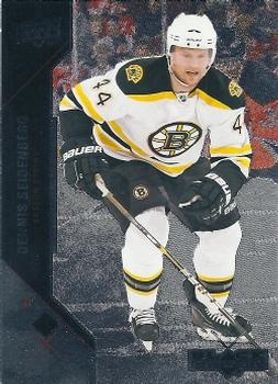


Sunday, September 27, 2020

Set: 2011-12 Upper Deck Black Diamond (Rate)

Card: #73 Dennis Seidenberg


“ This looks like it would be amazing in hand. ” -muskie027

“ a card I actually have! With as many cards as we have scanned, that doesn't happen all that often. Might be the first hockey card to come up that is in my collection (that I didn't scan), The etched foil used on Black Diamond sets are fun to look at in hand, but not so nice in scans. Name is easy to read in hand but not here. He just retired within the last year. ” -Billy Kingsley

“ Great hockey card. ” -parsley24

“ Probably looks really nice in hand, but uses a foil that scans dark? That's my guess. ” -switzr1

“ Foil + scanner = unreadable card ” -dilemma19

“ Interesting treatment on the photo background. Not sure it's fair to judge if I like or dislike the front based solely on a scan. The back's OK except for the large amount of blank space in the lower left half. ” -kents_xtras_trd_sell

“ This is a nice design. ” -Brendan Barrick

“ This card probably looks nice in hand, but the scan doesn't do it justice ” -IfbBirdsCards
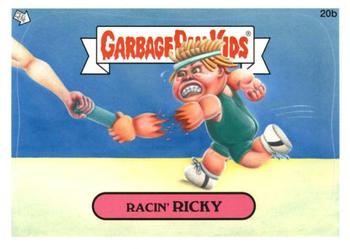

Saturday, September 26, 2020

Set: 2012 Garbage Pail Kids Brand New Series (Rate)

Card: #20b Racin' Ricky


“ I loved the original version when I was a kid. Totally got me into card collecting. Wish I still had them. I have no idea what happened to these or my mid-80's wrestling cards which started my collecting. ” -muskie027

“ Now that's a handoff. ” -parsley24

“ I absolutely hate these. Loathe. They are the reason I can't tell people I collect non-sports cards, I have to quantify it as some non-sports. The world would have been a better place if these had not been invented. ” -Billy Kingsley

“ What confuses me even more than the card itself is where one would put the sticker if they did take it off... ” -Soarin22

“ I'm into a lot of non-sports sets, but never got into Gargafe Pail Kids. I still like it though! ” -bkklaos

“ I've never seen the appeal of these. I know they're popular. I know RCOTD comments are the first thing a person sees when they visit this site so I try to stay positive, but I just don't like GPK cards at all. ” -switzr1

“ I have no idea what this is ” -BasketbalHQ

“ I'm a fan, always have been. Ricky giving his all for the race! Actually kind of plain for a GPK's card but still manages to make an impact. ” -Camstone

“ I have such fond memories of GPKs! If my PC wasn't so costly per card I would attempt to put together a GPK collection. I should have never sold the ones I had. ” -YoRicha

“ These never get old. They've seemingly outlasted the Cabbage Patch Kids in terms of modern relevance. ” -DanD
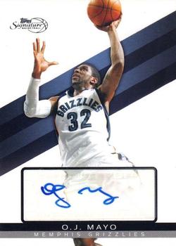

Friday, September 25, 2020

Set: 2008-09 Topps Signature - Autographs (Rate)

Card: #TSA-OJM O.J. Mayo


“ At least you can make out the O.J. and M in the autograph ” -IfbBirdsCards

“ I like this card design. Other than not listing his position on the front, I can't see anything missing. ” -dilemma19

“ Nice stickergraph card. Simple design can be read easily. No major complaints. Well there is the whole stickergraph thing. ” -captkirk42

“ Nobody in LA calls USC "Southern California" ” -abide

“ Cool card. I remember him more for his college years at USC. Ended up with a solid pro career as well. ” -crushnmove

“ Not a big fan of the no background cards. Other then that, the card is a pretty standard sports card. Doesn't do much for me. ” -Camstone

“ I like the design, but not the player ” -BasketbalHQ

“ I don’t know about you, but I would never mix OJ and Mayo together. Does not sound good at all. Yuck! ” -Derek McDonough

“ Deja vu? Or is it possible we had another OJ Mayo autograph card as RCotD a couple years back? I feel like I commented on his autograph. Or I'm getting old and senile. ” -kents_stuff

“ orange juice and mayo - not a good mix ” -ganondorf666

“ Take it or leave it. Would probably look better without the autograph. ” -Phil

“ His signature looks like a stick man with a shield (the first name) fighting a snake (the last name). ” -muskie027
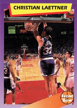

Thursday, September 24, 2020

Set: 1992 Front Row Dream Picks (Rate)

Card: #45 Christian Laettner


“ Interesting. That's all I have to say about this card. ” -IfbBirdsCards

“ Very very basic card. The set is unusual in the sense that each player has five cards. Some of the other cards have stats and player bios on them. It looks like only one of the five cards per player even has a picture on the back. Odd that for this one they have him in a "Front Row" jersey. A quick glance at the 100 card set this seems to be the only one where instead of the player's team/school jersey he has a jersey with the card company name on it. ” -captkirk42

“ his first year in the nba and he's hoping he can continue bully ball like in his college days. ” -Camo Hunter

“ I like the Front Row college cards ” -BasketbalHQ

“ One of the rarest cards ever, capturing Duke Phenom Christian Laettner fixing the rim mid-game in the historic Slanted Rim Game Duke Vs Maryland 1991. The Back of the card just has him high at the gym faking shots. ” -parsley24

“ Good defensive effort from Maryland here. ” -switzr1

“ I like it. Might make the purists mad with no stats on the back, but I think it's like getting two cards for the price of one. ” -Camstone

“ It's amazing how much I still think these cards are awful after all these years. How do we know the front is the front and the back is the back? I guess that's true for all cards, but just a card number is all we're basing this on? And did Toyota pay anything to Front Row for the free ad? ” -kents_stuff

“ Dream Team legend. Must be in the FRONT ROW! ” -crushnmove

“ A local Buffalo boy! ” -muskie027
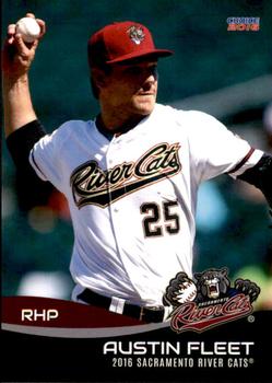

Wednesday, September 23, 2020

Set: 1967 Philadelphia (Rate)

Card: #75 Lee Roy Caffey


“ Nice design. A little bland but for the era it's nice to have a bright border. Overall I like it. ” -Billy Kingsley

“ Awesome! ” -IfbBirdsCards

“ Go Pack Go! ” -StarrsCards

“ Always a sucker for a 60s or 70s Topps football card......simply love the nostalgic look, and the humbleness of the pic. I miss that. ” -tbshaw

“ Classic! Love it! I wish I had some of these, whether the back was scratched to reveal the answer or not! Sure would like to know where he was living! ” -bkklaos

“ The old Philadelphia sets are probably my favorite football sets of all time. Love this card. ” -BasketbalHQ

“ Decent card, but I'm left wondering who's Leroy, referenced by the trivia question? ” -dilemma19

“ REE COY LAFFEY ” -ganondorf666

“ Amazing how they were able to screw up his first name on the back. ” -NJDevils

“ The yellow borders of the 1967 Philly work perfect for a Packers card. Hard to dislike anything about it. Every time I pick up one of these cards in decent shape, I thank a kid from 50+ years ago for not rubbing a coin over the back of it. ” -DocOso

“ Love these 1960s cards. ” -captkirk42

“ A classic set. I like that the card shows the logo on the helmet. The only negative to this set is the lack of stats on the back. ” -Brendan Barrick

“ The yellow border looks great since it's a Packers card. ” -vanstryland

“ I love old football cards. That's really all I have to say. ” -mkaz80

“ Classic, clean look. (I meant the card, but I guess the haircut, too!) Love the big photo, clean & legible fonts, the shield, and a trivia spot on the back. Fabulous! ” -kents_stuff

“ What a great card. Why is everything old good? ” -muskie027


Tuesday, September 22, 2020

Set: 2006-07 Ultra (Rate)

Card: #96 Marian Gaborik


“ I like the nice big picture on the front of the card ,the back format is not too bad either. Gaborik ,excellent hockey player. ” -uncaian

“ Never tried Red Baron Pizza. However I ain't much for boxed pizza, would rather make it from scratch. Anyways, another winner from Fleer Ultra. ” -Gunny

“ Good player, good photo, good product (Ultra), good product placement (Red Baron is vastly underrated), but terrible uniform. ” -mkaz80

“ OK I guess. Fleer Ultra is usually pretty good. I don't like the player name in script but usually you can read them, some of the names are hard to read, and some of the colors are odd. Back UGH the same photo only in black and white only zoomed in and cropped tight. Other than that back is OK for the standard. ” -captkirk42

“ Pretty card. Great set ” -parsley24

“ If this photo had been timed better, and from a slightly lower angle, they could have made him look like the Red Baron Pizza guy! Such a missed opportunity. ” -Billy Kingsley

“ I am not a big fan of this design. I do like the Red Baron advertisement in the background. When I first saw this card my first thought was Pizza! ” -Brendan Barrick

“ Looks like an advertisement for Red Baron. ” -Phil

“ As much as I dislike all the fuss and messy variants that result every time a card company tries to remove advertisements from the background of their images, this one is very distracting and should not have been used. Apparently Gaborik is still under contract to the Senators. ” -dilemma19

“ I quite like this card. Everything you want in a sport's card. Simple yet powerful picture on the front without a lot of clutter and a back that has all you want and nothing you don't. ” -Camstone

“ Another beautiful Ultra product. ” -muskie027

“ I dont know anything about hockey ” -BasketbalHQ

“ You know, the guy on the wall doesn't look anything at all like I remember Red Berenson from his playing or coaching days. They spelled his name wrong, too. ” -kents_stuff

“ Actually the advertisement on the boards in the background is awesome! ” -rmpaq5


Monday, September 21, 2020

Set: 1992 Bowman (Rate)

Card: #239 James Campen


“ Pretty good action photo of a lineman. ” -abide

“ not a bad bowman card, would like to see position on the front though. ” -parsley24

“ Oddly I like this set even though the team name and logo is missing on the front. Even the backs I like despite the stats only being for one season (for the cards that have stats). I wonder why they didn't put stats on this card? He wasn't a rookie. ” -captkirk42

“ Two '90's Bowman designs in a row! Like this design better than 1990, but wished they would include some kind of stats for linemen. ” -IfbBirdsCards

“ Back when Tampa Bay was in the NFC Central with the rest of the current NFC North...and the Cardinals were in the East while the Saints and Falcons were in the West. The NFL has come a long way in geographical alignment. I think Bowman has improved since the early 90s as well. ” -vanstryland

“ An ok design. It is nice to see a veteran offensive lineman with a card. It today's set this is rearely the case. ” -Brendan Barrick

“ Not a huge fan, but not bad ” -BasketbalHQ

“ I love it. Great action shot while keeping the image clear. Lots going on, but Bowman makes their logo nice and simple yet bold. ” -Camstone

“ I really like the '92 Bowman design across the sports. I just wish some of the baseball rookies weren't so expensive to obtain. ” -tenlbpain

“ Nice, basic football card with a good action photo. Cards of a contact sport should have lots of photos like this. (I'm talking to you, Panini) ” -switzr1

“ More like James Crampin' ” -ganondorf666


Sunday, September 20, 2020

Set: 1990 Bowman (Rate)

Card: #423 Scott Leius


“ I never really got into the look of these and they used this in more than one sport. Something about the look made it look cheap. ” -muskie027

“ His helmet looks too big. Also, an old friend of mine used to always gripe that Scott Leius stole his girlfriend. Nice set, by the way. I really like it despite the very small print. ” -switzr1

“ Scott-"Ok how do you want me to pose" Photographer-"Deep and introspective, like your watching your loved ones leaving on a ship never knowing if they will return, and try to hit that moment as the ship disappears over the horizon...oh and put on your helmet while doing that too." ” -rmpaq5

“ Back in 1990 when this set came out I remember thinking like they looked like a generic Topps card. 30 years later I look at these cards and think they look like a generic Topps card. 1990 and 91 Bowman where my least favorite designs of the early 90s. ” -YoRicha

“ I’m not a fan of this card nor do I like the design in general. ” -chemistclete

“ Bowman sure has come a long way since this set. ” -Bassbunny22

“ I have fallen back in love with 90 bowman. Just wish the writing was better to see and there was a pos on the front. ” -parsley24

“ Not a big fan. Feel like the name and the team should be a bigger part of the card, ” -BasketbalHQ

“ I like this card. Some might call it boring but I like the simplicity. Just a clean shot of the player, no bells or whistles. ” -Camstone

“ Bowman, the set that always has subpar photography. Back looks different than the hockey variation ” -dollar guy

“ Hideous border ruined these cards. What were you thinking, Topps? Real Bowman cards from the '50s would have never been so ugly. ” -bpaul14

“ Can't really complain about '90 Bowman! ” -IfbBirdsCards

“ I don't like the fact that it at least doesn't have a team logo. ” -Phil

“ Never was a huge fan of the late 80s early 90s Bowman years, and this one definitely lacks character ” -Soarin22


Saturday, September 19, 2020

Set: 2016 Choice Sacramento River Cats (Rate)

Card: #07 Austin Fleet


“ Nice minor league card. I like it. ” -switzr1

“ not a bad design for a minor league set ” -Thunderfoot

“ Beautiful card . . . ” -georgecf

“ river cats is a pretty cool name ¯\_(?)_/¯ ” -torald

“ Nothing fancy. I like it ” -BasketbalHQ

“ Very nice minor league card. NO complaints on this one. ” -captkirk42

“ A very solid minor league design! Can't find a single thing about this card that I don't like. ” -IfbBirdsCards
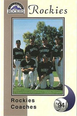

Friday, September 18, 2020

Set: 1994 Colorado Rockies Police (Rate)

Card: #NNO '94 Rockies Coaches


“ Rockies 2nd year. Bunch of former players on staff. I loved the idea of the expansion teams when I was 12-13 years old. Had a purple Rockies shirt too. ” -rich1516

“ Nice card and a rare bird at that. A police set AND a Coaches card. ” -captkirk42

“ Maybe if the photographer had stood on the other side, we could see their faces. ” -switzr1

“ Had no idea former Met Larry Bearnarth was the Rockies' pitching coach. I love coach and manager cards! ” -mkaz80

“ I like the coaches cards in these types of sets. Strange to see Dwight Evans in Rockies attire. ” -tenlbpain

“ Nothing special, but I like it. ” -BasketbalHQ

“ Cockies Roaches ” -ganondorf666

“ Design is okay. Photo looks a bit unfocused. ” -Phil

“ Awesome! Go Rockies! They played at Mile High Stadium that year. ” -cjjt

Page:


Copyright © 2024 Trading Card Database LLC
Designated trademarks and brands are the property of their respective owners.