Random Card of the Day |
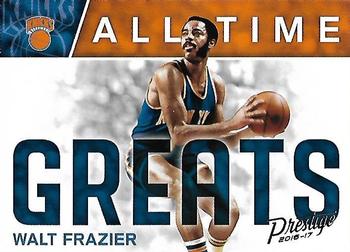
Friday, July 24, 2020Set: 2016-17 Panini Prestige - All-Time Greats (Rate) “ That's an interesting design. I like it. Walt is an icon around these parts, although these days more for his outfits and tv broadcasts than his playing career. Starting point guard on the only two Knicks teams to ever win the NBA Championship in their 70+ year history. ” -Billy Kingsley
“ "Your beard is weird" ” -trauty
“ So much Soul in the 70s NBA. The ABA wasn't far behind with Jackie Moon and the Tropics. Now that was a soulful player. ” -CardFlipper1974
“ Great looking card and flashback card. ” -parsley24
“ Nice Prestige. Even though it is a landscaped/horizontal card I like it. Prestige sets are usually very nice this one is part of that group. With the back the image should be centered. Even better center it and flip the image so it looks like you are seeing through the card. Sort of an acetate simulation. ” -captkirk42
“ All I can see is him and Keith Hernandez mocking Mr. Graybeard in those goofy old Just For Men commercials. ” -switzr1
“ Walt Frazier is definitely one of the coolest players I've seen, a defensive beast, and I like the design, plus Panini Prestige is one of my favorite sets. ” -BasketbalHQ
“ Walt Frazier! Yes! Showing the Knicks some love since we haven't known any since Jordan was repeatedly putting us out of the playoffs in the 90's! The card is nice. Bold. Reminds me of an old school poster than would've been on my wall as a kid. ” -Vonnegut37
“ I think the word GREATS is too big. No stats so thats disappointing ” -dollar guy
“ The picture of Walt is pretty nice but the overall design is subpar. ” -Phil
|
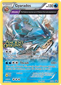
Wednesday, July 22, 2020Set: 2013-17 Pokemon XY Promos (Rate) “ Full picture cards tend to be not easy to come by, but the design is nice, though it is, I'm guessing based on the Promo description, just used as an advertisement for the seventh main expansion of cards in the Japanese XY International set ” -BasketbalHQ
“ i refuse to comment on pokemon cards ” -parsley24
“ I bought exactly one pack of Pokemon cards in my life....Gyarados seems like a good one? Although "stage 1" is concerning, and the dude hurts himself on a 50/50 chance ” -BooguhRed
“ Pokemon..ah. I used to like pokemon cards. If I still collected pokemon cards I guess this would look nice in my collection ” -dollar guy
“ Evolves from Magikarp, but is a LITTLE bit scarier.... ” -royals
“ Me no pokeman guy. ” -muskie027
|
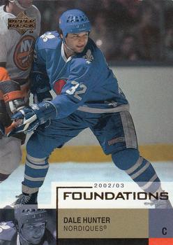
Tuesday, July 21, 2020Set: 2002-03 Upper Deck Foundations (Rate) “ I like the Foundations set. Only have a couple of cards from it, but I'm still pretty new to hockey. Don't see defunct teams come up as Card of the Day very often. ” -Billy Kingsley
“ Not a fan of the design. Bad color scheme ” -BasketbalHQ
“ I like it when these sets that highlight players from the past also include the lunch bucket brigaders. Dale was certainly one those types of players. Anyways, nice looking card and the Nordiques sweater is just perfection! ” -Gunny
“ Another cool upper deck card. Were they still around? no they moved to become the Avalanche. ” -ericidol1984
“ I like this card. Something different about the photo. Not sure what it is. ” -switzr1
“ Not a bad looking card. Good simple design for a parallel. ” -parsley24
“ I like the design of this card. The picture in the back is unusual. ” -Brendan Barrick
“ Never liked it when they have more than one player on a card. ” -Phil
“ not sure about the duplicate face in the bottom left corner but otherwise i like this card ” -torald
|
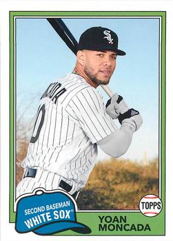
Monday, July 20, 2020Set: 2018 Topps Archives (Rate) “ Alright, the design is nice. Nice retro design. Decent card. ” -dollar guy
“ Classic look . . . how can you lose using it??? . . . ” -georgecf
“ I Like the original 1981 design this card is based on. Getting tired of it being used in retro sets like Archives. By the time it comes around for Heritage (in 9 or 10 years) I will be super tired of seeing it. ” -captkirk42
“ Archives did the style of the first set I ever collected. I love it! ” -switzr1
“ i love archives. This is fantastic. ” -parsley24
|
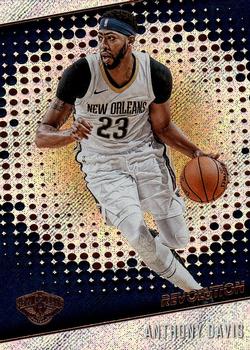
Sunday, July 19, 2020Set: 2017-18 Panini Revolution (Rate) “ Panini has too many Basketball sets with craziness going on in the background. If they had just one or two, they would be cool, but they get to be a bit much. ” -muskie027
“ One of the most frustrating sets for me ever. I had always wanted to do a case, it was a "bucket list" item...so I got a case of this set. One entire BOX out of the case was nothing but duplicates, even the one-per-pack parallel, in the same exact order as a previous box. From the entire case I ended up 5 cards short, and this is a tiny, tiny set. I had to buy or trade for 5 cards out of a set with no short prints...terrible. I doubt I will ever do another case in my life, after how disappointed and angry this one made me. ” -Billy Kingsley
“ Fear the brow but not this card. That foil scanned pretty well though. ” -UKboogie
“ I like the picture used, but I don't enjoy looking at the background. Kind of just there, and doesn't serve any purpose, especially not as eye candy ” -BasketbalHQ
“ The action shot is okay but I'm not particularly fond of the background. ” -Phil
“ It is kinda hard to read the name. The name is white on top of a white backround... who though of that terrible idea. ” -dollar guy
|
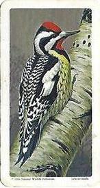
Saturday, July 18, 2020Set: 1966 Brooke Bond (Red Rose Tea) Canadian / American Songbirds (Canadian Black Backs) (Rate) Card: #5 Yellow-bellied Sapsucker “ Awesome, LOVE bird cards. (yes, birdwatching is a hobby of mine). Yellow Bellied sapsucker brings up thoughts of the Looney Tunes, used as an insult for a cowardly person. ” -Billy Kingsley
“ Who doesnt like a songbird. Technically this is a trading card but does a UNO card count as one, ” -ericidol1984
“ Love it! ” -NJDevils
“ Nice simple design (never seen a bird-related set though) ” -BasketbalHQ
“ Love it! ” -switzr1
“ What a wonderful card. Relaxing to look at, and entertaining to read. ” -CollectingAfterDeath
“ Good looking bird but I'm more of a Sports guy. ” -Phil
“ I need the autograph one ” -Young Kilo
“ oh wow I did not need to know that there are trading cards for birds... now I will start looking for those too... ” -torald
|
Friday, July 17, 2020Set: 2012 Press Pass - Blue Holofoil (Rate) “ Nice! Landon is a card collector, his collection was even featured on TV once. I wouldn't be surprised if he's seen our website actually. ” -Billy Kingsley
“ Simply design goes a long way. The bio with the line of stats over top of the driver's race car has a nice clean look on the back. I like this card. ” -CollectingAfterDeath
“ Not a oval track racing fan im more of a street circuit F1 fan . Nice looking card i wish they had these for F1 . The great champion Lewis Hamilton only has 2 Sports Illustrated cards. ” -ericidol1984
“ Driver on one side. His car on the other. That makes a satisfactory racing card for me. ” -switzr1
“ I personally don't like the design very much, and the picture isn't great. Everything is hard to read. ” -BasketbalHQ
“ I have no idea what to say about racing cards.... ” -dollar guy
“ The PressPass logo looks like the Arby's hat. Jim Halpert (aka Landon Cassill) looks very pleased with himself as he waits patiently for Dwight to discover that his Security Benefit has been messed with. ” -BucCollector
|
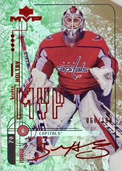
Thursday, July 16, 2020Set: 2018-19 Upper Deck MVP - 20th Anniversary Colors & Contours (Rate) “ A cool twist on a throwback design. Was the starting goaltender to win the Stanley Cup in my first full season watching the sport. I was not lucky enough to pull any of this insert parallel from my box, but I got it into my collection via COMC. ” -Billy Kingsley
“ Mixing 1998-99 MVP design with Colors & Contours design makes it bit too busy. ” -SharksAttack
“ Not sure if I like the colors on this or not.....seems like a nice mix, but also seems like someone puked....Might be all the red on it ;) Go Pens!!! ” -Gator415
“ Colors and Contours? Lime Jello and Coffee? Sad when a card for my homie team looks better on the back than on the front. ” -captkirk42
“ this card is so busy... i would probably think it was cool if i pulled it, but from a design standpoint there’s just one too many things going on here ” -torald
“ Start with a decent photo of the player, and then add as much garbage as possible to make the card look like a mess . . . It looks as if a graffiti artist did it . . . That may be fine on a subway wall but it's not what I want on a trading card . . . ” -georgecf
“ This set was a copy of the basketball and football sets. Not a fan ” -parsley24
“ Garish would be an understatement. ” -buckstorecards
“ Front is way too busy and of course it is another insert/parallel card. ” -uncaian
“ There's a lot going on here, and some of it is ok. I can't quite figure out the background. But the photo is good. ” -switzr1
“ this card is so busy... i would probably think it was cool if i pulled it, but from a design standpoint there’s just one too many things going on here ” -torald
“ An ok design. ” -Brendan Barrick
“ There is a lot going on, on both sides of this card, but it works quite well. Nice card! ” -CollectingAfterDeath
“ Looks like a really messy card with a lot of things going on. Full career stats are nice though. MVP is a nice set so it would likey be a set I would collect if it was possible ” -dollar guy
“ Ewww. ” -bpaul14
|
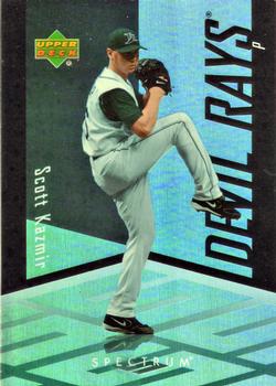
Wednesday, July 15, 2020Set: 2007 Upper Deck Spectrum (Rate) “ Another photoshopped card. Why don`t they try to use an action shot and apply the spectrum design??? ” -dollar guy
“ This card must look awesome in hand. I've never encountered any of this set in person, but you can tell it's all holofoil, which is great. ” -Billy Kingsley
“ While I can appreciate the attempt at the design, it's always bad when the notes about the copyright are longer than those about the player. ” -volbox
“ Nice looking card. Upper Deck always got it right with baseball. I know they make hockey but If they would come back and make a baseball set it would be awesome. ” -ericidol1984
“ I expect the floor to light up like the Billie Jean video when he pitches the ball. ” -switzr1
“ Back from vacation. I was looking forward to writing something witty about a card and get this card. I will wait until tomorrow to write something. ” -parsley24
“ The pitcher steps into the crystal box and goes into his wind up... High dislike of chromeness. Don't like the sideways name and team name towers. Back OK but not great much better than the front. ” -captkirk42
“ Wow! what a BORING card....If you are going to change to non-sports back ground at least make it flashy or something....and the back.....ugh...so much empty space with nothing there!!! ” -Gator415
“ Whatever Upper Deck was trying to accomplish with this design - it didn't work. It looks like an action figure inside a plastic cube. Some may find it attractive, but if they do, it call their taste into question. Ironically, there's much they tried to do, if the individual components are broken down. But together, it looks like a lot of nothing. Definitely being a case of the sum of the parts being lesser. ” -georgecf
“ Not really digging the design. I get what they were going for, but--meh. The back is standard late 2000's UD. Not a bad card, but not great either. All that aside, I need this card... :D ” -Vonnegut37
“ Not Upper Deck's better effort but that's what happens when you try and keep up with all the others in a multiple release filled era. ” -baseballcardstoreca
“ I usually hate these designs, but this looks pretty cool. I don’t know about a whole set, but it is a great design for an insert concept. ” -muskie027
“ Interesting design. His first year in the majors being 2004, I can see why the back is a bit empty. This set kind of grows on me the more I look at the gallery. Not a bad looking card. ” -CollectingAfterDeath
|

