
Random Card of the Day |
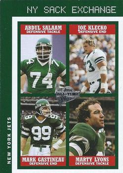
Monday, July 13, 2020Set: 2004 Topps All-Time Fan Favorites - Jumbos (Rate) Card: #6 Abdul Salaam / Joe Klecko / Mark Gastineau / Marty Lyons “ Nice multi-player card. Local team, albeit not in a sport I follow, is always a plus. ” -Billy Kingsley
“ Not withstanding the Klecko, the photography is pretty good on this card. B- ” -Phil
“ OH "Fan Favorites" that is why this looks like a retro vintage card. I like it. ” -captkirk42
“ I love this set! I’ve gotten Lyons to sign a card for me before. I should buy this card and see if I can get all 4 to sign it. ” -StarrsCards
“ Not crazy about it, but it isn't terrible. ” -switzr1
“ Don`t know any of them so, fan favourites? ” -dollar guy
“ As weird as this looks, I really like it for some reason. Props for the creativity! ” -muskie027
|
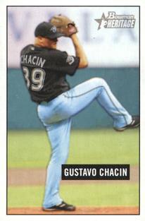
Sunday, July 12, 2020Set: 2005 Bowman Heritage - Mini (Rate) “ Wow, haven't thought of him in years . . . He was pretty good for the few years he was with Toronto . . . He then bounced around to four or five times until his career ended quietly . . . The card is OK, but the picture on the front makes me "uncomfortable" . . . Probably the angle of the shot . . . It seems it would have been better if it was a full front-shot or profile, but it seems to be in-between the two . . . The back is OK for what it is, but it's limited by the original style of the card set . . . By today's standards, it seems rather lame . . . I originally had not known he suffered from alopecia areata, but that explains a lot about his distinctive look . . . ” -georgecf
“ That is a memorable name that I don't remember. ” -cckeith
“ Beautiful card....we need more like this. ” -beansballcardblog
“ Nothing to write home about. Card has a cloudy look to it. ” -Phil
“ Okay action shot, quite plain though. Then of course, that is probabaly the point of bowman heritage ” -dollar guy
“ Mini cards. Ugh. How to store? How to display? So many issues. ” -CardFlipper1974
“ Chacin had a great rookie season, but didn't like up to the potential he showed. I do remember him looking really cool on the mound with his shades on. ” -DanD
“ Terrible choice as to where to put the name, but good picture use ” -BasketbalHQ
|
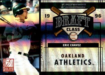
Saturday, July 11, 2020Set: 2004 Donruss Elite Extra Edition - Draft Class (Rate) Card: #DC-21 Eric Chavez / Roy Oswalt “ Difficult card to scan. Though I do not like the concept. Never did like cards with different players on each side. ” -kirkscards
“ This set looks good. Eric C and Roy O were good players . I wouldnt mine having this card. Nice design. ” -ericidol1984
“ Ugh two player card with one player per side. Or if you like a two front card. ” -captkirk42
“ Oh my eyes! ” -BucCollector
“ I do not like the dark line that goes through the middle at all ” -dollar guy
“ I've never liked two player cards with the players on opposite sides -- something about it just seems wrong. In my opinion, the back should be used soley to expand on the player presented on the front. Additionally, Donruss did a good job to make sure that 70% of the card was taken up by a gigantic graphic with only 3 pieces of information -- Name, draft class, and team. (And the most important of those, name, looks like it was printed with size 10 font) I guess that was just too much for them to condense. smh ” -Slug03
“ Nothing worse to me than a card featuring two different, completely unrelated players on different sides of the card. And then it is ugly, too. ” -bpaul14
“ This doesn't do anything for me. Nothing about it impresses me. ” -Phil
|
Friday, July 10, 2020Set: 2009 Score Inscriptions - Autographs (Rate) “ Interesting design choices here. My first reaction is not a positive one, but it appears the borders are team colored, which is something I like and am a definite fan of. ” -Billy Kingsley
“ Did not even notice the autograph on the front, till I read the congrats note on the back. A card front ill suited for an auto, imo. ” -CollectingAfterDeath
“ Why collectors ever started accepting a card with an autographed sticker attached to it, as an autographed card, is beyond me. You can put steak sauce on Spam, but that doesn't make it a steak. ” -switzr1
“ OH I forgot how much I don't like the 2009 Score design. Plus a stickergraph. Maybe I should just leave the hobby. I'm getting depressed by it more and more. ” -captkirk42
“ I am split about the design, I like it and dislike it at the same time. And the autograph is a sticker auto, I certainly don`t like that ” -dollar guy
|
Thursday, July 9, 2020Set: 1998 SkyBox Premium - Fleet Farm (Rate) “ I really like the foil they used on these cards. It's much more interesting than the single color foil we got in the NBA set. ” -Billy Kingsley
“ Skybox has some pretty amazing cards. This set is one. ” -CardFlipper1974
“ Not a fan of this set. The player I highly respect Had a super career. ” -captkirk42
“ I like the base card. What the heck is a fleet farm? This has to be the most unusual name for a set I have ever heard of. ” -Brendan Barrick
“ Nothing to write home about. Not sure who this would appeal to. ” -Phil
“ Okay action shot, I can`t read the names. ” -dollar guy
“ Loved me some Rocket back in the day. Last pitcher who would pitch inside and claim the plate!!! Deserves HOF ” -cowboyfaninlr
“ Love when the legends show up! ” -muskie027
“ Would the Minister of Defense defend the cringe-worthy design of this card. I believe not. ” -CollectingAfterDeath
|
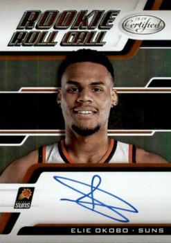
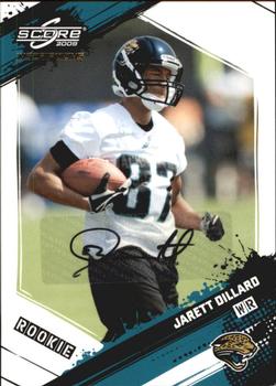
Tuesday, July 7, 2020Set: 2018-19 Panini Certified - Rookie Roll Call (Rate) “ So refreshing to see that the lost art of penmanship still has a few champions! ” -bevans
“ Not a lot of pizzazz here. Looks like he's stuck somewhere in the astral plane. ” -mkaz80
“ Were these on card autos? I don't know but I thought Certified was usually just the stickergraphs. Design is both too plain and yet too busy if that makes any sense. ” -captkirk42
“ Penmanship is not Elie's strength, is it? ” -bpaul14
“ I wish they would use action shots of rookies instead of photoshopping them onto a random design which sometimes is nice looking and sometimes terrible. ” -dollar guy
“ Ok, now for your signature on this one, just make a star....... ” -Gator415
“ Scribble autographs. I HATE them. Why even bother? ” -royals
|
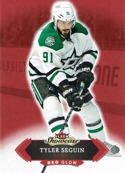
Monday, July 6, 2020Set: 2016-17 Fleer Showcase - Red Glow (Rate) “ The red throws everything off. Minus the glow, I think its a nice, simple, eye-pleasing design ” -BasketbalHQ
“ Well since today's RCOTD has no comments I will say something...It is red and it glows. ” -rmpaq5
“ This was the first NHL set I ever did a box of, it will always bring back fond memories for me. I got three of these red parallels in my box. ” -Billy Kingsley
“ I am not a big fan of the Red Glow. I do like the base version. ” -Brendan Barrick
“ Why was Fleer Showcase replaced by Synergy? Anyways, this card is a pretty standard card, 5 years of stats on the back, yeah, pretty standard. Would be a good set to collect though. ” -dollar guy
“ I'd prefer the non-red version of this. ” -muskie027
|
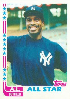
Sunday, July 5, 2020Set: 1982 Topps - Blackless (Rate) “ Perfect for customization! Stick your head over Dave's and write your name down below. ” -DanD
“ Winfield was great. I am unfamiliar with Blackless. ” -muskie027
“ The design on the left looks like a hockey stick. Looks like a typical early 80s baseball card though. ” -dollar guy
“ Pretty great All-Star card for Dave Winfield. Really like it. ” -FinBeast
|

")