Random Card of the Day
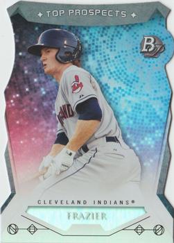
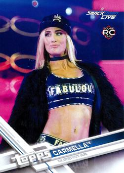


Wednesday, June 17, 2020

Set: 1973 Topps (Rate)

Card: #348 Walt Sumner


“ Classic 1970s football pose ” -parsley24

“ Nice '73 card.The back image looks bright and clean enough to almost be the OPC version. ” -captkirk42

“ A classic set. ” -Brendan Barrick

“ Please, Walt, if you're reading this don't be offended. Man, lookit the twigs that used to play in the NFL. That guy wouldn't last 10 minutes in the game today. ” -bpaul14

“ People who think that elite athletes from the 70's can do the same in today's game needs to see this card of Walt. Imagine Walt trying to stop Derrick Henry. ” -jarosa04

“ Pretty plain card, but that is what you would expect from an early 70s card. ” -dollar guy

“ One of the most classic, iconic designs in trading card history. ” -mkaz80

“ nice clean classic topps design, cartoons are always a plus, and looks like we both suffer from male pattern baldness ” -Thunderfoot

“ B-E-A-UTIFUL!!! ” -muskie027

“ I have this set. I always thought the banners were stupid -- did not coordinate with the player's team or position. Plus it was when Topps only had the Players' Association contract and not the NFL contract so they could not show team emblems, etc. sucked. ” -cjjt


Tuesday, June 16, 2020

Set: 2019-20 Parkhurst (Rate)

Card: #48 Aleksander Barkov


“ I never saw Parkhurst for 19-20 in any store, hobby or retail. The only place I saw Parkhurst was on e-Pack. The only 19-20 Parkhurst I got on e-Pack was through trades. ” -Gunny

“ Nice looking card. Sneaky stick design on the front there. Just needs his position on front. Team logo would be nice but at least the team name is there. Back should have a different photo than front. Needs more than one year of stats. ” -captkirk42

“ I like this card. Parkhurst is a good product by Upper Deck. The product tend to have good designs, and is low cost. ” -Brendan Barrick

“ I actually like this set, the only negative would be the front seems crowded. There is a blurb on the back which is always good. Barkov is a bear, pretty hard to stop ,when he gets going. ” -uncaian

“ I wish my local stores had bothered to stock this set...I would have enjoyed collecting it. ” -Billy Kingsley

“ parkhurst cards are probably my least favorite for hockey. i like barkov though, he's underrated ” -torald

“ Parkhurst cards look like they were made by a 4th Grader learning PowerPoint. ” -jarosa04

“ Pretty regular base card. The slanted name is kinda cool. Overall, it`s an okay base. ” -dollar guy


Monday, June 15, 2020

Set: 2014 Bowman Platinum - Top Prospects Die Cuts (Rate)

Card: #TP-CF Clint Frazier


“ OK looking front not great. Team logo would be nice and his position. Is his first name there below his last name in the foil? (Zoom feature from card page looks like a no there) Back yeah OK for an insert that this is ” -captkirk42

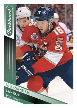
“ A great trade to get Andrew Miller!! Miller helped the Tribe in the playoffs for two years! ” -Gator415

“ Very cool card. This die cut looks very nice. The blue and red in the backround is absolutely stunning to the eye. ” -dollar guy

“ I do believe Bowman Platinum are my favorite cards due to their design every year. ” -CardFlipper1974

“ Ugh on multiple counts. It's Bowman. It's metallic looking. CGI background. It's not a rectangle. ” -bpaul14

“ Okay card, design is not my favorite. They should have added the first name. I like the die cut part though. ” -FinBeast

“ He looks 15 years old in this picture. I like the way the name looks in the scan. ” -muskie027
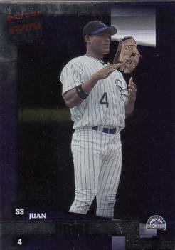

Sunday, June 14, 2020

Set: 2002 Donruss Best of Fan Club (Rate)

Card: #148 Juan Uribe


“ For Juan's next act he will float his glove between his hands. ” -CardFlipper1974

“ Like the picture on the front. ” -kirkscards

“ Just passing the time during the pitching change. ” -captkirk42

“ Pretty dark card. The dark borders make it really hard to read his last name. Has some sort of nightly sense to it. Dark indeed. ” -dollar guy

“ Have a feeling the scan ruined this one ” -Moholtzy88
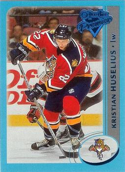

Saturday, June 13, 2020

Set: 2002-03 O-Pee-Chee - O-Pee-Chee Premier Blue Line (Rate)

Card: #86 Kristian Huselius


“ Nice card. ” -Brendan Barrick

“ Nice design overall. Both front and back are laid out well. If I was a hockey fan, this is the type of set that I would try to complete (base OR this parallel version). ” -spazmatastic

“ Very cool looking card. The bright blue borders make it stand out. Very nice O Pee Chee Premier card! ” -dollar guy

“ Great scans! Its a shame the uploader went dark on the site. ” -UKboogie
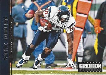
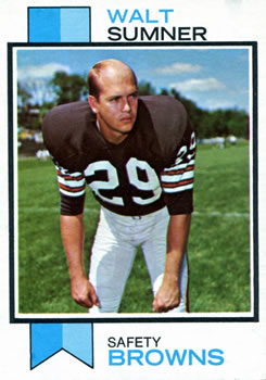

Friday, June 12, 2020

Set: 2012 Panini Gridiron (Rate)

Card: #75 Andre Johnson


“ Same picture front & back. Terrible. ” -cjjt

“ same photo front and back.... ugggggh. ” -parsley24

“ I am torn with this set. I kind of like the fronts even with the sideways letters and foiling of team name on dark background and no team logo. The back upsets me same photo one year stats and general back design. I'm pretty sure I'm only keeping my Redskins and Rams from this set with the occasional PC player. ” -captkirk42

“ Photographically speaking, an outstanding base set. ” -buckstorecards

“ Snooze, pretty boring card. ” -SandersFan

“ Pretty good looking action shot. Name is kind of hard to read though. ” -dollar guy
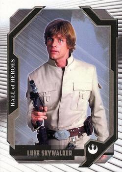

Thursday, June 11, 2020

Set: 2017 Topps Star Wars Masterwork - Hall of Heroes (Rate)

Card: #HH-1 Luke Skywalker


“ Looks like my high school math teacher except with hair. ” -vanstryland

“ Wish Disney had never gotten Star Wars. Turned the greatest movies ever into a parody of itself. ” -Billy Kingsley

“ "Don't mess with me. I know The Force, Jedi Mind Tricks and 100 other Star Wars terms. I also carry a light saber. So just back off Father." ” -captkirk42

“ I like the concept. Though the back it looks like the verbiage should continue on. ” -kirkscards

“ Very interesting card. Hall of heros though, no to big on that. Anyways, it`s a pretty plain picture of Luke as there isn`t a real backround really. Overall though, this card is ok I guess. ” -dollar guy

“ Hey all right a luke card. This was taken after he lost his left hand in a duel with vader. Dont worry as you can see he is all right..... lol ” -parsley24
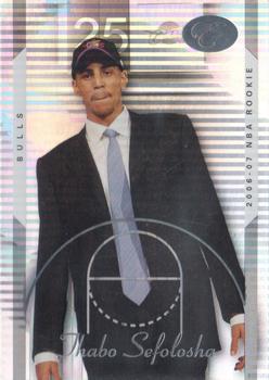

Wednesday, June 10, 2020

Set: 2006-07 Bowman Elevation (Rate)

Card: #129 Thabo Sefolosha


“ "Now for this shot lean on your right leg and act like your standing on a mountain top. Ok now, try not to laugh or smile." ” -CardFlipper1974

“ This photo was clearly taken as he was walking up to the stage during the NBA draft. Still in the league. One of the few Swiss players in NBA history. ” -Billy Kingsley

“ A modern basketball card that says modern cards are kind of boring right now. ” -captkirk42

“ This card is kind of confusing for someone new to this, all those lines in the backround. Not a good photo for a rookie, since he is in a professional suit. I imagine an action shot would be much more preferable for NBA rookie cards. ” -dollar guy

“ it looks like they drew a circle around his tie... whoops ” -torald


Tuesday, June 9, 2020

Set: 2017 Topps WWE (Rate)

Card: #38 Carmella


“ *quietly adds to wantlist....... ” -parsley24

“ The down in the logo blends into the background, so it looks like Smack Live. When I was in school all my friends were into wrestling but I just couldn't get into it. ” -Billy Kingsley

“ The fabulous Carmella.My favorite non auto Carmella card. A former New England Patriots and Lakers cheerleader.WWE Smakdown champion. In the 6 years I have visiting this site this is the Best card I have ever seen on RCOTD. The design is not good for baseball but she makes it look good.Like Carmella says "Mella is Money". ” -ericidol1984

“ Wow! I see these WWE Diva cards and think I should start collecting them all, but then I think again I don't want to go down that pretty face rabbit hole. Now if one of these ladies fit the sharing my birthday (04 April) niche collection then I'll jump into that. ” -captkirk42

“ Just realized that I might be a wrestling fan! ” -UKboogie

“ Definitely one of the most appealing cards to hit RCOTD! ” -muskie027


Monday, June 8, 2020

Set: 2007 Traks (Rate)

Card: #71 Jimmie Johnson


“ Really great to see a card photo from Victory Junction...for those that don't know, it's a camp for terminally ill children run by the Petty family in honor of Adam Petty, who was killed in an accident at age 20 in 2000. Even at his age, Adam was already laying the groundwork for it if I remember correctly. The families of the children pay nothing, it's all done by volunteers and donation. I personally have donated to it. ” -Billy Kingsley

“ Looks like he is bowling. ” -kirkscards

“ Who do you think you are? I am!!!!!! ” -parsley24

“ UM OK its a racing card. I thought it was a bowling card at first. "Hey the reset button is broken" LOL. ” -captkirk42

“ Looks like he is bowling. ” -Brendan Barrick

“ Great cause! Terrible card. ” -SandersFan

“ Wow,some of these really ARE random,huh? ” -OogaBooga

“ When did Jimmie Johnson do a bowling action shot? ” -muskie027

“ this particular subset does do this set justice, the base set has a beautiful design, but this not so much ” -Thunderfoot

Page:


Copyright © 2024 Trading Card Database LLC
Designated trademarks and brands are the property of their respective owners.