
Random Card of the Day |
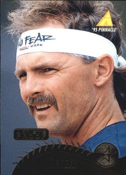
Friday, June 5, 2020Set: 1995 Pinnacle - Artist's Proofs (Rate) “ Fire the artist ” -volbox
“ Doug was 1-1 with a 1.65 ERA thru 16 1/3 innings, giving up only 12 hit against my Reds in the 1990 NLCS. The shining star on that Pirates roster. He went 22-6 in 1990 and won the Cy Young. Doug was fierce on the mound. I would definitely NOT wear the headband. ” -CardFlipper1974
“ At first glance, I thought this was a tennis card. I think the baseball border at the bottom is a nice touch. ” -vanstryland
“ I never thought of Doug Drabek as a "No Fear" headband wearing dude. Shows you how little we actually know about these guys. ” -bpaul14
“ Awesome front photo. the back is pretty good as well. I can only imagine the bricking that these cards have tho ” -parsley24
“ Like Pinnacle not a huge fan of this set due to all the foil on foil lettering and such. Much nicer looking in hand than in scans. I have warmed up to these over the years in my old age. As far as Mr. Drabek goes I think I first knew/heard of him during his final year as an Oriole. ” -captkirk42
“ I really liked this set when it came out and remember thinking that I would never get one of these ultra rare Artist proof cards for my PC! ” -YoRicha
“ Blah! ” -NJDevils
“ Thought it was a tennis card. ” -muskie027
|
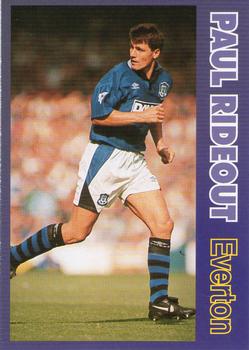
Thursday, June 4, 2020Set: 1995-96 LCD Publishing Premier Strikers (Rate) “ A full back on a sticker! Think that's the first time I've ever seen that. I wish Panini and Topps did that as well. ” -Billy Kingsley
“ I really like this set! Great colors, great photos, large friendly letters, the cards though are pretty slim stock. The card stock is the only negative about this great set. ” -Gunny
“ I love this card. He has a cool name . Nice facts n stats on the back. The dude scores 4 hat tricks and was booked 6 times. I believe that means yellow card . Awsome ” -ericidol1984
“ I love that the stats on the back include sending offs! ” -rmpaq5
“ Soccer card with sideways wording. Two things I hate the most. Opinion held. ” -CardFlipper1974
“ A random soccer card that ISN'T a TCG. CCG ” -captkirk42
|
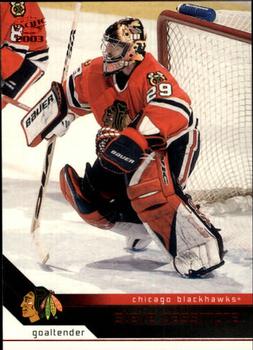
Wednesday, June 3, 2020Set: 2002-03 Pacific - Red (Rate) “ This was produced during my time away from the hobby. Not a bad looking card, not something I would go out of my way to obtain today. ” -Gunny
“ He was NOT a fan of heavy metal. Look it up. ” -wjhipwell
“ Very nice Hockey card very very nice. Think I'll need to look into getting a Caps team set plus look for some PC guys from that season. ” -captkirk42
“ Very unfortunate name for a goalie. Would be much better for a quarterback or a point guard. ” -Brimose
“ Why do goalies always look like middle school math teachers without their masks. ” -parsley24
“ Red foil on a black field doesn't show up well in scans, but looks nice in hand. Nice photo, solid design, this was the flagship brand for this company. ” -Billy Kingsley
“ Great. Blackhawks once again. But I hate Pacific Red parallel. ” -Duke
“ Not a good name for a goalie. ” -deporcoruña
“ I like this design. The biggest issue with pacific was that they overdid it on parallels. I did like their large team sets for their main sets. ” -Brendan Barrick
|
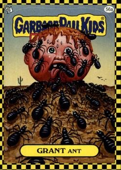
Tuesday, June 2, 2020Set: 2010 Topps Garbage Pail Kids Flashback Series 1 (Rate) “ THIS is why I can't tell people that I collect Non-Sports cards. I have to say SOME, because I don't want these at all. I would be much happier if these never existed. ” -Billy Kingsley
“ Never ever liked these cards. ” -volbox
“ Garbage Pail Kids where my doorway drug to collecting back in the 1980s. I have regrets selling all I had a few years back. ” -YoRicha
“ It’s ahhight ” -Manthonys1984
“ Garbage Pail Kids cool. This particular kid is gross with those ants but that is the point of these sets. ” -captkirk42
“ My first time writing something for the random card of the day and i get this one. Garbage Pail Kids creeped me out as a kid and they still do, especially this one. Whew. case closed. ” -torald
|
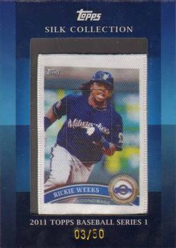
Sunday, May 31, 2020Set: 2011 Topps - Silk Collection (Rate) “ Silk reproductions of cards are very cool. I have a couple in my collection. They seem to fade over time. ” -CardFlipper1974
“ A card to wipe your cards. Nice idea. ” -volbox
“ This has a somewhat cool look. ” -muskie027
“ That's actually really cool. I would be making an effort to collect these if they were available in my sports. ” -Billy Kingsley
“ Not much to say about this other than I am not a fan of it. If it was a full sized card maybe, but it is a framed mini. ” -captkirk42
“ Count me among those who don't understand the allure of something like this. But, to each their own. ” -mkaz80
|
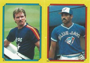
Friday, May 29, 2020Set: 1988 O-Pee-Chee Stickers (Rate) Card: #32 / 185 Alan Ashby / Willie Upshaw “ Hey my 2nd RCOTD selection, and this time unlike the first time I see it to comment on it! And....well it is what it is. These sticker sets from the 80s I remember actually being more of an annoyance as a kid. Bought the album, buy the stickers, I am a kid so can't get the stickers in straight in the album, get frustrated and give up on trying to complete the album because it looks bad because I can't put the stickers (especially the puzzle pictures) in straight enough. That said amazing scan :). ” -rmpaq5
“ Didn't like the yellow border. ” -muskie027
“ I love stickers! But not those players..... ” -crushnmove
“ Nice 80s sticker. But man what a rabbit hole the checklists for these things are. Set collectors just put them in their numerical order, player and team collectors that collect more than one of these guys or more than one of these teams have the problem of where to put it in their collection. Also do you try to get multiples for your collection? ” -captkirk42
“ I really think the value of a mint or nrmt sticker should be much higher. I know I destroyed several sticking on my locker, my bedroom door, and threw a few away. The worst mistake was sticking one on my mom's refrigerator. Super adhesive. How many nrmt stickers are still around? ” -CardFlipper1974
|
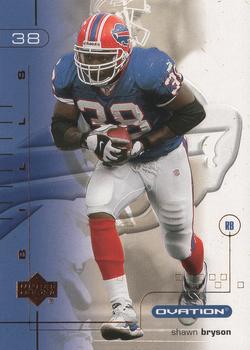
Thursday, May 28, 2020Set: 2001 Upper Deck Ovation (Rate) “ If you're going to digitally remove the background, a team logo is pretty much the only thing I like to see in it's place. ” -Billy Kingsley
“ Same Photo front and back. Man i hate that. But a good looking card. ” -parsley24
“ I like the card . Upper deck always has nice cards. Bills should go back to those uniforms. Why did they change . ” -ericidol1984
“ OK design, not great but OK. Looking closer front player name should be more prominent, Where is team name or logo? Back shouldn't have the jersey number bigger than card number hard to tell which number is card number plus they were silly with putting jersey number on front of card. Again player name too dang small in comparison to everything. Oh there is the team name if you turn your head sideways, or read sideways from bottom to top. Only 1 year stats, UGH same photo as front and a bit big. Do I have some of these? Maybe maybe not. ” -captkirk42
“ Too confusion on the front of the card. I like the logo of the team on the front. The back is ok. ” -Brendan Barrick
“ Very Upper Deck. Love those Bills uniforms. ” -crushnmove
“ This card has layers....like an onion. ” -cardhobbyist
“ I thought this was a cool looking card until I saw the reverse. Not a fan of using same image on front and back. ” -Derek McDonough
|

")