
Random Card of the Day |
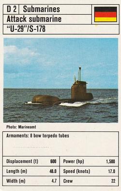
Monday, May 25, 2020Set: 1981 Ace Trumps Modern Warships (Rate) “ I like it...wish there was a little more info, but this is typical for gaming cards of this style. ” -Billy Kingsley
“ This card is meh, but I do enjoy most photo and art cards of sea vessels; classic, modern, military, civilian. ” -Brimose
“ I like the idea, but if the card is of the boat I'd like to see more of the boat. ” -jackal726
“ Nice Non-Sport card. BTW the checklist has this set listed as 1978-19 where the other similar sets are 1978-81 and Hmm the backs for that set are blue. Must be different print runs (years published) or different decks? I'm guessing there are more of these things out there. My quick Google searching only came up with blue backed samples. ” -captkirk42
|
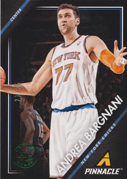
Sunday, May 24, 2020Set: 2013-14 Pinnacle - Artist Proof Green (Rate) “ The only season the Pinnacle brand ever appeared in the NBA. Walt Frazier, the broadcaster for the Knicks, could not say his name. Called him "barn yarnee". Drove me nuts, so much that I had to stop listening to the broadcasts. Just that second r made all the difference. ” -Billy Kingsley
“ Mkay a "green" parallel where the only part that is a green parallel is a foil logo. Don't you just love modern cards? ” -captkirk42
“ I like the design, could have used a little less Pinnacle logo space. The one year of stats on the back kills me. ” -muskie027
“ never knew panini revived the pinnacle brand, im definatly down with the front design though ” -Thunderfoot
|
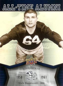
Friday, May 22, 2020Set: 2013 Upper Deck University of Notre Dame - All Time Alumni (Rate) “ The card works because of the nostalgia in seeing Buonoconti from his college days . . . Not much thought in the design, but so what? The nostalgia is the whole thing, and rather than burying it in some outlandish design, they presented it front and center, with no distractions . . . ” -georgecf
“ Cool looking card. This sort of card sort of nixes my anti-College Cards collecting choices. ” -captkirk42
“ the jumping at the camera photo is an iconic football yearbook and card pose of a bygone era. ” -parsley24
“ Weird picture. I liked Nick Buoniconti when he hosted Inside the NFL with Len Dawson. This was my favorite football review show ever. Speaking of Len Dawson he had a card that was up for Random Card of the Day. As for the card it is ok for an insert. ” -Brendan Barrick
“ Not bad, just not a fan of the Upper Deck logo in the middle. ” -muskie027
“ This is the exact angle his GF sees him on Saturday nights. Weird angle. Sweet card. ” -CardFlipper1974
|
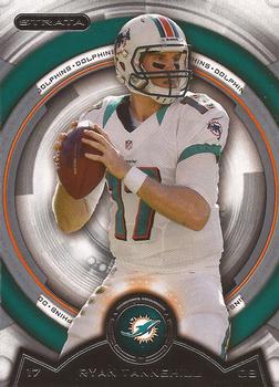
Thursday, May 21, 2020Set: 2013 Topps Strata - Retail (Rate) “ Trippy. I like it. ” -muskie027
“ Topps Strata Kodak Camera Lens Edition. Where is the Fuji Film variant. LOL ” -captkirk42
“ An ok design. ” -Brendan Barrick
“ never was fan of the "collars" on the uniforms during this time, the card design is fine with me, but I hated how topps did there retail and hobby versions with the only difference being the thickness of the card ” -Thunderfoot
“ Looks like Ryan is on an episode of "Time Tunnel". ” -bpaul14
|
Tuesday, May 19, 2020Set: 1996 Collector's Choice - Silver Signature (Rate) “ I always liked Collector's Choice (baseball and hockey) nice lower end product. Plus this one is a Bucco, HOORAY! ” -Gunny
“ I'll say it again, I hate names sideways on cards. Yeah I'm looking at you 2020 Topps. ” -CardFlipper1974
“ My second-favorite Collector's Choice set (the seminal release was tops, IMO). Adding the foil signature to their colored parallels was a nice move by UD -- and something wish Topps would've adopted at some point. ” -mkaz80
“ This is a beautiful card, front and back . . . That was the first thought I had upon seeing it . . . ” -georgecf
“ Nice parallel. Like that you can actually tell at a quick glance that is is the silver version. You don't have to look for the foil lettering to see it it is a different shade of silver, or the small UD logo is chrome/not chrome. ” -captkirk42
“ I really like that photo of the players in the dugout, displayed on the back of this card. A good looking card overall, imo. ” -CollectingAfterDeath
|
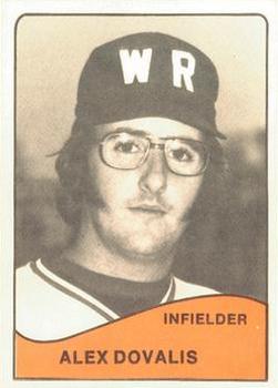
Monday, May 18, 2020Set: 1979 TCMA Wisconsin Rapids Twins (Rate) “ Who has that "Softball Brawlers" list? We have a new entry for you. ” -rmpaq5
“ There's just something I love about the '77, '78 and '79 TCMA minor league cards - the rough matte finish, the newsprint ink. The combination of low budget and high aspirations perfectly captures minor league baseball at the time. ” -AtarianX
“ Card screams 1970s. The sideburns, the "W R" on the cap (bet the back was mesh), single font on the front, and zero stats on the back. Minor League cards progressed quickly. Ten years after this MiLB set was produced, we had Glossy MiLB sets and much better production overall. We wouldn't have gotten there without sets like these, so I like this set! ” -vrooomed
“ My mom went to high school in Wisconsin Rapids! Not a very good baseball hat though. ” -vanstryland
“ Very 1970s/80s minor league card. Nice ” -captkirk42
“ Looks like a hormonally advanced Little Leaguer with the lambchops, glasses, and awesome "WR" logo on the hat. ” -bpaul14
“ Holy cats--what a look. Sideburns & glasses that scream 1970s! Then there is the hat--talk about basic design. The lack of imagination is staggering. ” -cjjt
“ About as boring as you can get. ” -muskie027
“ Love TCMA MiLB sets from the 70s! ” -UKboogie
“ I'm surprised more baseball players from 70s aren't wearing eye patches due to shards of glass making them blind. ” -CardFlipper1974
|
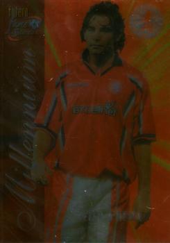
Sunday, May 17, 2020Set: 2000 Futera Fans Selection Middlesborough - Foil (Rate) “ Is this supposed to be like a magic motion type card? ” -rmpaq5
“ This looks like it would be really cool in hand. ” -muskie027
“ One of the reasons I don't like foil or more so am beyond beyond tired of foil is this they don't scan well. ” -captkirk42
“ I'm assuming this is just a poor quality scan, if not this is the worst card I've seen in some time. ” -twfurey
“ Looks like this card broke the scanner. ” -bpaul14
|
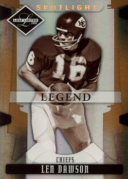
Saturday, May 16, 2020Set: 2008 Leaf Limited - Bronze Spotlight (Rate) “ Very cool for me as a Chiefs fan, back to back legendary Chiefs QBs. Although of course today’s QB is much better known for his time in KC, whereas yesterday’s QB Montana is obviously better known from his days in SF. Still cool though. This is a nice card. Not a huge fan of the LEGEND banner right across the middle, would be better down lower, on the side, or removed completely, but apart from that a nice card. ” -Brimose
“ Montana then Len Dawson? Maybe a hat trick of Chiefs QBs? ” -muskie027
“ Len Dawson. One of three Purdue quarterbacks to win the Super Bowl. Did you know Purdue quarterbacks have started more NFL games than any other college by a wide margin! ” -bpaul14
“ I like this set. I am not much of a parallel collector, but the parallels of this set are among the few I do collect. I did enjoy watching Len Dawson on Inside the NFL. ” -Brendan Barrick
“ WOW. 2 in the same week! I'm on fire. Although I own this card & the set, I have always thought it ugly. ” -cjjt
|

")