
Random Card of the Day |
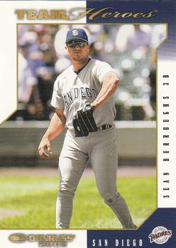
Tuesday, January 7, 2020Set: 2003 Donruss Team Heroes (Rate) “ Hard to believe this is the last card of the day we will write about in this decade. Even harder to believe 2003 is 17 years ago (by the time this comment goes live) It is very much a design of the first few years of the 2000s. All angular and with a gradient fade, totally asymmetrical design, no question about it! But, I do like it. ” -Billy Kingsley
“ Good card. Only complaints are I don't the sideways printed name and the team logo could be bigger. ” -chvlDm
“ One of the biggest busts in the last 20 years. The card is good, nothing great but not bad. ” -davidhandberry
“ Don't box me in. ” -wjhipwell
“ not a bad looking card really ” -parsley24
“ Decent player, card is kind of all over. Not sure I like it. ” -muskie027
“ Team Heroes a decent enough set. Of the years they produced the Team Heroes sets most were very good, this one isn't as good but is still OK. ” -captkirk42
|
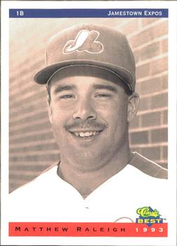
Monday, January 6, 2020Set: 1993 Classic Best Jamestown Expos (Rate) “ Meh. Nothing good, nothing bad about this product. Early 90's Classic usually had good info on the back and this fits the bill. The picture could be better, but I'm not surprised that it isn't. Overall, it's a decent card from the mid-90's that would get at least a 5 of 10 vote from me. ” -spazmatastic
“ This is weird. 3 days in a row!! I think the database gods heard that I had seen too much hockey lately and have blessed me with an abundance of minor league baseball. I have many cards from the 93 Classic Best sets and though it is a pretty basic looking set, it has everything you want on both sides and it is minor league baseball so it's all great with me. ” -davidhandberry
“ Sorry I wrote one already but I took a look at this set and had to add in something strange. All the other cards from this team set the pictures are in color and on the field. This is the only card with a black and white photo in front of a brick wall. Seemed strange to me. ” -davidhandberry
“ Nice minor league card. ” -captkirk42
|
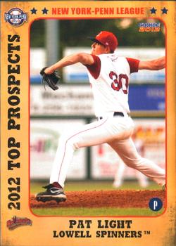
Sunday, January 5, 2020Set: 2012 Choice New York-Penn League Top Prospects (Rate) “ It feels like Christmas time...oh wait. Two minor league baseball cards in a row!! Front is great, back is boring. I think they spent all their money on the front and saved money on the back using just black and white. Even so I love it as I love most minor league cards. ” -davidhandberry
“ Love these NY Penn league sets, full of players that never made it to the Majors yet were still good enough to end up on cardboard and I appreciate that! ” -baseballcardstoreca
“ BACK TO BACK LOWELL SPINNERS..... WHAT ARE THE ODDS. not a fan of the cards.. ” -parsley24
“ Nice Minor league card. ” -captkirk42
|
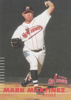
Saturday, January 4, 2020Set: 2000 Multi-Ad Lowell Spinners (Rate) “ I love minor league baseball sets and this is no exception. I would like the back to have some color and not to have used a duplicate picture. That is my objective opinion but my brain just sees minor league and wants it. ” -davidhandberry
“ Nice minor league card. ” -captkirk42
“ Love this angle of pitchers that show the torque on the elbow. I like the card's simple design, and I like minor league team names. Overall a pretty sweet card. ” -jmurph8081
“ Cool Team logo... that led me to look up the team. Card is not bad, although the cropping on the front is a little zoomed in to close. ” -parsley24
|
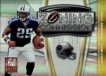
Friday, January 3, 2020Set: 2008 Donruss Elite - Zoning Commission Gold (Rate) “ Awful. Looks like a memorabilia card that they forgot to put the memorabilia on. The front is boring and the back is worse. ” -davidhandberry
“ Would have been a nice card had they shrunk the Zoning Commission sign. It's as though the player is secondary. ” -NJDevils
“ Nice looking insert. I thought it would be an interesting design for relics and yes they did have some "jersey" parallels. ” -captkirk42
“ I always thought Donruss Elite had good parallel/insert sets. ” -cjjt
“ The card front is nice...the back of the card is kinda empty looking. Under the SN800 should have been a close-up portrait style picture of the player, instead of the floating helmet, imo. ” -CollectingAfterDeath
“ When I think Zoning Commission, I think of government bureaucrats sitting around a table, not a 230 lb. running back. Ha! I always liked LenDale. Thought he was going to end the 2005 BCS National Championship. Instead, he got tackled before the line to gain and we got to watch Vince Young make some magic. ” -jmurph8081
|
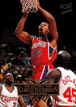
Thursday, January 2, 2020Card: #135 Clarence Weatherspoon “ It's strange to me that some companies reuse the same picture, on the front and back and sometimes even in the background, yet here is a company than can have 4 pictures of a person on one card. Other companies should feel ashamed. This is a great looking card, love how they used the little box on the front so that you can see the foil lettering, wish they had done the same for the logo or put the logo in the box. The back is phenomenal. The only thing I might have changed is to put the bio information over the faded picture so the text could have been larger and easier to see. ” -davidhandberry
“ Ultra was my favorite brand and this set was the first one I experienced. I love the set for nostalgic purposes but a lot of the cards suffer from being cropped too closely, something that also affected the 1994-95 set. ” -Billy Kingsley
“ is water dumping in my mouth? ” -crashdavis28
“ I normally like Ultra, but I'm not digging this design. Back has too many pictures and I'm not sure what stats I'm looking at. Seems to have too much blank space. ” -captkirk42
“ Great looking card. The name plate on the front is straightforward. I really like the back with the three images. ” -CollectingAfterDeath
“ 4 different pictures! Awesome. Clean card, but the name is a little difficult to read ” -cjjt
“ All 1995-96 Ultra products were hot back in the days when i had a brick and mortar operation. The no border base cards, photography, and the inserts were very well thought out. ” -baseballcardstoreca
|
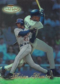
Tuesday, December 31, 2019Set: 1998 Topps Gold Label - Class 3 (Rate) “ I wanna like it, but I don't like the superimposed images and I can hardly read the name. ” -chvlDm
“ Loved the Gold Label brand. Didn't last as long in my sports as it did in baseball but in hand they are great. ” -Billy Kingsley
“ Tigers! Although this looks really bad. Is he fighting a giant version of himself? ” -rmpaq5
“ Great scan. Nice card. ” -cjjt
“ I'm conflicted about Gold Label. I hate how hard it is to build class 3, but I love the way they look in a binder (I do mine so page 1 is: Card 1, Class 1 - 2 - 3, card 2 Class 1 - 2 - 3, card 3 class 1 - 2 - 3, etc). ” -jackal726
“ Nice higher and card. Name in script foil a little hard to read Back OK. ” -captkirk42
“ An interesting concept on the front. To me, there seems to be two focal points. The smaller image in the front, and then the larger one in the back. I have a hard time looking at this card for very long. On a side note, I like the quality of this scan. ” -CollectingAfterDeath
“ I love this set. ” -davidhandberry
“ Late 90s Tigers are a grim proposition, and Hunter's 65 OPS+ is particularly emblematic of that. Always thought the other Brian Hunter would go farther, so that shows what I know. But hey, can't go wrong with Gold Label. Even for a guy with a 72 career OPS+ in the heart of the steroid era. ” -crimnos2
“ Looks kind of cool. I am not familiar with this set. ” -muskie027
|
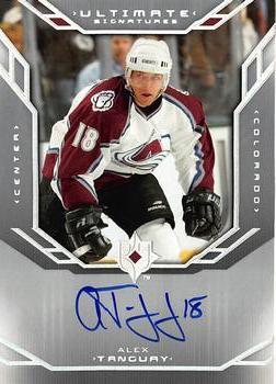
Monday, December 30, 2019Set: 2004-05 Upper Deck Ultimate Collection - Signatures (Rate) “ Strange a memorabilia card on RCOTD and an autograph for the Write One, both with the same issue for me. Front design is good but the back with the congratulations taking up the entire space, with no room for any info about the player, no stats, nothing. ” -davidhandberry
“ Nice card! ” -Billy Kingsley
“ From the lockout season when there were fewer hockey products than usual comes this little gem of a very good player who had a longer than average NHL career. Nice built-in COA ” -baseballcardstoreca
“ Nice card with an interesting looking signature. I like how the jersey number is incorporated into the back end of the auto. ” -CollectingAfterDeath
“ Cool card ” -parsley24
“ Wow Border too SILVER much like many cards are way too WHITE. OK design for autos but man all that silver border. Back typical boring "Congratulations you got a card with an autograph on it". ” -captkirk42
“ I first glanced at the auto and thought it was T.J. Oshie ” -NJDevils
“ Cool, an auto on the RCOTD! Not a bad player either! ” -muskie027
|

")