
Random Card of the Day |
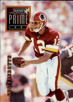
Tuesday, November 5, 2019Set: 1996 Playoff Prime (Rate) “ These cards have an interesting metallic like sheen on them, unlike any other card sets I've seen. Thankfully they scan pretty well, unlike most cards with any special features like that. ” -Billy Kingsley
“ No borders always a huge plus ! Numbering is silly 073 really ? Nice solid card stock , not flimsy, with a nice finish.Room for more stats on back. ” -baseballcardstoreca
“ Heisman winner gus frerotte ” -parsley24
“ I wish the front had the team name and position and that the name wasn't vertical. The back is nice looking but I wish the helmet was off. ” -davidhandberry
“ The photos are pretty good. At the same time, it needs more stats on the bank. Also, if your text on the back is about the "air bus" maybe the photos shouldn't be of him running without the football or handing it off. Just a thought. And make the playoff prime logo smaller. ” -vanstryland
“ Nice mid 90s card. Very simple. Front OK player name should not be vertical, team name and logo would be nice. Back OK but only one year of stats. Cool that it is a Redskin, Gus Frerotte (Hmm forgot that he spelled his name with that "r" after the "F") a player often forgotten, not as quickly as some of the QBs the Skins had in the 1980s and 90s, but still didn't solve their age old problem at QB. I probably have this card somewhere, maybe. ” -captkirk42
“ Very sharp looking card. I like it a lot even though I don't like the sideways name and the giant Playoff Prime logo. It still just looks real nice. Gives Frerotte a 3D look. ” -muskie027
|
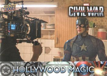
Monday, November 4, 2019Set: 2016 Upper Deck Captain America Civil War - Hollywood Magic (Rate) “ I never thought it was possible, but the Avengers series has surpassed the Star Wars series for my favorite movie franchise of all time. I wasn't a huge fan of this installment, because I can't stand when heroes fight each other...something Marvel is known for. Luckily it hasn't played a huge role in the movies. ” -Billy Kingsley
“ 1 of the inserts/special cards in this release and the least attractive,at least someone is paying attention cardbord-wize to Marvel since Fleer went Bankroopt ! ” -baseballcardstoreca
“ I don't care for this card at all. Boring picture on the front, duplicated on the back. Nothing special, the back actually looks like a gaming card to me. ” -davidhandberry
“ Nice looking Non-Sport. Nice idea for an insert set "behind the scenes" but doesn't give too much behind the scenes info. Like those 1/2 hour "making of" specials that don't tell you much of anything when it gets down to it. ” -captkirk42
|
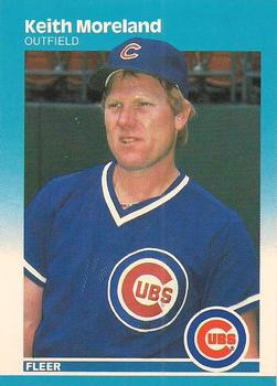
Sunday, November 3, 2019Set: 1987 Fleer - Glossy (Rate) “ I like this set however I think they could have found a better photo of Mr. Moreland. ” -chvlDm
“ I don't think I own any 1987 Fleer, I know I don't have any Glossys. How this escaped me back in my early collecting days, I don't know. ” -muskie027
“ I miss the days of one parallel for a set and easily identifiable. You look at glossy vs. regular and it is obvious in a moment, which is which. ” -davidhandberry
“ Against all my instincts, I love this series. The blue frame is soothing, and I like the way the top of the player stands out from the picture into the frame. I like the back, too. Cards need to provide complete stats on the back, and this one does. Overall, the design is a bit simplistic, but it works very well. Maybe the simplicity is what is so nice about it. ” -georgecf
“ I know I'm probably in the minority, but in my opinion this was the best looking Fleer set of the 1980's. Not to mention that they were impossible to find on store shelves in 1987. ” -DocOso
“ This has always been one of my favorite fleer designs. Saying that, I have always hated the glossy version because it isn't easy to tell it apart from the regular. ” -YoRicha
|
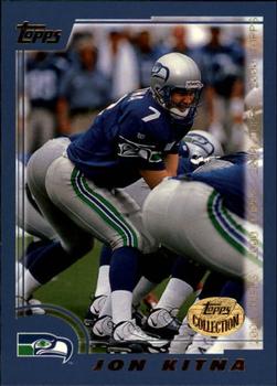
Saturday, November 2, 2019Set: 2000 Topps - Topps Collection (Rate) “ Be funny if one of those other guys never got his own card so he shows up on the List showing players who appear on a card but never got his own, and it's just his butt sticking up in the air. Yes, the things that amused me at 5 years old still do! ” -Billy Kingsley
“ This is just about a perfect card, and it's from Topps. I think I have seen my first miracle. But alas it is a parallel but looking at the base set it is very nice as well. I wish they could bring color and quality to baseball. Also has one of my favorite things on a football card, a helmetless picture! ” -davidhandberry
“ :)!! ” -RoyalChief
“ card design is fine, but I didn't like how topps did the topps collection cards, I believe the cards from the factory set had this logo on them, I love parralells but this one is not needed since its basically the same as base ” -Thunderfoot
“ Great looking card. Different, yet traditional good looks. ” -NJDevils
“ 2000 was an OK year for Topps but not super. ” -captkirk42
“ A big meh. Kitna wasn't a bad QB. ” -muskie027
|
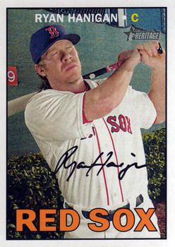
Friday, November 1, 2019Set: 2016 Topps Heritage (Rate) “ Wait, are his eyes closed? That's certainly unique! ” -Billy Kingsley
“ 1 of those sets where the backs are better than the fronts. Crisp , clean and easy to read.Hanigan even in retirement could probably out-catch Gary Sanchez ” -baseballcardstoreca
“ Photographer: EYES OPEN!! Hanigan: Don't bother me, I'm catching up on a nap... ” -rmitchell6700
“ Are his eyes closed? This is the best photo they took? ” -rmpaq5
“ Great looking set. Reminds me of '67 ” -parsley24
“ I really enjoyed these throwback cards when they first started. The novelty is over and I wish Topps would come up with a new idea. ” -davidhandberry
“ Swinging with his eyes closed. Might be why he hit .171 in 2016. ¯\_(?)_/¯ ” -vanstryland
“ Nice Heritage card. ” -captkirk42
“ always a plus when there is cartoons on the back ” -Thunderfoot
“ They chose an awful picture of Hanigan for this card ” -Tylergallo
“ Probably would have had a better batting average if he opened his eyes. ” -SandersFan
“ I love Heritage sets more and more with each time I come across one. ” -muskie027
|
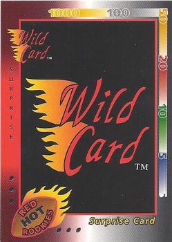
Thursday, October 31, 2019Set: 1992 Wild Card - Red Hot Rookies Silver (Rate) “ I hate redemption cards. I older packs and get things like this quite often and if you missed the date on the card you are out of luck. I have gotten several that would have given me very nice cards but I was a few months behind and so therefore out of luck. It is ok when the card is actually a picture of a player or something of some redeeming value even if you don't redeem in time but when you end up with something like this that is basically going at the bottom of a box somewhere in the attic it really hurts. Here is a rare 1 of 1 card, oops you missed a deadline, here is a piece of trash that you can use to protect other cards. ” -davidhandberry
“ I'll be surprised if anyone says anything nice about this card! ” -Billy Kingsley
“ Who doesn't like a surprise? Especially if you have to pony up more $ to get it shipped to you. 1 of the many exchange type cards Wild Card tried to woo collectors with FAIL ! ” -baseballcardstoreca
“ My favorite card company. The premise was clear, and the possibility of completing a master set seemed humanly possible (even if it probably wasn't). Of course, this particular card doesn't represent their characteristic "stripe" concept. ” -altaeria
“ Someone should try to redeem it now. After all, it says AFTER March 1, 1993! Does anyone know what was in the surprise package? ” -DocOso
“ Just in case there were any conspiracies running around that RCOTD isn't truly 'random'... ” -Brimose
“ You won! Now send us more money for additional cards. ” -vanstryland
“ IN general I like the Wild Card brand. However I don't like the all draft versions, this set was full NFL not draft I think. This "Surprise Card" is pretty neat, but to be part of the set is a bit weird. Even with my weird tastes. I sort of like this better than some of the regular base cards. ” -captkirk42
“ Did anyone actually exchange the Wild Card stripes for the surprise package? ” -Corky
“ Surprise!!! ” -cjjt
|
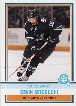
Tuesday, October 29, 2019Set: 2009-10 O-Pee-Chee - Retro (Rate) “ As a general rule I don't like sharks... except the San Jose kind. And hammerheads. Hammerheads are cool. The San Jose Sharks are my 2nd favorite Western conference team. ” -Billy Kingsley
“ Now here is some rare originality despite it being the same year after year, a parallel set that isn't just a different color or finish, it actually has different photos YES!! ” -baseballcardstoreca
“ Its basic and retro... But to me, just isnt hitting the right notes. Close, but not quite there. ” -parsley24
“ Seems like we have had lots of hockey lately. Maybe just my imagination. This is one of the more boring cards I have seen lately. Even with a decent action shot it doesn't help the drab white border and baby blue writing. If they had done more orange and navy it would have helped. The back, oh the back is even worse. Black on grey is never a good option and the blue, for me is hard to see. ” -davidhandberry
“ Not my favorite OPC retro design, and I'm a fan of their retro parallels... ” -rmitchell6700
“ NIce OPC retro card. It doesn't look like the use of an older design just a new design in the old fashioned style. I like it. I wish more sets were done this way, retro style but not necessarily a reused design. ” -captkirk42
“ This one really has an old look. I always liked the name Setoguchi. Sounds very hockey-ish to me. ” -muskie027
|

")