
Random Card of the Day |
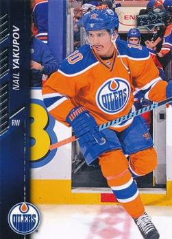
Saturday, February 25, 2023Set: 2015-16 Upper Deck (Rate) “ I'll bet this guy really likes to get hammered...buh duh bum. I'll see myself out. ” -hiflew
7
“ This was my first year back in the hobby and this was my hockey set for the year. Still the nicest set Upper Deck put out since I've been back. ” -muskie027
5
“ The best #1 overall pick made by the Oilers! ” -702tpr777
3
“ Gonna take this stick and NAIL you in the YUCK-N-PUFF! ARGHHH! ” -CollectingAfterDeath
“ Nail your cup off? ” -scottwalker29
“ Good quality photography for this card! ” -tinyshogun
“ Not the best player, not the worst ” -Lennoxmatt
“ Very nice-looking front, because of the picture . . . Back is pretty blah . . . ” -georgecf
“ Prototypical modern hockey card. Good shot but colors don't look great from the scan. ” -pjdionne12
1
“ I am happy that Upper Deck continues to release hockey card issues. The 2015-16 issue was one of their best designs. ” -Brendan Barrick
“ The "numbers on the shoulder pads" never really looked good on Edmonton's jerseys. So glad they stopped that. ” -Theron_Nett
“ Nice hockey except for sideways text and duplicate of photo. ” -captkirk42
|
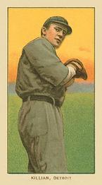
Friday, February 24, 2023Set: 1909-11 American Tobacco Company T206 White Border (Rate) “ Classic set. One of these days I need to get one just to have this set in my collection. ” -tcarter
5
“ Sweet classic tobacco card. Would like to collect them all, but my wallet keeps reminding me, that I'm not a smoker. ” -CollectingAfterDeath
6
“ I have a couple of these cards. I would love to have more of them. Awesome looking cards!! ” -tinyshogun
3
“ Beautiful vintage. When parallels weren't a thought in these peoples minds and they collected cards for cards. ” -TwinKiller
1
“ Great image for such an old card ” -Lennoxmatt
“ Very nice Tobacco card. I am VERY impressed by the super condition of this over 100 years old card. Makes me wonder where the image comes from. ” -captkirk42
“ Fun fact: Killian holds the record for longest streak of innings pitched without allowing a home run. (He also allowed only 9 home runs during his major league career.) ” -Musclebeech
1
“ "Ed Killian...might be worth a million..." ” -Ken Kinsey
“ Seems like 1909 was a big year for card collecting. Lots of different sets were made that year, leading with tobacco issues. Now days one could only dream of finding some old stash of tobacco cards hidden away in a cigar box stuffed in an attic. ” -Derek McDonough
“ Ed threw 794 innings in 04, 05, and 06 and allowed zero home runs, he was good ” -jamestagli
1
“ I am guessing no negative comments will come up for one of these beauties. ” -muskie027
|
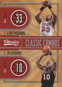
Thursday, February 23, 2023Set: 2009-10 Panini Classics - Classic Combos Silver (Rate) Card: #7 Alonzo Mourning / Tim Hardaway “ This is a card I'd love to see redone. ” -scottwalker29
4
“ I used to love watching Alonzo play back in his Charlotte days!! ” -tinyshogun
3
“ Love the Classics design. Most of their stuff looks pretty good and holds up to the flashier stuff. ” -hamrlik22
2
“ Using the same images front/back kind of works here, with the one on the back being unedited. ” -jackal726
1
“ This was a classic combo... both dont get enough cred. ” -parsley24
“ I like some multi player cards but my limit seems to be 3 maybe 4 players sometimes. At first I thought this was a 4 player card. Glad it is only two players except I don't that the same photos are repeated on the back. It would also look better if they were in different poses. ” -captkirk42
“ What's this a spot the difference game card? "Get that garbage outta here!" as Jack Armstrong likes to say on the Raptors broadcasts. ” -BuccaneersDen
“ I like how they slightly moved the photos horizontally on the back so we wouldn't realize the same photos were on the front. #SneakyPanini ” -UKboogie
2
|
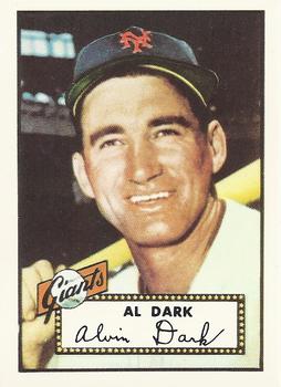
Wednesday, February 22, 2023Set: 1983 Topps 1952 Reprint Series (Rate) “ The original card is better. ” -Brendan Barrick
4
“ Wow! Is this a sign? I collect Alvin Dark and had only recently added this set to my Want List. ” -Sportzcommish
2
“ I'm a fan of the reprints! ” -tinyshogun
4
“ The name in the marquee really is a nice touch, on what is to me, one of the best card designs ever. The reprint disclosure on the back, takes nothing away from the overall look. ” -CollectingAfterDeath
1
“ Nice reprint of a vintage card ” -captkirk42
1
“ Nice reprint . . . Love those old cards. . . ” -georgecf
1
“ Tough legacy for this guy… I definitely recommend reading or listening to “24” by Willie Mays and John Shea for some perspective on Al Dark. ” -Musclebeech
1
“ Another one for you Joshua! Classic look. Very nice. ” -RonEaston
|

Tuesday, February 21, 2023Set: 2010 NECA Twilight Eclipse Series 2 (Rate) “ Teenage vampire angst. Who knew? ” -CollectingAfterDeath
1
“ I need sideburns, maybe them big lambchop ones, but alas it will never be. ” -Gunny
2
“ I love reading. I love movies. I love cards. I love my wife. This franchise is a blight on everything I love. ” -jackal726
22
“ NNNNNNooooooo my eyes are burning!!!!!!!!!!! ” -tinyshogun
3
“ If you were a 300-year-old immortal vampire, would you enroll in a local high school? I know I wouldn’t. ” -Musclebeech
2
“ UMK. a Twilight card. NO Thanks. ” -captkirk42
1
“ Cringe ” -parsley24
3
“ Give me a break . . . ” -georgecf
2
“ ugh ” -freakizon
3
“ I'd watch that movie under one condition: it has to be the Rifftrax version ” -DanD
4
“ My daughter just started reading these books and would probably love these. ” -muskie027
1
|
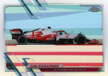
Monday, February 20, 2023Set: 2021 Topps Chrome Formula 1 - Refractor (Rate) “ That is possibly the smallest image of the subject of a card that I have ever seen. I had to go to Google just to see if Kimi was the driver or the car. ” -hiflew
4
“ Torille! Fantastic card. Best motor sport and finnish Iceman Kimi the Great himself. ” -Duke
2
“ Beautiful car, the card is fine but Kimi's name and team are a bit hard to read. Oh jeez, the new season starts soon I had better go and read up on any rules changes. ” -Gunny
2
“ That just screams speed! This card gets two green flags. ” -CollectingAfterDeath
1
“ Sorry but this is the ugliest racing card I have ever seen. I take that the back the scan of the "base" chrome card of this card is worse in all black the way chrome scans. All in all it looks like the base of the normal set looks the best, but still is awful looking. Very poor subject matter a striped guard rail taking up a third of you photograph. ” -captkirk42
“ This card design being the same as baseball for that year is just another reason why I wish card companies didn't have exclusive rights to certain sports. I'd love to see a frankenset of multiple sports for one year that all use the same design. ” -Bowersbird
2
|

Sunday, February 19, 2023Set: 1955 Topps Double Header (Rate) Card: #19-20 Karl Spooner / Jim Hughes “ I am not a big fan of comic looking art for cards. ” -muskie027
1
“ Neat concept using the double header theme. Poor Jim got the short end on this card though. ” -CollectingAfterDeath
1
“ How is every one of these cards not already creased in half to so the kids could "flip" between the two double heads? ” -Tscastle
1
“ The front is awesome! ” -pjdionne12
“ One of my favorite all-time sets. The backgrounds of the cards line up perfectly when placing the cards next to each other numerically. ” -jayoneill
1
“ I wonder if non-standard sized cards made a different sound in bike spokes back then. Like, was there a size that made kids really excited because it sounded more like a rocket bike (or something)? ” -jackal726
“ I had no idea Topps did this first. I always thought it was a Fleer creation in the early 2000s. ” -hiflew
“ B-E-A-utiful card! Lovin’ the artwork on this vintage set. ” -Musclebeech
1
“ This card is cool as hell. I think I need one for my collection!! ” -tinyshogun
1
“ Nice "tallboy" card, but I'm not sure why they had the picture of the guy on the back upside down.... ” -Theron_Nett
“ Fun looking odd sizes cards. ” -Derek McDonough
“ Very very cool vintage. ” -captkirk42
|
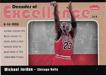
Saturday, February 18, 2023Set: 2007-08 Fleer - Decades of Excellence Glossy (Rate) “ Meh! Not an impressive card at all and well after MJ retired. Just not needed and clearly just a ploy to get people to buy more Fleer cards, even though Upper Deck owned the name at that time. UD didn't make NBA (or MLB cards) much longer after that year and poor designs was a big reason for their loss of licenses. I wouldn't care to have it in my collection, even as a trader. ” -spazmatastic
1
“ Not glossing over the fact that creative excellence went out the window with these inserts. ” -Sportzcommish
5
“ Great. Wonderful card. ” -Duke
1
“ Two three-peats in the 1990s, is a definition of excellence. And with MJ on the front, being the main man during that time, is fitting for this card! ” -CollectingAfterDeath
“ The true GOAT ” -Lennoxmatt
1
“ Ah, Fleer and their crooked insert cards. Finding a card that had been cut properly was difficult in the early 2000s. ” -hamrlik22
“ Wonderful, a card with TWO backs. [/sarcasm] I am not much of a hoops collector but if this were my first introduction to an insert card I would have to pass on it. ” -captkirk42
“ I never grew up during the Jordan era, but this is probably the greatest NBA Player ever. Those 90's Bulls were always a dominate team and ruled the 90s ” -michael1206
“ Stuart Scott: "Once and for all, did you push off of Bryon Russell?"
Michael Jordan: "What'd they call? Whatever they called, I did" ” -nkandy11
2
|
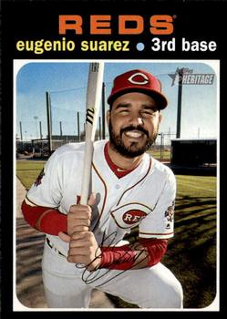
Friday, February 17, 2023Set: 2020 Topps Heritage (Rate) “ "Eugenio and his wife, Genesis, costumed themselves as Superman and Super-girl last Halloween."
-2020 Topps Big League
Random fun fact for you. ” -jdogg1228
2
“ Eugenio is one of my favorite players. I hated losing him to the Mariners. This guy is always smiling!! ” -tinyshogun
3
“ Not a fan of reusing retro designs. Makes it more timing consuming to flip through bargain bins at card shows looking for older cards because you keep having to do double takes. ” -lildog7
3
“ This Heritage card Almost got me at first.(the trademark by the team name is tiny and I didn't notice it at first) His beard is a giveaway, for many years beards were not allowed, trimmed moustaches yes, beards no. Plus the pose is a bit more modern at least the camera angle of it. OH yeah and the Heritage logo when you get around to seeing it. ” -captkirk42
“ "Eugenio! THAT'S fun to say!!" - Buddy ...probably ” -jackal726
1
“ As a Reds fan, I was absolutely devasted when Suarez got traded. I hope him and the M's make another playoff run this year. ” -Bowersbird
1
“ Nice throwback . . . not one of Topps' better backs . . . ” -georgecf
“ I really like this retro design reboot. That design stands the test of time. ” -Derek McDonough
1
“ I really enjoy Heritage. The irony is that the past designs and cardstock make it one of the best modern day sets going. ” -muskie027
4
“ The sun must have been in his eyes when this picture was taken. ” -fedoratipper
1
“ Ah there's not a woman that can handle a man like me, that's why I juggle two or three. I ain't one to commit, you can omit that bit, you pop the question that's it. {ave maria} ¡RICO! {ave maria} SUAVE ... ” -BuccaneersDen
“ Horrible design in 1971. Horrible now
” -cjjt
1
|

")