
Random Card of the Day |
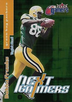
Wednesday, September 7, 2022Set: 2000 Fleer Gamers - Extra (Rate) “ There should be an NFL rule that there be at least one guy named Bubba on every team. ” -hiflew
12
“ Normally I like Fleer products but this insert (as I think it was) I am not thrilled about. ” -captkirk42
2
“ Is it just me, or has there been a lot of football cards the last couple of weeks? Also, Bubba Franks is an A+ name. ” -Bowersbird
1
“ A failed spinoff of the Bubba Burgers franchise ” -stdolan1
“ 3x Pro Bowler. He had a pretty damn good career. Not a very exciting card! ” -tinyshogun
1
“ This is an ok card. I don't like how the stats are presented on the back. ” -Brendan Barrick
|
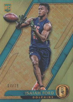
Tuesday, September 6, 2022Set: 2017 Panini Gold Standard (Rate) “ I actually like the front design, but I don't really care for combine-like photos on cards. Give me players in uniforms and I'm interested. ” -Sportzcommish
3
“ Great looking card! ” -tinyshogun
3
“ I never have liked Gold Standard as a product. It kind of hovers in that mid-range that doesn't really appeal to high end collectors or low end collectors. ” -hiflew
2
“ My biggest problem with the amount of inserts and parallels. This guy was a 7th rounder. #237 out of #260 some odd picks. How is this the gold standard. Now i realize there are hidden gems out there a la brady in the 6th, but there are soooo many cards not needed. Give this guy one card and thats it. Not a SN79. ” -parsley24
2
“ Not much to say. The gold background and foil is the design. ” -captkirk42
1
“ Looks like a basketball player catching a football. ” -jayoneill
1
“ Looks like a basketball player wanting to play football . . . Other than that, it's a yawner . . . ” -georgecf
1
“ Nice card. Design is simple but looks good. It's a great card. ” -John Mullins
|
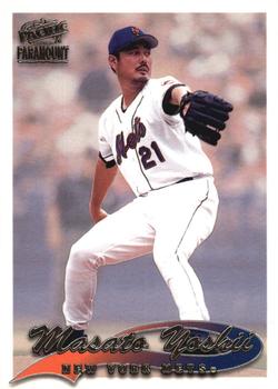
Monday, September 5, 2022Set: 1999 Pacific Paramount (Rate) “ Not exactly "thrilled" about this set. It is another 1990s set that relies on the foiled lettering for most of the design. The foil color is also the way the variations are identified between the regular and the "gold" or "silver" or however many different parallels they have. A silly way to make variants if you ask me. ” -captkirk42
2
“ I remember the epic battles between Yoshii, Mario and Princess Peach. ” -tinyshogun
8
“ Mets Legend! ” -jdogg1228
2
|
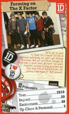
Sunday, September 4, 2022Set: 2013 Top Trumps One Direction The Journey So Far (Rate) Card: #NNO Forming On The X Factor “ I feel like I am getting old. I was thinking One Direction was a newer band and they have been around since 2010! ” -davidhandberry
2
“ Horrible. ” -Duke
6
“ What? Ugh. ” -freakizon
5
“ I am just at a loss here. I have no words. ” -hiflew
2
“ Only 48 on Excitement. Where are they getting these stats. ” -kirkscards
3
“ My ears are bleeding just thinking of their music. I bet this card would make a great coaster for my drink. ” -tinyshogun
7
“ EEEEEEEEEEEEEEEEEEEEEEEEEEEEEEEEEEEEEEEEEEEEEEEEEEEEEEEEEEEEEEEEEEEEEEEE!!!!!!!!!!!!!!!!!!!!!!!!!!!!!!!!!!!!!!!!!!!!!!!!!!!!!! ” -Ken Kinsey
“ Just when I think that the Top Trumps card sets are all just games they have something like this for a music group. ” -captkirk42
1
“ I want to buy a Top Trumps deck some time. Just not this one. ” -switzr1
1
|
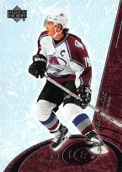
Saturday, September 3, 2022Set: 2003-04 Upper Deck Ice (Rate) “ Burnaby Joe! As a Red Wings fan, I have a deep and undying hatred for the Avs of this era, but I will always love Sakic. ” -DarthTempest
5
“ Nice looking card from my hiatus years. Never seen these. Adding the Canucks to my want list now. ” -switzr1
2
“ Man led his team to two Stanley Cups and another one years after his playing career was over. A Colorado Avalanche legend, if anything. ” -Theron_Nett
3
“ Instead of skating, it looks like he is giving a shoulder block to a stucco wall. Weird design. ” -hiflew
“ OK but not great hockey card. ” -captkirk42
1
“ Is he skating into the Stargate? I don't think the armor and hockey stick will enable him to defeat Apophis. Just saying!!! ” -tinyshogun
“ Weird. Player seems too small compared to background. Too much empty space. ” -Duke
1
|
Friday, September 2, 2022Set: 1997 Bowman Chrome - International (Rate) “ I always liked the International parallels. It combined my love of cards with my love of geography. ” -hiflew
1
“ Still not a fan of Chrome. I think the photos on this card should have been reversed. Backs should be less colorful. ” -captkirk42
1
|
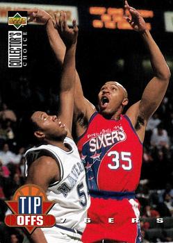
Thursday, September 1, 2022Set: 1994-95 Collector's Choice (Rate) Card: #185 Clarence Weatherspoon “ I always liked Clarence Weatherspoon and these are my favorite 76ers jersey design ever. ” -Billy Kingsley
2
“ Odd photo only because the ball is not in frame. The ball is the key part of a tip off. This is more tip off aftermath. ” -hiflew
1
“ Pretty good UD card. Not great. ” -captkirk42
1
|
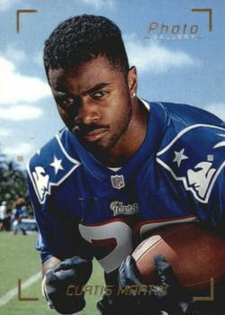
Wednesday, August 31, 2022Set: 1997 Topps Gallery - Photo Gallery (Rate) “ This is an ok insert. Curtis Martin was a great running back. ” -Brendan Barrick
2
“ Looks like Curtis is trying to be intimidating, but also like he’s about to drop some Boyz II Men lyrics on his girl. ” -DarthTempest
20
“ "I dare you take this ball out of my arm" ” -tinyshogun
6
“ I really like pictures like this on trading cards. Just a neat thing I think ” -mkb
“ They are trying to make it look like you are looking through the view finder of a camera. That or the markup for photo cropping ” -captkirk42
1
“ I started playing Fantasy Football in the late 90's, and it feels like I had Curtis Martin every year. He rarely disappointed. ” -jackal726
1
“ Hey, come here. Let me tell you something. You break my little sister’s heart and you’ll be talking to my two friends here, Pain and Suffering! ” -Tscastle
“ Curtis "My Favorite" Martin ” -SalTnutZ1
1
“ Interesting concept for a card. I like the training camp feel in the background. Martin was a great running back, wish he had spent his whole career in New England. ” -tenlbpain
“ One of the best running backs of all time. Hall of Fame class of 2012. Nice looking portrait card. ” -freakizon
1
“ "He's been compared to a young Emmitt Smith, only faster." That didn't age well...... ” -BigBoyOnWheels
“ Why does this look like a senior yearbook photo? He was an all-time great. ” -muskie027
2
|
Monday, August 29, 2022Set: 1998 SkyBox Premium - Fleet Farm (Rate) “ This is a nice card. Fleet Farm is a weird name for a parallel set. ” -Brendan Barrick
2
“ I wish they had used this foil on the NBA version of the set. ” -Billy Kingsley
2
“ Love the gold leaf labeling!!! ” -tinyshogun
2
“ Don't like it. It relies too much on the foiled lettering. Just what is that symbol thing in the upper right corner? At first I thought this was a Japanese Card because of that thing. It is apparently the logo for the Premium set? Ugly design with all that foil junk, oh and some blurry smoke effect behind him to show speed? The back isn't any better it is just a black and white headshot (with helmet on that some of our members dislike) and the stats are sideways vertical. UGH and Jersey number larger than the card number that is just below. BAD Design. ” -captkirk42
2
“ Skybox did some subtle things with their foil cards. This is a good example. ” -hamrlik22
“ I thought this was a Broder card.
Skybox this aint it. ” -parsley24
2
“ Not a particularly good front, although the picture is good . . . The back is nice-looking, but as a card back? Looks more like a magazine page . . . ” -georgecf
1
“ never seen a fleet farm card before, for those not in the upper midwest Fleet Farm is chain of stores that carry almost everything, they specialize in hunting fishing and outdoors supplies, but also have clothes tools, hardware, housewares, thier nickname is the "mans mall" ” -Thunderfoot
3
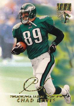
“ I liked Chad Lewis. This is a nice looking card, but hard to tell with the glittery font just how nice it may look in hand. ” -muskie027
“ What a Chad. ” -BigBoyOnWheels
|

")