
Random Card of the Day |
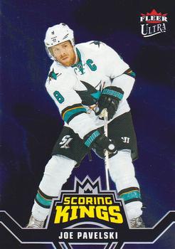
Sunday, July 24, 2022Set: 2016-17 Fleer Showcase - Ultra Scoring Kings (Rate) “ This was from the first hockey box I ever opened! I didn't get this card though. ” -Billy Kingsley
1
“ This is a nice card from an insert set. ” -Brendan Barrick
1
“ Joe Pavelski looks like he's ten feet tall on the front of this card! ” -BuccaneersDen
1
“ Nice Ultra card. I wouldn't be surprised if this was a blue parallel, but it appears to be the base. ” -captkirk42
“ Terrific product with some great looking cards. This unfortunately isn't one of them. ” -hamrlik22
1
|
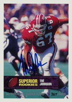
Saturday, July 23, 2022Set: 1994 Superior Rookies - Autographs (Rate) “ This is an altered scan and should not be on the Database. ” -Billy Kingsley
2
“ This had to have been one of the first "authentic autographs" ever produced. Kind of makes a boring O-lineman card a little more noteworthy. ” -hiflew
4
“ The word "superior" resents the name of this set. ” -UKboogie
5
“ Nice looking card. ” -captkirk42
1
“ It looks like he dropped something . . . Not a very good picture yet the card is not bad looking . . . ” -georgecf
1
“ What even is a temple owl anyway?
(Stolen from google:)
Why is Temple called the Owls?
The owl, a nocturnal hunter, was initially adopted as a symbol because Temple University began as a night school for young people of limited means. Russell Conwell, Temple's founder, encouraged these students with the remark: "The owl of the night makes the eagle of the day." ” -TwinKiller
2
“ This an ok card. The card need stats on the back. ” -Brendan Barrick
1
|
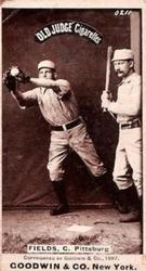
Friday, July 22, 2022Set: 1887-90 Old Judge (N172) (Rate) “ "Just a bit outside!" - Bob Uecker ” -rmpaq5
13
“ Love these old cards! Old Judge made a great product! ” -tinyshogun
6
“ What is there to dislike about this? ” -TwinKiller
5
“ Fantastic vintage tobacco card. I love the history of trading cards. One of the things that keeps me in the hobby despite all the modern trends that I hate. ” -captkirk42
3
“ I miss the old baseball names. It’s a shame Pork Chop Pough, Motor-Boat Jones and Wonderful Terrific Monds never had big league careers. ” -Matt9975
4
“ Now THAT’S a baseball card! ” -Musclebeech
5
“ Amazing! ” -cjjt
3
“ The man's name was John Joseph Fields and his nickname was Jocko. So why does it say C. Fields? ” -hiflew
1
“ Never mind. It's for catcher. Brain fart. ” -hiflew
1
|
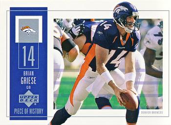
Thursday, July 21, 2022Set: 2002 UD Piece of History (Rate) “ This is a nice card. ” -Brendan Barrick
4
“ Upper Deck had some creative people in the early 2000s and produced some interesting designs. This one is pretty good. ” -hamrlik22
4
“ This is not bad, but it does look like an early predecessor to the panini contenders which i detest. ” -parsley24
3
“ Piece of SOMETHING anyway. ” -hiflew
1
“ Eh an OK looking card. ” -captkirk42
“ Not a bad card . . . Looks unique . . . Like it overall . . . ” -georgecf
1
“ I remember I had gotten a bad stomach bug over a weekend in the fall of 2013. So I was bed ridden and I watched a football game between Georgia-Missouri. Brian Griese was the color analyst and the guy could not play the neutral card. He was pulling for Missouri and talking up all the players. I thought he was the worst until I heard Andre Ware call a game. ” -Matt9975
“ I like it. Why wouldn't I like it? It's a funny coincidence that today I saw and was impressed by a Terrell Davis card (2000 Upper Deck - Wired) on a plaque in the shop a food vendor that is a big Broncos fan. https://www.tcdb.com/ViewCard.cfm/sid/36331/cid/3714702/2000-Upper-Deck---Wired-W2-Terrell-Davis?PageIndex=1 ” -freakizon
|
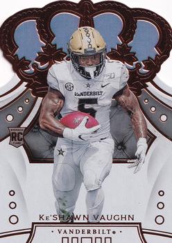
Wednesday, July 20, 2022Set: 2020 Panini Chronicles Draft Picks - Crown Royale Draft Picks (Rate) “ The information on the back is a bit overwhelming. Oh, and by the way, college cards CANNOT be rookie cards. ” -C2Cigars
5
“ This is an ok card. I prefer the version with players in NFL uniforms. ” -Brendan Barrick
2
“ Nice to see Panini respond to the frequent complaints about re-using the same photo on the back. But I don't think an empty back was the desired alternative.
And why is there a sofa cushion in the background? I guess he spent a lot of time riding the bench. ” -bevans
3
“ The only redeeming quality of this card is the fact that since the die cut portion is at the top of the card, it is easier to place the card in and out of top loaders or album pages. ” -Ymmat
“ Always liked the classic Crown Royale design, but not spending $300+ a box to get new versions of it. ” -hamrlik22
“ Not a fan of Crown Royale die-cuts or Draft cards. Nice look but Not for me. ” -captkirk42
“ is panini chronicles the Score of the the '20s ” -parsley24
“ That's a fun name to say! The Crowns are my favorite die-cuts. Are there any acetate die-cuts? Seems like the corners/edges might hold up better, but maybe they're harder to cut. ” -jackal726
“ I live in TN so I like that it's Vanderbilt. After that, not much. I got swimmy headed looking at the background behind his head. ” -ToppsrBest
|
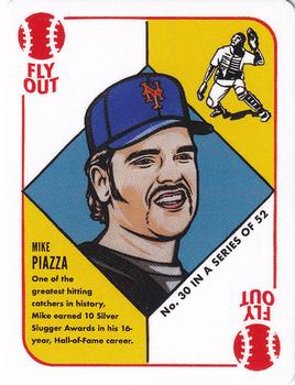
Tuesday, July 19, 2022Set: 2021 Topps 1951 Topps by Blake Jamieson (Rate) “ I like this card and set. I like all throwback design inspired by game card sets. Oh wait, except the sets that are Topps website exclusive, and / or a collaboration with an artist, such as Blake Jamieson, Ben Baller, Steve Aoki etc. ” -abide
2
“ Interesting set... never heard of it before. ” -jdogg1228
2
“ I love the card games when they make them. The 1951 set of these cards deserved a tribute. Plus it's Mike Piazza, what can be wrong with that? ” -tinyshogun
3
“ Another thoughtless regurgitation of past designs. ” -jayoneill
1
“ Pretty good "sketch" card giving homage to vintage cards. I am not a fan of it personally but it is better than some of the others I've seen. ” -captkirk42
“ I have a need to collect all these like mini game cards. This set is no different ” -parsley24
“ I've always hated "Game" cards, going back to the late 1960s . . . ” -georgecf
“ Anyone actually use these cards in a card game? The new ones, not the vintage cards they are based on. ” -DanD
“ Meh. That's about it. ” -BigBoyOnWheels
|
Monday, July 18, 2022Set: 2016 Topps - Vintage Stock (Rate) “ I like the base set from this year. Not near as boring as the normal Topps release. ” -tinyshogun
2
“ For 2016 I like the peek of the logo with team color bars. However I’m not a fan of the smoky fade in the two adjacent corners and blurry backgrounds. ” -Tscastle
3
“ Hmm "Vintage stock"? Shouldn't the back ground look sort of grayish due to being raw cardboard? Or am I missing the point Topps is making? ” -captkirk42
1
“ This reminds me of some weird custom photo retouching that Facepage keeps giving me ads for. ” -jackal726
1
“ Probably my favorite newer set. I didn't know that vintage stock was numbered either. ” -TwinKiller
“ Good picture on the front . . . You can feel the intensity of his coiling up . . . Back is routine but it gets the job done. . . ” -georgecf
“ In my opinion, this is the worst Topps flagship design of all time. Followed closely by 2017. ” -hiflew
1
“ Meh. For a /99 parallel, it's underwhelming. ” -BigBoyOnWheels
1
“ I love 2016 Topps. Such a nice classic-style design. ” -pugchump
“ I actually liked this parallel for some reason, although, if not for the serial number, I never would have known I had a parallel. ” -muskie027
“ is there anything that makes this vintage other than the throwback topps logo and SN99 ? ” -abide
2
|
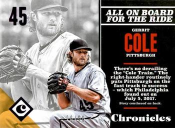
Sunday, July 17, 2022Set: 2017 Panini Chronicles - Purple (Rate) “ Same picture three times and no team logos for licensing reasons. A big fat NO! Would have been cool if not for the 2 giant complaints. ” -muskie027
5
“ I don't like this style of card that Chronicles used for some of their base cards the front looks like the back and the back looks like well the back. Two backed cards are not cool looking. I don't know what they were looking for in this design but I think they failed. ” -captkirk42
3
“ I miss Pirates Gerrit Cole... ” -Soarin22
3
“ I don't see the purple. ” -BigBoyOnWheels
2
“ Joe Musgrove, Colin Moran, Michael Feliz and Jason Martin of the Astros were traded to the Pirates for Gerrit Cole. That trade worked out just beautifully didn't it (Sarcasm)? Then the "Cole Train" went on to sign a 9 year 324 million dollar contract from the Yankees. Bet the Pirates regret that one! ” -jdogg1228
3
“ What a crap looking design. Both sides of the cards look like a back of a card. ” -YoRicha
3
“ Purple? Is this one of those cards that doesn't scan well? Like the photo portion of the card, but if I pulled this from a pack, I would probably be flipping it over to what I thought would be the front of the card as this looks like the back. ” -dettigersmlb
1
“ Where’s the purple? ” -pugchump
1
|
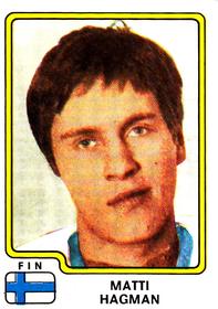
Saturday, July 16, 2022Set: 1979 Panini Hockey Stickers (Rate) “ Look at that Hockey 79 font! Very 70s. ” -Billy Kingsley
3
“ Tough picture. Looks like the kind of guy that neighbors would describe as "kind of quiet." ” -hiflew
16
“ Never knew these went back so far. How cool! ” -muskie027
“ Pretty weak design ” -pugchump
1
“ Hakki. The first player from Finnish junior system to play in NHL. Nice sticker. ” -SharksAttack
“ Oh a Hockey sticker I thought it was Soccer forgive me. ” -captkirk42
“ World Championship what? Al Pacino look alike contest? ” -tinyshogun
2
“ ok get ready 3... 2... (click) 1....
i think i blinked....
Nah fam you good. ” -parsley24
1
“ Awful. Looks like the poor guy is constipated. The reason why I don't collect these older cards, they're just awful. ” -hamrlik22
2
“ high school picture day cards? lol ” -madd4
3
“ There's a guy who has been hit in the face a time or two! ” -cckeith
3
|
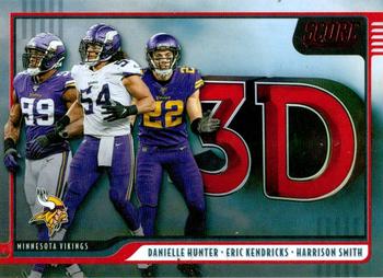
Friday, July 15, 2022Set: 2020 Score - 3D Red (Rate) Card: #3D-HED Danielle Hunter / Eric Kendricks / Harrison Smith “ And somehow 3 photos are used twice. SMH. ” -rmpaq5
12
“ This is a nice card. ” -Brendan Barrick
1
“ The defense is ready! ” -tinyshogun
1
“ Nice looking card. A fresh look for a card that I haven't seen before. In an odd way it looks like a screenshot from a children's educational show. Football players singing about 3D. ” -captkirk42
“ Where is 2022 Score? Crazy. ” -freakizon
“ What an uninspired insert set. ” -hiflew
1
“ Man named Danielle? ” -pugchump
|

")