
Random Card of the Day |
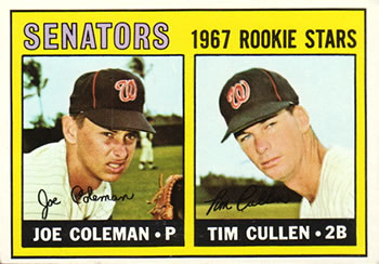
Friday, March 11, 2022Card: #167 Senators 1967 Rookie Stars (Joe Coleman / Tim Cullen) “ Nice to the point card. Basic, just the way it should be. ” -Bassbunny22
5
“ ‘67 was pretty plainly designed but I can’t complain about classic Topps ” -pugchump
3
“ Does anybody else here think that Joe kinda looks like a baby Alex Rodriguez? ” -TwinKiller
11
“ Joe Coleman at age 18 (1965) and 19 got 9 AB's for the Senators. Struck out 7 times. Thats wild to think He was playing in the majors at 18. ” -parsley24
2
“ My favorite set - ever. ” -jayoneill
1
“ When Washington got a new team they should have gone back to using the "Senators" as their name. I like it better than Nationals. ” -tinyshogun
3
“ Why does Joe Coleman have stank face? ” -tinyshogun
2
“ It's funny, Joe Coleman had a 9-29 record in the minors and 3.97 ERA, but turn into a decent major league pitcher. ” -kirkscards
“ YES! VINTAGE SENATORS! Very nice Rookie Stars card. ” -captkirk42
“ Joe Coleman! Great Tiger. One of the better trades the Tigers ever made. ” -cjjt
1
“ Joe looks disgusted & Tim looks like Forest Gump. ” -BigDaddy
2
“ Joe looks like he is watching his girl kissing another guy. ” -UKboogie
4
“ im not a huge baseball fan but i am a twins fan and knew for a fact the senators moved to minnesota and became the twins in 1961, so i had to go do some research to find out there was another senators ” -Thunderfoot
“ So nice to see the vintage stuff pop up here. ” -muskie027
2
“ They look like they are staring at someone who crop dusted them and walked away... ” -Musclebeech
1
|
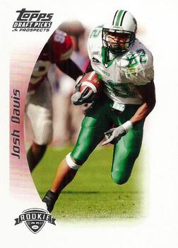
Thursday, March 10, 2022Set: 2005 Topps Draft Picks & Prospects (Rate) “ This is very unattractive and very boring ” -pugchump
5
“ Sideways name on front. Rest is OK should at least mention team on front. Back is OK many will say they used the same photo but changed the coloring/tinting. ” -captkirk42
4
“ Too much white border for my taste. Also, I would have color-coordinated a little better. ” -Ken Kinsey
4
“ Good looking card good info on the back. Looks to be an error card in the TD category on the back ” -parsley24
3
“ This is a nice card. ” -Brendan Barrick
1
“ HUGE WHITE BORDER... little tiny picture. ” -BigDaddy
3
“ The greatest WR in Hamburg Sea Devils history! Scored on a 50+ yard TD pass in World Bowl '07 ... a bit too much border on this card & same picture front and back ” -BuccaneersDen
3
|
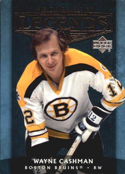
Wednesday, March 9, 2022Set: 2005-06 Upper Deck Artifacts (Rate) “ Artifacts is a nice issue. ” -Brendan Barrick
1
“ I wish I could see the chrome title on the front. I bet it looks cool in hand. ” -pugchump
1
“ Not crazy about this one. ” -switzr1
2
“ Ok looking card. Can't read the chrome set logo at the top even though it is oversized. I can barely make out it is supposed to say "Legends" but looks like "Degends" ” -captkirk42
“ Not a big hockey guy. I've vaguely heard of him before. Not a good design though. ” -BigBoyOnWheels
1
“ If you live in the Toronto area, you're probably as familiar with another "Cash Man" from TV commercials. "Oh yeah!" ” -DanD
1
“ I always like getting a legend card. This one is nice, but could be better. ” -muskie027
|
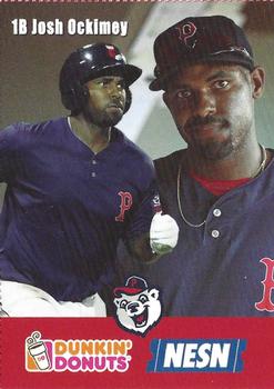
Monday, March 7, 2022Set: 2018 Dunkin' Donuts NESN Pawtucket Red Sox (Rate) “ Wow! I’ve met this guy! He threw me a ball at a Sea Dogs game the same year this card was printed. What a huge coincidence, he’s literally the only player I’ve ever interacted with at a game before. Too bad he’s with the Phillies now, hopefully he’ll be a star there because he was very good in the Boston system. Card design is ok. ” -pugchump
6
“ I was surprised that when I went to a hotel in Taunton, Massachusetts and put on a Celtics game, that this channel name is pronounced "nessen" and not En Eee Ss En. ” -Billy Kingsley
3
“ All this card needs is a coupon for free donut. ” -jayoneill
6
“ I really miss the food issues of the 70’s through the mid 90’s. I still love to collect them and I wish they would make a comeback. It’s nice to see one from 2018! ” -twinscollector34
“ Even Dunkin Donuts know that 2 different pictures look good on a card. Why can't Panini catch on to this? ” -switzr1
3
“ This is a weird front to a card with the dual image of action image and "you were just asked to take out the garbage again by your wife" image. ” -parsley24
2
“ As a fan of minor league baseball, it saddens me to think that the PawSox are no longer in business. ” -Dave Sosidka
1
“ Nice looking minor league food tie-in card. ” -captkirk42
“ Dunkin' Donuts makes good donuts. ” -Brendan Barrick
1
“ Ooh. Random MiLB player here. He got a card though, something I'll probably never get one of me, so he has that... ” -BigBoyOnWheels
“ Did they tell him to make the same face as the bear? ” -Musclebeech
“ Do the players get free donuts for appearing on these cards? Asking for a friend. ” -tinyshogun
3
|
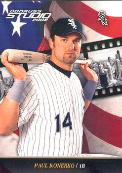
Sunday, March 6, 2022Set: 2002 Donruss Studio (Rate) “ Konerko had an underrated career. This card is eh at best. ” -muskie027
1
“ The front is kind of lame but it's a decent design overall ” -pugchump
2
“ Paul was the man for a few seasons. He had some serious raw power! ” -tinyshogun
2
“ Pretty cool card. ” -BigDaddy
2
“ Not a fan of the Studio Series. ” -captkirk42
1
“ Is "bat on shoulders" the universal "tough guy" pose for baseball players? ” -Musclebeech
1
“ Nice card. Good player. I don't think I have any cards from this set. ” -switzr1
“ the only thing i like about this card is really the flag in the background... i've never seen this set b4 but im not that impressed with this design at all but to each his own.. ” -infamous
“ I can understand the film reel in the back but the American flag clashes with the black and white theme this card has. ” -TwinKiller
1
|
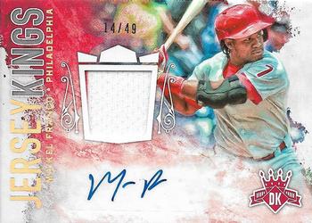
Saturday, March 5, 2022Set: 2017 Panini Diamond Kings - Jersey Kings Signatures Holo Gold (Rate) “ Diamond Kings is pretty weak in general. Kind of a lame design here. ” -pugchump
1
“ Signature looks like "Mr. P" ” -rmpaq5
10
“ I thought this dude was going to have a better career. He had a couple of really good seasons and has just fallen off the past few years. Too bad, because this guy has the tools! ” -tinyshogun
4
“ Nice looking card. Sure, some will complain about the missing logo, but blame MLB idiocy for that, not Panini. They would have a license if one was available. ” -switzr1
1
“ Both 14 and 49 are divisible by his jersey number (7). ” -DanD
2
“ OK design but like most relic auto cards it is too busy. ” -captkirk42
3
|
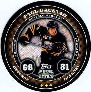
Friday, March 4, 2022Set: 2009-10 Topps Puck Attax (Rate) “ Cool design, not a fan of these tiny disks for cards though. ” -pugchump
3
“ These are cool. Hope I can add some to my collection some day. ” -Billy Kingsley
2
“ Didn't have my glasses on and wondered how this one got passed the editors?! ” -scottwalker29
5
“ I really liked these cards when I found them at a local Target one day. Bought a few packs and had a blast opening them. Sadly when I returned a few weeks later there were none to be found. ” -Gunny
“ Hockey on a puck. Now that's creative ” -tinyshogun
1
“ Is this a hockey puck? A poker chip? I can't really tell. ” -switzr1
1
“ What The Puck? Joking. Wait Topps Attax so it is the NHL Attax CCG ” -captkirk42
1
“ Ooo, look! A hockey card shaped like a puck. How original. You get a D- Topps. ” -hamrlik22
1
“ This card actually suits the name. Pretty rare these days. ” -cardcollector65jw
2
“ Nice puck. ” -Brendan Barrick
1
“ That's kind of a cool design. ” -BigDaddy
1
“ Reminds me of that Ratt song "Round and Round" (you youngsters can youtube that) ” -BuccaneersDen
2
|
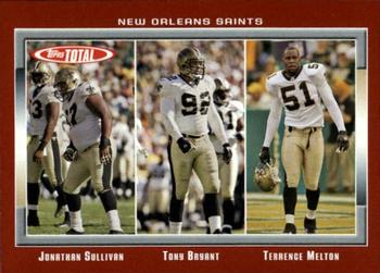
Thursday, March 3, 2022Set: 2006 Topps Total - Red (Rate) Card: #386 Johnathan Sullivan / Terrence Melton / Tony Bryant “ Love Topps Total. They should've gotten some action shots instead of these boring photos but it's a nice design overall. ” -pugchump
4
“ I love the concept of putting offensive or defensive groupings together , but the colors were pretty bad. ” -BigDaddy
4
“ I really like the Topps Total sets. ” -captkirk42
5
“ This looks like progress pictures from a weight loss ad. ” -Musclebeech
4
“ Not a fan of topps total, but do like the look of this card. Would like a little more. For ex if these are the DEF anchors say something that this is a def card or something. Kind of just rando players. ” -parsley24
1
“ Total Topps Total was a good concept. They had a lot of players you wouldn't find in other issues. The 2006 Topps Total issue had a lot of parallels which you can easily tell apart. This is a very nice red card. ” -Brendan Barrick
3
“ i usually don't like multiple player cards but, but in total it worked for me, loved this set every year it was made ” -Thunderfoot
1
|
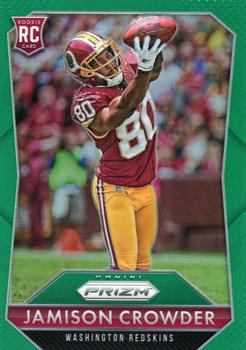
Wednesday, March 2, 2022Set: 2015 Panini Prizm - Green Prizm (Rate) “ Prizm is very cool, albeit very pricey. ” -muskie027
3
“ Panini Prizm is probably the best looking recurring Panini set, and this one is no exception. Could use a team logo on the front though. ” -pugchump
6
“ Right sport. Right division. Wrong team. Go GIANTS! ” -freakizon
3
“ Great Photo and overall a good design
” -parsley24
1
“ Not a fan of Prizm but MAN This is a SWEET looking card. It helps that it is a Redskin. The green works well as a border. ” -captkirk42
1
“ 2015 was my favorite year for Prizm. I like this card. ” -switzr1
1
“ It's always interesting to read the backs of rookie cards - at least those that include a written section.
I can't comment on this player, but I'm guessing some of those comments age much better than others. ” -dilemma19
“ Nice card design, but it seems blurry to me. ” -BigDaddy
1
“ Meh! When I first glanced at this image, I thought it was Jerry Rice. I guess any receiver is a let down after that. ” -tinyshogun
1
|

")