
Random Card of the Day |

Tuesday, September 28, 2021Set: 1988 1949 Bowman Reprint (Rate) “ Never been a fan of irregular-shaped or retro card designs. It smacks of cheapness and a complete lack of new ideas. ” -hamrlik22
2
“ Not thrilled about reprints ” -NJDevils
6
“ Talk about simplicity. Just a photo, a white border, some stats and a description. And then you have a promotion on the back. The opposite of the Hrbek card a week ago. ” -TwinKiller
4
“ Nice reprint of a vintage card. ” -captkirk42
“ Hodges hit 4 home runs in one game on 8/31/50 ” -pugchump
1
“ Ok, I want that ring advertised on the back. Crazy they forgot to include the zip code. 😉 ” -Tscastle
1
“ Gil Hodges should be in the Hall of Fame. Just saying... ” -Vonnegut37
4
|
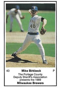
Monday, September 27, 2021Set: 1989 Milwaukee Brewers Police - Portage County Deputy Sheriff's Association (Rate) “ Great message on the back. ” -parsley24
2
“ Absolute classic. I think the ‘89 set is my favorite ” -BrewerAndy
2
“ There have been a lot of Brewers police sets for RCOTD since I joined. I am starting to question the R part of this. Besides the point the card is simpler than other cards in the 80's and then they have the player give a life lesson telling people they have a low chance of making it. EX: One of my relatives made it to Double A in the Yankees organization and didn't get higher. ” -TwinKiller
3
“ I wish I had a nickel for every time I heard Mike Birkbeck say what's on the back of this card . . . ” -georgecf
2
|
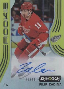
Saturday, September 25, 2021Set: 2019-20 Upper Deck Synergy - Green (Rate) “ Something I don't like about this one. Not sure what, I think it is the coloring and Synergy logo. ” -muskie027
4
“ Looks yellow to me! ” -jdogg1228
1
“ nice/99 ” -pugchump
8
“ Upper Deck's Synergy...the cards nobody asked for continues on. The foil-on-acetate is a large problem, with half the cards I pulled having foil rolling off the surface. I had that problem with this card. Kudos to Upper Deck on another failed product. ” -hamrlik22
1
“ nice number ” -mkb
“ Stickergragh? Bit too wild of a design for an auto card. ” -captkirk42
|
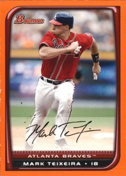
Friday, September 24, 2021Set: 2008 Bowman - Orange (Rate) “ Didn't know they did all of these fancy parallels back in 2008. Thought it was just gold. ” -jdogg1228
2
“ I forgot about Teixeira's Atlanta years. I remember as a Ranger to begin his career, a Yankee to end it, and briefly an Angel as a trade deadline acquisition as they made a playoff run, but not a Brave. Nice card. ” -abide
2
“ One of the Bowman sets I have a love/hate relation collection relationship with. Due to Bowman's crazy numbering system. I think I have one or two of these orange variants for some of my homie players. ” -captkirk42
“ Another bowman design, and again it’s pretty good. Parallel isn’t too distracting because it’s just the border changed colors.
Nice looking card. ” -mkb
“ Back when players held their own darn gloves and didn't wear mittens :) ” -domentho
2
“ Orange and green are two border colors that I think just don't have a nice look, unless the border is meant to match the team colors. ” -muskie027
“ Interesting, on the front he is wearing a left handed batting helmet. On the back he is wearing a right handed batting helmet. I thought switch hitters wore helmets with both ears covered. ” -Tscastle
“ Nice action shot. ” -rmpaq5
|
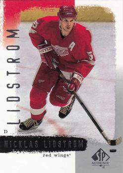
Thursday, September 23, 2021Set: 2000-01 SP Authentic (Rate) “ This is a nice card. Lidstrom in my opinion was the Greatest European born player in NHL history. ” -Brendan Barrick
“ Another card made during my time away from the hobby. SP Authentic never really seems to catch my interest. This design follows in that vein. Great player though, one of the best D-Men ever. ” -Gunny
“ its coming out of that late 90s overly cheesy graphic phase and maturing into a modern graphic phase. not bad card. ” -parsley24
“ This hockey card is a bit lower than OK. Wow very difficult to read player name in the scan must foil of some kind. Back a little better, 3 seasons of stats (out of 9) better than just one I guess. ” -captkirk42
|
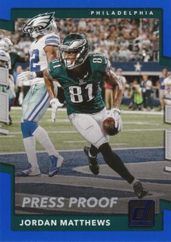
Wednesday, September 22, 2021Set: 2017 Donruss - Press Proof Blue (Rate) “ On the back, the white letters on a light gray background is fine if you're a falcon ” -NJDevils
2
“ Nice card for a modern Panini Donruss. However, I am not a fan of modern Panini Donruss. ” -captkirk42
1
“ Now that is a great Photo... Any photo of someone scoring on the cowboys is 100% in my book!!!! ” -parsley24
8
“ Panini puts out too many parallels. It is a nice action shot on the front by the way. ” -Brendan Barrick
1
|
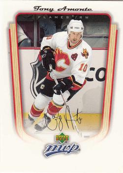
Monday, September 20, 2021Set: 2005-06 Upper Deck MVP (Rate) “ I always liked how the Flames pay tribute to their roots with the Alternate Captains by having them wear the old Atlanta Flames logo. As for the card, the only thing that bugs me is how the image fades to nothingness at the bottom of the card. I guess they did that sos the Upper Deck MVP logo is more prevalent. ” -Gunny
2
“ something is askew with the scan on this one ” -parsley24
1
“ OK front design I guess. Hard to read player name with signature font. Team name and logo would be nice as well as player position. Back pretty good except with the duplication of the hard to read signature font of players name. ” -captkirk42
1
“ Some of the set names seem a stretch. Are there really 445 MVP players in the league? ” -Tscastle
“ This is a nice card. ” -Brendan Barrick
“ Another example of poor scanning/cropping. ” -freakizon
1
“ Sooooo much wasted space on the front of this card ” -aussiewayne
3
|
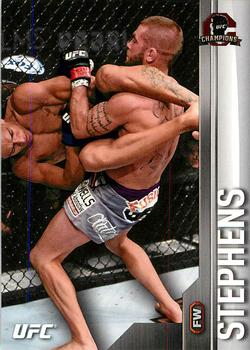
Sunday, September 19, 2021Set: 2015 Topps UFC Champions (Rate) “ I never collected MMA, but this is a great card with a great action photo. ” -muskie027
5
“ Is Jeremy the slammer or the slammee? ” -NJDevils
2
“ Great photo! ” -pjdionne12
1
“ Couldn't they find a better photo? It looks like an attempt at the human pretzel gone wrong. ” -TwinKiller
1
“ The open air Dutch oven is an underrated move in mma ” -parsley24
1
“ Very odd, even for a MMA/UFC card. ” -captkirk42
1
|

")