
Random Card of the Day |
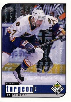
Sunday, February 16, 2014Year: 1998-99 Set: UD Choice - Prime Choice Reserve (Rate) “ I really like when companies use the same designs for all their sports in the same year. This is either a level 2 or 3 parallel, but it's done differently than the NBA version of same, which did not have words going up and down in the background. At least, if it's a level 2 parallel, I don't remember if the NBA had a level 3; if they did, I never got any. ” -Billy Kingsley
“ This card just looks like a kid scrawled all over it. Interesting to see a design I remember from baseball transferred over to hockey, though. ” -Luckynumber78
“ A big reason why I don't care for parallel sets is ones with little effort like this. ” -DanD
“ Decent front, again would be nice to have the team logo. Oh, and remove the ghost "choice reserve" from the front. It detracts. Back would be better with a larger number for us old guys. ” -NJDevils
“ This was a nice looking & affordable set for collectors.Turgeon is one of the best. ” -uncaian
“ They have the logo on the back, why not the front? OK action, at least he isn't just standing there with his stick in his hand. ” -SFC Temple
“ Nice set, nothing great about it. This particular parallel was a bit lame back then and is even more now. At least they were serial numbered. ” -vrooomed
“ I know it's a parallel, but that watermark text on the card is annoying ” -Hollywood42
“ The Blues looked best in simple blue and gold. No red, no navy, just royal blue and gold. ” -jlaz10
|

")