
Random Card of the Day |
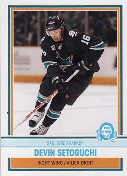
Tuesday, October 29, 2019Year: 2009-10 Set: O-Pee-Chee - Retro (Rate) “ As a general rule I don't like sharks... except the San Jose kind. And hammerheads. Hammerheads are cool. The San Jose Sharks are my 2nd favorite Western conference team. ” -Billy Kingsley
“ Now here is some rare originality despite it being the same year after year, a parallel set that isn't just a different color or finish, it actually has different photos YES!! ” -baseballcardstoreca
“ Its basic and retro... But to me, just isnt hitting the right notes. Close, but not quite there. ” -parsley24
“ Seems like we have had lots of hockey lately. Maybe just my imagination. This is one of the more boring cards I have seen lately. Even with a decent action shot it doesn't help the drab white border and baby blue writing. If they had done more orange and navy it would have helped. The back, oh the back is even worse. Black on grey is never a good option and the blue, for me is hard to see. ” -davidhandberry
“ Not my favorite OPC retro design, and I'm a fan of their retro parallels... ” -rmitchell6700
“ NIce OPC retro card. It doesn't look like the use of an older design just a new design in the old fashioned style. I like it. I wish more sets were done this way, retro style but not necessarily a reused design. ” -captkirk42
“ This one really has an old look. I always liked the name Setoguchi. Sounds very hockey-ish to me. ” -muskie027
|
Additional Comments
| Posted By | Message | ||||
|
Joined: Aug 2017 |
| ||||
|
Joined: Mar 2018 |
| ||||
|
Joined: Nov 2018 |
| ||||

")