Friday, November 20, 2020
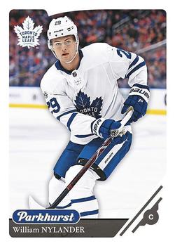
Year: 2018-19
Set: Parkhurst (Rate)
Card: #180 William Nylander
“ Great design. Unfortunately not stocked locally so I wasn't able to get any...even though we have 3 local teams. ” -Billy Kingsley
“ I kinda feel that since Parkhurst has made its' way to epack that it is the new cheapo Upper Deck brand taking over for Compendium. I actually liked Compendium better. IMO Parkhurst should be a more retro mid-level brand celebrating hockey cards with a distinguished look and style. ” -Gunny
“ Crisp and simple. Not bad. ” -DarkSide830
“ NIce hockey card. No real complaints but improvement for front would be moving brand logo someplace else or make it smaller than player name. Back use a different photo. Maybe add some highlights of players career or a small bio paragraph. ” -captkirk42
“ Nice hockey card. I never saw this set before. I like it. ” -switzr1
“ Overall, the design is nice and simple, which I like - but I wish they had used a different picture on the back, instead of reusing the same one ” -Coloradohusky
“ Clean card, but the extra-wide borders seem excessive...just like Nylander's six-year, $41.77 million contract. ” -wjhipwell
3
“ Same photo front/back. Boo. Card looks real nice, but that effort or lack there of really is off pudding for me. ” -parsley24
1
“ Classic crime of using the same picture on the front and back. Also could use a short bio on the back to fill the blank space. Otherwise, a solid card. ” -IfbBirdsCards
“ This is a very nice Hockey card. Maybe better if that same picture wasn’t used on both sides. Otherwise a nice card. ” -Derek McDonough
“ Such a great opportunity wasted on the back of the card for a different picture. ” -Blargh
1
“ Nice clean design. ” -Phil


")