Saturday, January 9, 2021
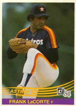
Year: 1984
Set: Donruss (Rate)
Card: #283 Frank LaCorte
“ A set that escaped me in my early years. I like it. ” -muskie027
“ One of the most iconic modern sets. If only Mattingly could have avoided the back injury and Strawberry would have just said no. ” -trauty
3
“ Probably the best design of the 11-year run of 1981-1991 for Donruss. Unfortunately, the back is pretty much the same from 1982-1991. ” -vrooomed
6
“ You know, I've always preferred to have full career stats on the back of the cards (likely because that's what Topps always did in my childhood). But as I age a bit I have to give Donruss props for a consistency with their 80s card layouts. Of course, these were pre-internet and it would have been really, really hard to get this card and say "hmm...I wonder what his career stats were before this" and easily dig up the information. Well, unless you had one of his Topps cards, I guess.
Oh--never cared for the front side design on the 84's. I like swooshes, but I like legibility more. ” -kents_stuff
“ Yesterday I said it was hard to say anything good about an Astros card. This card proves me wrong. Way before the trashcan scandal. And 1984 Donruss is one of my favorite sets ever. So I must admit I do like this card. ” -switzr1
“ I really like the design of this set. The back gives you just what you want and the front has a great full action shot. Then the team name swirl just finishes it off. Very nice card. ” -Camstone
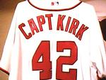
“ I like the pre-super overproduced years Donruss. The 1984 design I didn't like at first, but like it now. ” -captkirk42
“ Petitioning the Astros to bring back these uniforms and the shooting star jerseys. ” -IfbBirdsCards
“ I've always loved the 84 Donruss set for some reason. When I was a kid and these came out, I could not find any anywere! I think I only ever opened a handful of packs. I love the simple design, I wish Topps would rethink their design process sometimes! ” -cckeith


")


 Thumbs up to this set!