Wednesday, February 24, 2021
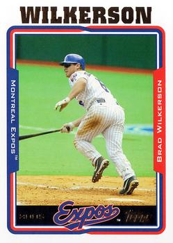
Year: 2005
Set: Topps (Rate)
Card: #79 Brad Wilkerson
“ Good thing that dirt stain wasn't a few inches the other direction... ” -Billy Kingsley
9
“ I like this Topps set. It's also a good chrome set. ” -abide
2
“ I really liked the design this year. The foil was well done and complimented nicely. ” -BrewerAndy
1
“ I really like this design overall for the card. It is a nice clean design. the only think is I would like the position on the front of the card. ” -kirkscards
“ This exists? I can't say I've ever seen a 2005 Topps Baseball card. Then again, I opened my first pack in 2016. The style reminds me of a low quality Minor League set. Not a fan. ” -NickyCollects
1
“ Not a big fan of the 2000's Topps designs, but the early ones are better then '07 and '08 at least. ” -DarkSide830
“ Nice Expos/Nationals card. One of my fave Expos to Nationals at the time of their move. During that inaugural Washington Nationals Season Brad was the Nationals spokesperson for Capital One bank or Oops might have been PNC bank. Hmm the more I think it might have been PNC bank. There was a cool commercial where he turns the "M" on his hat upside down to make the "W" and he has a briefcase for his bat. Sadly it has been ages since I've seen that commercial and have never found it online. Ah seems none of the banks involved nor the Nationals were pleased with the gimmick (https://www.karenfeld.com/cap-lost-dueling-pitches/) ” -captkirk42
“ This was the last year the Expos had cards printed before they moved to Washington. Also I like this design a lot, I like the reflective letters at the top. ” -pugchump
“ The name and team logo look good, but the team name and player name are difficult to read . . . The back is nicer than the usual Topps effort . . . Except for the vertical writing, a nice card . . . But the vertical writing ruins it . . .
” -georgecf
“ I like this design! ” -cjjt


")