
Random Card of the Day |
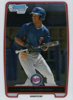
Saturday, February 27, 2021Year: 2012 Set: Bowman Chrome - Prospects (Rate) “ Maybe it's just me but I don't think the team logo should be smaller than the Bowman Chrome logo ” -pugchump
3
“ Either Daniel was planning to bunt and said "NO" or the photographer caught him just as he was starting to show a bunt. Either way, I like the photo and the design. Bowman tends to have nice designs overall, but Topps destroys that with multiple versions of EVERYTHING! I'd bet that there are 4-6 versions of this card before you even get into the parallels of this card. I still like the general design of this specific card though. ” -spazmatastic
4
“ This design is almost too basic. I dont like all the wasted space on the border. ” -parsley24
“ Solid! As a collector from the 1900's I've always had a thing for these shiny cards. ” -Madden95
“ I think I've mentioned my love/hate with Bowman sets many times. I like the designs for the most part. I recall in 2012 I got plenty of these cards and probably have a Nationals team set maybe, maybe not. I really hate the Prospect aspect of the set particularly the numbering system that Topps uses for Bowan flagship and Chrome. First they use BC# for the very base chrome cards which are the regular guys and vets, then they use P =Prospect well really BCP# Bowman Chrome Prospect, then there is I think BCPD which is Prospect-Draft or is it BCDP? see I'm confused already. Then when I look on the checklists to see if my card for some guy who was only drafted by the team with a minor league contract and never made it to the Big team is in the set that is called "Bowman Chrome Drafts and Prospects" or just "Bowman Prospects". I never know which "set" to look under. ” -captkirk42
“ yeet ” -Buckeye Fan
“ That's a good scan for a chrome card. I used to love them before I began scanning my entire collection. Not so much anymore. ” -Billy Kingsley
“ I never got into Chrome, but liked the few i pulled as inserts. They have a fun cool look to them. ” -muskie027
|


")