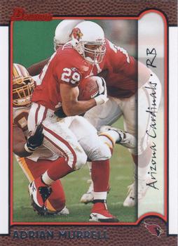
“ I like this card. Adrian Murrell did have a nice career. ” -Brendan Barrick
1
“ One of the best modern Bowman designs in my opinion. ” -dbro02
5
“ Nice design for a lower budget. Unlike Upper Deck, whose design work on the low cost product were abysmal. ” -hamrlik22
5
“ I like the look of this Bowman design, but don't like the team name and position being sideways in a strange font. Also player name hard to read in this scan. I forget it the cards in hand are hard to read. Back looks OK but could be improved, stats should be more than just the one season. ” -captkirk42
“ only if it was written in comic sans could this font choice be any worse. Boo on this design. ” -parsley24
1
“ i've always enjoyed the look of this set ” -Thunderfoot


")