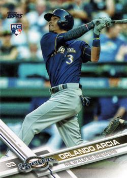
“ It's nice to see an actual plain ol' base card on here from time to time. You can only see so many supa dupa-fly mega retro-liquifactors numbered to 67 before fatigue starts to set in. ” -mkaz80
14
“ Like the RC logo. That mishmash of a design at the bottom takes up way too much of the card and draws way too much attention to itself. The focus of the card is the player, not your yearly design framing Topps! ” -Tscastle
4
“ Not a fan of the design, nor when topps just takes what they did the year before, but make it look different. ” -parsley24
3
“ Modern Topps design that I still haven't warmed up to much. It is OK but very tiring. Back very boring. I think if Topps were still using the card stock that was used pre-mid 1980s the background colors for these last few years of Topps sets would look like the Donruss backs from the 1980s. ” -captkirk42
1
“ I like this set, but found the design was not much different from 2016-2018. Nice to see a regular base set card on the RCOTD. ” -muskie027


")