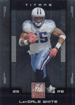
“ Donruss/Playoff put out some fine sets, but Elite wasn't one of them. The card fronts picked up fingerprint smudges like eyeglass lens and always had too much going on. ” -hamrlik22
1
“ I am tired of this design. I don't mind the front design if it wasn't all chrome (part of the point of the "Elite" product yes I realize). The computer printout type font used is hard to read, not impossible like some simulated to look like handwritten script, but still a little difficult to read. Back would be nicer with full stats, but since this is a higher end product except Donruss didn't seem to ever have a real regular/low budget "flagship" base set. ” -captkirk42
2
“ The front is nice. The back could have made room for the prior season's stats. ” -Brendan Barrick
3
“ Nothing too crazy about the card design but its still pretty solid ” -cheesy
“ LenDale, when one first name isn't enough. ” -UKboogie


")