Random Card of the Day
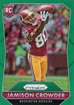


Wednesday, March 2, 2022

Year: 2015

Set: Panini Prizm - Green Prizm (Rate)

Card: #245 Jamison Crowder


“ Prizm is very cool, albeit very pricey. ” -muskie027
  3
“ Panini Prizm is probably the best looking recurring Panini set, and this one is no exception. Could use a team logo on the front though. ” -pugchump
  6
“ Right sport. Right division. Wrong team. Go GIANTS! ” -freakizon
  3
“ Great Photo and overall a good design ” -parsley24
  1
“ Not a fan of Prizm but MAN This is a SWEET looking card. It helps that it is a Redskin. The green works well as a border. ” -captkirk42
  1
“ 2015 was my favorite year for Prizm. I like this card. ” -switzr1
  1
“ It's always interesting to read the backs of rookie cards - at least those that include a written section. I can't comment on this player, but I'm guessing some of those comments age much better than others. ” -dilemma19

“ Nice card design, but it seems blurry to me. ” -BigDaddy
  1
“ Meh! When I first glanced at this image, I thought it was Jerry Rice. I guess any receiver is a let down after that. ” -tinyshogun
  1

Additional Comments

Posted ByMessage

just cards

Posts: 61
Joined: Jul 2015
Wednesday, March 2, 2022 6:08 AM

always like prizm i just wish baseball had the liscence


LESTER4HOF

Posts: 9
Joined: Jan 2022
Wednesday, March 2, 2022 7:07 AM

Great looking card!  Prizm definatly has always been sleek especially on the football front.   Doesn't hurt that its a pretty decent player too.


-------------------------------

Blake


CardSlave

Posts: 89
Joined: Aug 2021
Wednesday, March 2, 2022 11:09 AM

Well, I don't comment much on the site, but in this case I will say that the border should be straight and not angled into the picture.  The large PRIZIM logo or insignia is placed in the worst spot and the box border housing it is too large. It's important to me to show the athlete depicted in the card in their complete physicality, because their athletes and not head models or disperportinate manakins.  These people work hard at their craft and agree to terms to be photographed and what all else is asked or required of them, only to have partial photos or still shots (the worst kind of card is still shots) taken and used after the overlooking of them and instead the card company thinking of themselves or sales and design.  Move the logo and crop the border straight, and yes, clean up the blurry photo and now you have a decent Rookie Card of an ATHLETE and NFL player.  A decent and predictable set that seems to mix a feeling of Collectors Edge or Edge Advatage and old 90's PRIZIM with a little Topps Chrome on top.  Maybe that's crazy but I see these as that kind of today's hybrid card.  I tend to lean to plain or simpler card designs but see how certain cards in these sets are collectible and attractive.  I wonder sometimes, other than cost maybe, why we don't see a card with a more simple and plain feeling front of the card while then turning the card over to the back and then seeing a cool PRIZIM or Chrome or whatever design?  There is only one difference...the fun is on the back.  Spread BIO of the player on the front with card number on the front as well (I have never understood why the card number is on the back of the card) and stats on bottom of the back of the card.  Yeah basically you're flipping the card around, but it's at an advantage of the design to feature the athlete/player and then still have the flash. Of course adding another action photo on the back would be primary.  A still photo COULD be used as the front with BIO and card number, but an action photo fromt and back is keen.  Thanks for reading this. 
CardSlave


Onemorepoint

Posts: 1446
Joined: Apr 2014
Wednesday, March 2, 2022 11:28 AM

So many pointless parallels!


weekendroady

Posts: 224
Joined: Jun 2020
Wednesday, March 2, 2022 12:13 PM

I get it that rainbow collecting has its niche (I've gone after a few rainbows myself) but Panini has just gotten overboard with most of their products in that respect. I actually fear what to make of an extended "variation oversaturation"-era as opposed to any Junk Wax 2.0. Parallels have their place, but its just gotten ridiculous. 

As for Crowder, he's had a semi-respectable career playing for generally lousy teams (and I'm a Washington fan). Nice to see he's still in the league. 


Log in or register to continue.


Copyright © 2024 Trading Card Database LLC
Designated trademarks and brands are the property of their respective owners.