Random Card of the Day
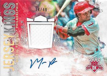


Saturday, March 5, 2022

Year: 2017

Set: Panini Diamond Kings - Jersey Kings Signatures Holo Gold (Rate)

Card: #JKS-MF Maikel Franco


“ Diamond Kings is pretty weak in general. Kind of a lame design here. ” -pugchump
  1
“ Signature looks like "Mr. P" ” -rmpaq5
  10
“ I thought this dude was going to have a better career. He had a couple of really good seasons and has just fallen off the past few years. Too bad, because this guy has the tools! ” -tinyshogun
  4
“ Nice looking card. Sure, some will complain about the missing logo, but blame MLB idiocy for that, not Panini. They would have a license if one was available. ” -switzr1
  1
“ Both 14 and 49 are divisible by his jersey number (7). ” -DanD
  2
“ OK design but like most relic auto cards it is too busy. ” -captkirk42
  3

Additional Comments

Posted ByMessage

WickedLobstah

Posts: 12
Joined: Sep 2018
Saturday, March 5, 2022 7:04 AM

Card looks awful. It's just a colorful mess that makes it hard to read the name. Reverse has the same photo which is sheer laziness imo.


DarkSide830

Posts: 227
Joined: Sep 2015
Saturday, March 5, 2022 10:36 AM

Even now this would be one I'd love to have. Visually appealing arrangement of the swatch and the signature.


lyfestory

Posts: 115
Joined: Jun 2013
Saturday, March 5, 2022 7:23 PM

Always liked Diamond Kings, but these kinda relic/patch cards are nothing to get excited about without the addition of an autograph. 


schwitz

Posts: 183
Joined: Nov 2021
Saturday, March 5, 2022 8:19 PM

I like the back better than the front.


-------------------------------

Collecting White Sox, Royals, and 1978 Topps Baseball. Trying to build a multi-sport HOF frankenset.

Done is better than perfect.


Onemorepoint

Posts: 1446
Joined: Apr 2014
Sunday, March 6, 2022 9:43 AM

The front is a bit messy and back a bit lazy


Log in or register to continue.


Copyright © 2024 Trading Card Database LLC
Designated trademarks and brands are the property of their respective owners.