
Random Card of the Day |
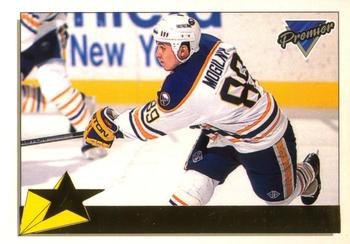
Thursday, May 5, 2022Year: 1993-94 Set: O-Pee-Chee Premier - Gold (Rate) “ im assuming the foil makes the scan bad, but an otherwise great photo and card front.
the back is boring ” -parsley24
1
“ Cheap, ugly, and with some of the worst photo choices of any release. It's like Topps didn't care. ” -hamrlik22
“ He shoots! He Scores!! ” -tinyshogun
4
“ I hope this design would have been rejected had scanner technology been the same in 1993. ” -hiflew
“ Needs a better scan ” -pugchump
“ OK looking set. Reminds me of Bazooka for kids a bit especially the back. Really hate the chrome font that you can't see in this scan. (Gold foil scanning as black on black background.) ” -captkirk42
1
“ Both the Topps and O-Pee-Chee Premier sets for this year were well done. I have already completed the Topps version, and just started working on the O--Pee-Chee version. The only way you can tell the difference between the two is the French text on the O-Pee-Chee version. The Gold Premier was an ok design. At least there aren't 20 different parallels as many current sets consist of. ” -Brendan Barrick
“ Nice picture on the front . . . you can almost feel that a sot is whizzing towards the goal . . whether that is what the picture shows or not . . . Back is pretty pedestrian and shows not much effort . . . ” -georgecf
1
“ He was pretty good in NHLPA '94 for the old Sega Genesis from EA Sports (it's in the game!). ” -BuccaneersDen
“ This is awesome! Also, it is a Sabre, so double awesome! And one of my favorites from the early 90's. 5 stars!!! ” -muskie027
1
“ Is his name in that foil stripe somewhere? ” -switzr1
|
Additional Comments
| Posted By | Message | ||||
|
Joined: Jun 2016 |
| ||||

")