
Random Card of the Day |
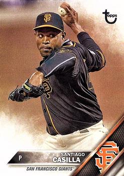
Monday, July 18, 2022Year: 2016 Set: Topps - Vintage Stock (Rate) “ I like the base set from this year. Not near as boring as the normal Topps release. ” -tinyshogun
2
“ For 2016 I like the peek of the logo with team color bars. However I’m not a fan of the smoky fade in the two adjacent corners and blurry backgrounds. ” -Tscastle
3
“ Hmm "Vintage stock"? Shouldn't the back ground look sort of grayish due to being raw cardboard? Or am I missing the point Topps is making? ” -captkirk42
1
“ This reminds me of some weird custom photo retouching that Facepage keeps giving me ads for. ” -jackal726
1
“ Probably my favorite newer set. I didn't know that vintage stock was numbered either. ” -TwinKiller
“ Good picture on the front . . . You can feel the intensity of his coiling up . . . Back is routine but it gets the job done. . . ” -georgecf
“ In my opinion, this is the worst Topps flagship design of all time. Followed closely by 2017. ” -hiflew
1
“ Meh. For a /99 parallel, it's underwhelming. ” -BigBoyOnWheels
1
“ I love 2016 Topps. Such a nice classic-style design. ” -pugchump
“ I actually liked this parallel for some reason, although, if not for the serial number, I never would have known I had a parallel. ” -muskie027
“ is there anything that makes this vintage other than the throwback topps logo and SN99 ? ” -abide
2
|


")