Sunday, October 9, 2022
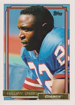
Year: 1992
Set: Topps - Gold (Rate)
Card: #689 Phillippi Sparks
“ I love Topps gold and love the 90s-era cards. But why do I feel like this is a common pose for each of these cards? ” -cardcollector65jw
2
“ I think the 1992 design was better than it gets credit for. This was the first year I remember the gold parallel and I remember when I got my first, I thought it was the greatest thing ever. It looked so cool and is way nicer than today's gold colored border parallels. ” -muskie027
9
“ I really like this design from Topps. The NBA set was their first since 1981-82 and I have actually come to appreciate it more now than I did when I began collecting that sport in 1996. And now that I'm collecting hockey, I can learn and explore hundreds more new to me cards, and their parallels. I love parallels. ” -Billy Kingsley
4
“ Alright. This guy never got to play in a Super Bowl for the GIANTS but watched his daughter sing the National Anthem at the big game (XLII) in their hometown [watching history as Tom Brady and the Patriots were dealt their only loss of the season, finishing 18-1]. Cool. I like this card's basic design and the gold foil on the parallels. I miss these sets with huge team checklists. ” -freakizon
“ I always liked the 92 Topps sets as they were the turning point from the cheaper cardboard look into the more modern appearance of cards. ” -lildog7
“ Good crossover set ” -parsley24
“ This was the first parallel set issued by Topps. You can tell it is a parallel, because the back has Topps Gold on it. Too bad Panini doesn't do it with its issues. You can easily tell which parallel set you are looking at. ” -Brendan Barrick
1
“ this card doesn't even have the best part of 92 topps inclued, as a kid this was one of my favorite sets cause i loved looking at the pics of the stadiums ” -Thunderfoot
2


")