
Random Card of the Day |
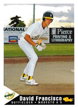
Saturday, June 26, 2021Set: 1994 Classic Best Modesto A's (Rate) “ I like the picture on the front. The back is pretty good too. ” -Brendan Barrick
2
“ For a minor league card it looks nice ” -cardcollector65jw
1
“ Like the interesting choice for the pose on this one. Setting up at second stealing poised to steal third. Hardly see that! ” -muskie027
1
“ Kudos for trying something different with the action pose, but I am not really sure what it is . . . He looks like a runner on third, waiting to take off, but it looks as if that is second base to which he is closest . . . It also looks like he is going to bunt without a bat . . . Nonetheless, it is not a bad-looking card . . . ” -georgecf
“ Francisco...that's fun to say! FRANCISCOOOO! ” -domentho
1
“ Good picture.
” -cjjt
“ Interesting Minor League card. Is he supposed to be "taking a lead" while pretending to be on base? Classic Best UhOH that probably means the base set has a couple thousand cards. ” -captkirk42
|
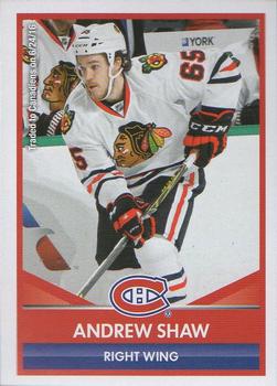
Friday, June 25, 2021Set: 2016-17 Panini NHL Sticker Collection (Rate) “ Nice front for a sticker. ” -Brendan Barrick
3
“ My one big bugaboo is shown here. Different logo and uniform ARGGGGHHH! Please don't do that! ” -Gunny
6
“ Shaw had a hat trick at a Red Wings game I went to. Stickers are cool. ” -pjdionne12
2
“ Nice Hockey sticker. ” -captkirk42
1
“ I wonder how Panini has the license to produce this card. From what I saw is Upper Deck and NHL had an exclusive deal. ” -cardcollector65jw
1
“ Beans Ball card blog will love to see this sticker. He loves stickers ” -parsley24
2
|
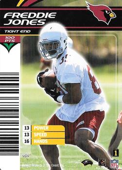
Thursday, June 24, 2021Set: 2002 NFL Showdown 1st & Goal (Rate) “ I'm thinking that is a bar code on the left, and I don't get it ” -abide
4
“ Ah NFL Showdown the football CCG/TCG The front is unusual with the barcode on the left there. Looks like a title card in a repack pack. OH Dear that is a feature on ALL the cards in this set. UGH. Not sure if I have any of these for my teams or my players. If Not I have no plans to get any. ” -captkirk42
2
“ The card games based on sports just look dumb ” -cardcollector65jw
4
“ What no logo on the helmet? ” -Brendan Barrick
|
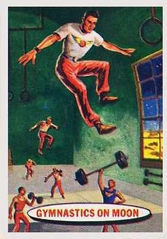
Tuesday, June 22, 2021Card: #59 Gymnastics On The Moon “ I can bench 6000 pounds. ” -domentho
2
“ I'd avoid injury doing a flip, and landing awkwardly on the floor, but would end up cracking my skull from drifting up into the ceiling. DOH! ” -CollectingAfterDeath
“ Gotta admit, looks fun. ” -rmpaq5
1
“ Awesome. I want to do gymnastics on the Moon! ” -cjjt
“ Nice vintage Non-Sport card that almost looks like a sports card. ” -captkirk42
“ This would be an amazing card as a kid for me because I was into the difference in weight and gravity on other planets/moons. In 4th grade we did the calculations of how much we would weigh on each planet and our moon and how it would affect our bodies. This card fascinates me 100%! ” -cardcollector65jw
3
“ I think I see Jeff Bezos and Elon Musk. ” -Godzilla8you
1
“ In 1957, only one house in my town could afford a color TV (not my house). Disney's Wonderful World of Color did not start broadcasting until 1961. So, it was a treat when Topps capitalized on the excitement of the space race and issued these Space Cards featuring full color illustrations of what space travel would be like. ” -IronButt
“ Any card older than me I find cool! There is no exception here! I'd be all over this set! ” -bkklaos
|
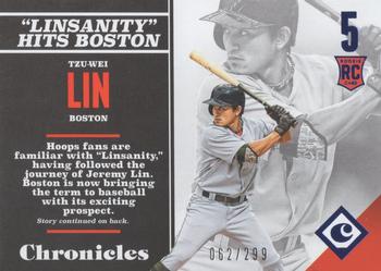
Monday, June 21, 2021Set: 2017 Panini Chronicles - Blue (Rate) “ 3 copies of the same picture. Lazy card making. ” -cjjt
8
“ Not a big fan of this set. The picture is not great and the write-up is even worse. The best part is we know print runs ” -goreds00
“ UGH another reason I don't like Panini Chronicles sets. The front looks like a back but not as much as the back looks like the back. My biggest beef with Chronicles is some of the "hits" that technically come from earlier years and earlier sets and are marked for those other sets but were not released as part of that set so they don't appear on an earlier checklist. Never in 1,000,000 years would I even think to look under "Chronicles" for some of those releases. ” -captkirk42
1
“ This is a great looking card but I hate that it is Panini and there are no logos. ” -cardcollector65jw
1
“ This looks like the back of a blaster box more than a card. ” -muskie027
2
|
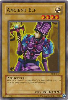
Sunday, June 20, 2021Set: 2002 Yu-Gi-Oh! Metal Raiders (Rate) “ I'm starting to understand why Yu-Gi-Oh! and MTG have been available at Target throughout. ” -jackal726
7
“ Nice looking Yu-Gi-Oh card. I wish they have chosen a different design for the back that swirling vortex thing is too plan and to me doesn't say "Yu-Gi-Oh". It says "What card game is this?" ” -captkirk42
“ More like Yu-Gi-Nooooooo lol ” -parsley24
2
|

Saturday, June 19, 2021Set: 2006 SPx - Spectrum (Rate) “ SPx baseball is [was ] a good product. 1996 die cuts with hologram, and then 1997 with a die cut in an x shape and hologram were 8's on the 10 point scale. absolutely loved the all serial number 1998, with 3 levels, grade 9, though also hated it, 1999 was nice, easier to build the set grade 8. after that the 2000-2009 sets are still good but grade 7 ” -abide
“ Just missed the HOF this year. Great glove, good bat. ” -Ken Kinsey
1
“ Rolen: humm-mph!!
UMPIRE: STRRRRRRRIKE THREE, YOUUURRRR OUT!!
Rolen: oh come on ump, it was a ball! ” -betaraymitch77
“ Not sure I like this SPx card set. Is the left side front chrome/foil? I'm guessing it is and that is why I don't like it. ” -captkirk42
1
“ Haven't heard his name in awhile, he had some real good seasons. This card has very little space devoted to the photo, which is a negative. ” -muskie027
1
|

Friday, June 18, 2021Set: 2016 Panini Prizm UEFA Euro (Rate) “ Bought a box of these at a card show held at Robert Morris University, the last card show they held at that venue. I was quite happy with them. I was a bit surprised that the card stock was pretty heavy. ” -Gunny
1
“ Another Soccer card for RCotD. Thankfully it isn't a game card, but UGH it's a Chrome/Prizm card. I am not a fan of chrome cards to begin with due to the overuse of them and the overall shiny of the cards. They just don't feel right to me. Of all the chrome type cards being made the ones that are absolutely on the very bottom of my list, so far down they are not even on it, are Panini Prizm. EVERY YEAR LOOKS LIKE ALL THE OTHER YEARS. It is often very hard to tell at a quick glance what season/year a Panini Prizm card is from. Sort of like Panini Donruss cards are all starting to look alike, but at least those you can sometimes spot the differences quickly. ” -captkirk42
5
“ Why do soccer players always have goofy faces. ” -OverkillKid
“ A beautiful card for the beautiful game. If only I could afford them. Sigh. ” -muskie027
1
|
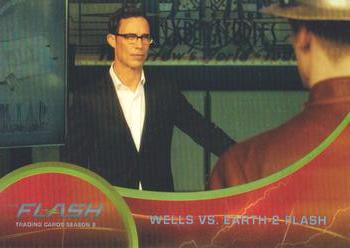
Thursday, June 17, 2021Set: 2017 Cryptozoic The Flash Season 2 - Rainbow Foil (Rate) Card: #14 Wells vs. Earth-2 Flash “ Could there be a worse card from a movie/tv show set? ” -parsley24
1
“ Just an OK non-sport card. Cryptozoic cards are still good but for a non-sport card this is just plain. OH I didn't notice it was a "foil" card I wouldn't have known without the card name/description. ” -captkirk42
“ Would you like to make a deal with me? ” -OverkillKid
1
“ Harrison Welles is probably my favorite character on "The Flash," but this card hardly seems merited . . . It is not a bard card, and checks al the necessary boxes, except for one: Was this card really necessary??/ . . . The same can be said for cards based on TV series and Movies . . . they often fail to capture the "heart" of the subject, and would not be missed if they didn't exist . . . ” -georgecf
“ I thought the caption was going to read "The Royal Canadian Mountain Police respond to a disturbance call at local business." ” -muskie027
1
“ I feel like this could have been a more dynamic shot. Also the red and silver border is very subdued and a bit hard to read. ” -Vonnegut37
|

")