
Random Card of the Day |

Friday, June 18, 2021Set: 2016 Panini Prizm UEFA Euro (Rate) “ Bought a box of these at a card show held at Robert Morris University, the last card show they held at that venue. I was quite happy with them. I was a bit surprised that the card stock was pretty heavy. ” -Gunny
1
“ Another Soccer card for RCotD. Thankfully it isn't a game card, but UGH it's a Chrome/Prizm card. I am not a fan of chrome cards to begin with due to the overuse of them and the overall shiny of the cards. They just don't feel right to me. Of all the chrome type cards being made the ones that are absolutely on the very bottom of my list, so far down they are not even on it, are Panini Prizm. EVERY YEAR LOOKS LIKE ALL THE OTHER YEARS. It is often very hard to tell at a quick glance what season/year a Panini Prizm card is from. Sort of like Panini Donruss cards are all starting to look alike, but at least those you can sometimes spot the differences quickly. ” -captkirk42
5
“ Why do soccer players always have goofy faces. ” -OverkillKid
“ A beautiful card for the beautiful game. If only I could afford them. Sigh. ” -muskie027
1
|
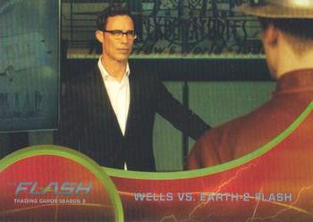
Thursday, June 17, 2021Set: 2017 Cryptozoic The Flash Season 2 - Rainbow Foil (Rate) Card: #14 Wells vs. Earth-2 Flash “ Could there be a worse card from a movie/tv show set? ” -parsley24
1
“ Just an OK non-sport card. Cryptozoic cards are still good but for a non-sport card this is just plain. OH I didn't notice it was a "foil" card I wouldn't have known without the card name/description. ” -captkirk42
“ Would you like to make a deal with me? ” -OverkillKid
1
“ Harrison Welles is probably my favorite character on "The Flash," but this card hardly seems merited . . . It is not a bard card, and checks al the necessary boxes, except for one: Was this card really necessary??/ . . . The same can be said for cards based on TV series and Movies . . . they often fail to capture the "heart" of the subject, and would not be missed if they didn't exist . . . ” -georgecf
“ I thought the caption was going to read "The Royal Canadian Mountain Police respond to a disturbance call at local business." ” -muskie027
1
“ I feel like this could have been a more dynamic shot. Also the red and silver border is very subdued and a bit hard to read. ” -Vonnegut37
|
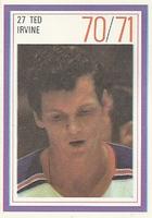
Wednesday, June 16, 2021Set: 1970-71 Esso Power Players (Rate) “ When I was a kid my uncle gave me this entire set in its album, no idea what became of it. ” -rmpaq5
2
“ Love these off the wall sets. If I collected Hockey this would be a set I would try to get. ” -goreds00
“ This is ok for a stamp. It will have been better if the front was of an action shot. ” -Brendan Barrick
“ This is the exact expression I have when seeing yet ANOTHER hockey card being featured. ” -domentho
1
“ Hmm, Chris Irvine's father, that's how I know of him. Chris has a few cards on the site too, but not in hockey. He's none other than Y2J, Chris Jericho, former WWE and AEW Champion! ” -jupiterhill
3
“ Put a tiger in your tank, and a power play packet in your pocket at Esso. These were cool stickers/stamps, but not as good as the Loblaws issue a couple of years later. ” -BuccaneersDen
“ I give this card a 70/71 on design ” -parsley24
“ The Father of Le Champion! ” -stevejrogers
2
“ Nice sticker/stamp set. ” -captkirk42
“ He looks like he was handed something magical and doesn't know what to do with it. ” -OverkillKid
“ This "power player" looks like he can barely stay awake. ” -NJDevils
“ I like the back better than the front. ” -jayoneill
1
“ This Card looks like someone took a picture when he was not paying attention. ” -cardcollector65jw
1
“ Love the classic look of this card. Nothing flashy, just straight to the point. ” -EJP
“ It is an image. ” -UKboogie
1
|
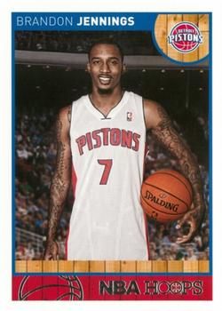
Tuesday, June 15, 2021Set: 2013-14 Hoops - Red Back (Rate) “ After looking like a future superstar his first year in the NBA, I'm kinda surprised to see that he's been out of the league for a few years already. ” -trauty
2
“ One of the all-time dumbest parallel concepts, but at least "red back" is better than "blank back" variants. ” -bevans
2
“ Another career that died in Detroit. Decent enough looking card but looks more like a RC than a vet. Go Pistons! ” -pjdionne12
1
“ A nice Panini Hoops card and it's a "Red" back. For some reason I like the standardized Panini Hoops backs. OK they get boring year after year but they are pretty consistent not too ugly and they tend to have full stats not just the previous season stats. ” -captkirk42
“ I don't get why they are using a portrait for a veteran player, I get it for a rookie but this is a veteran. ” -cardcollector65jw
“ Nice-looking card . . . For some reason, cards appeal to me when they feature a picture of the player with the stadium/arena in the background . . . They look clean and crisp . . . ” -georgecf
“ The backs are terrible, but I always liked Hoops. ” -muskie027
“ Reminds me of high school when you got your yearbook pictures taken and your parents would complain about the price but still buy a package and then mail off the smallest ones to relatives. ” -Blargh
1
|

Monday, June 14, 2021Set: 2003 Donruss Studio (Rate) “ An OK set. I am not a huge fan of the Studio sets, this one has a good concept having the player look like they are in front of their home stadium. I don't like what they did with the "Rookies" and "Prospects" with those letter tabs on the right or whatever you want to call it. I had to look at a couple of cards to figure out when they did that and what it actually said. Very hard to read those "tabs". Back uses those "tabs" for the personal stats. It works a little better on the back but still looks a bit strange. ” -captkirk42
2
“ 2009 World Series MVP ” -jayoneill
“ Except for the "Rookie" blocks on the right, this is a beautiful card . . . Showing Matsui against a backdrop of Yankee Stadium looks great . . . It probably could have been cleaned a bit, but it is nonetheless a nice-looking card . . . ” -georgecf
2
“ I like the view of Yankee stadium in the background. ” -Fremonthaus
|
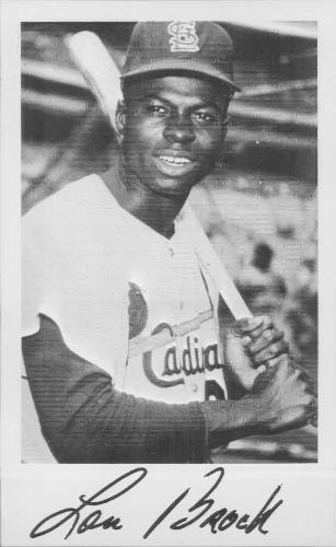
Saturday, June 12, 2021Set: 1970 St. Louis Cardinals Picture Pack (Rate) “ A legend, but kind of boring for my taste. ” -muskie027
2
“ For a70s card this is very sharp ” -cardcollector65jw
2
“ Legend and despite being a non-traditional trading card, I love it! ” -bkklaos
2
“ Nice team photo set. My big problem with this photo set is some are signed some are not. Fortunately the unsigned ones have the player's name at the top, but the signer ones don't have the name at the top. This inconsistency within the set I don't like. They should all have the player's name printed at the top. ” -captkirk42
“ Still one of my favorite sports references in a rap song
“ Okay, if knowledge is the key then just show me the lock
Got the scrawny legs but I move just like Lou Brock
With speed, …”
A Tribe Called Quest - Check the Rhime ” -StarrsCards
|
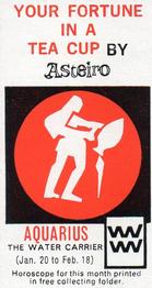
Friday, June 11, 2021Set: 1966 Fine Fare Tea Your Fortune in a Tea Cup (Rate) “ Uh, okay. ” -trauty
2
“ Dang...One card sooner in the checklist could of got me a free horoscope reading. ” -rmpaq5
2
“ Now this is different! Being an Aries I might have to try to track that one down! I hope it's not a "rare" one! ” -bkklaos
1
“ Wow I almost thought this would have been some in packaging advertising instead of a collectible. it stinks that 1) the card itself doesn't have a horoscope and 2) you had to collect the FULL SET and send that in to GET the horoscope. Granted it was a full year's worth "fortune". ” -captkirk42
“ They are not a good water carrier. Also a Horoscope card. I've seen it all now. ” -OverkillKid
“ This seems pretty intriguing ngl ” -mkb
“ I am trying to decipher what is going on in this picture. ” -cardcollector65jw
|
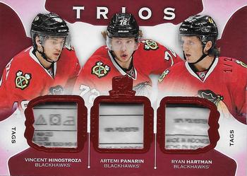
Thursday, June 10, 2021Set: 2015-16 Upper Deck The Cup - Cup Trios Jersey Tag (Rate) Card: #C3-ROOK4 Artemi Panarin / Vincent Hinostroza / Ryan Hartman “ 1 hockey player, 2 hockey player, 3 hockey player. I can’t do that much laundry. Sorry no room at the inn. Good luck else where. ” -cardcollector65jw
4
“ The front has nice memorabilia pieces. The back is typical of a memorabilia card. ” -Brendan Barrick
“ I never bought any of The Cup. I do know there are some fellers at the LCS that go nutsy cuckoo for this product. As for this card it does look nice but laundry tags just don't quite do it for me. ” -Gunny
3
“ Looks like an old slot machine. And not a good one. ” -hamrlik22
1
“ Nice card! Great tags! ” -cjjt
“ I thought this was a slot machine that didnt hit when i first saw this card. ” -parsley24
2
“ I think this is awesome! If I had it, I'd sure be wondering who had the other one! ” -bkklaos
“ OH boy tag relics from a player worn PHOTO SHOOT. Sorry about my sarcasm to those collectors who love relic cards and laundry tag cards like this. To be honest before I saw they were supposed to be "tags" I thought the card was missing something or they inserted some plastic with printing as place holders. ” -captkirk42
1
“ I'd prefer patches over tags. But still a nice rare card 1/2. ” -trauty
“ RC "Photo shoot" relic / patch - laundry tag - SN2 - is a sweet card, a player collector / team collector will love that card, any sport / player(s) .... but having said that, those laundry tags are weak. ” -abide
1
|

Wednesday, June 9, 2021Set: 2003-04 Upper Deck - Gifted Greats (Rate) “ Really like the way this card looks with the pucks looking like it is going into hyper speed ” -cardcollector65jw
1
“ What the puck is going on here? ” -domentho
4
“ Looks like he is at warp speed. Mr. Scott full power! ” -rmpaq5
“ Needs more pucks ” -parsley24
“ Unfortunate positioning of the puck movement makes it look like they're exploding out of his rear end. Upper Deck always comes up with novel ways to make awkward cards. ” -hamrlik22
“ Space invaders with hockey pucks? Magic "mojo" hockey pucks? Why all the flying hockey pucks? ” -captkirk42
“ Too many pucks for my taste. ” -Brendan Barrick
1
“ Kind of a cool effect on this one. ” -muskie027
|

")