
Random Card of the Day |

Wednesday, December 6, 2017Set: 1994 SkyBox USA - Gold (Rate) “ He is still better than his son. ” -carthage44
“ Trademark move and no "UTEP, two step"? great photography in the design though. ” -parsley24
“ An OK set. Except the cards of guys in the USA team jerseys with no identification of which team they normally play on. ” -captkirk42
“ A unique design that breaks the rectangular banner mold with the horsesho-shaped one. I'd make the USA in red, white, and blue, though. ” -Sportzcommish
“ I like this card. I liked this set. Hardaway even spent part of a season with the Pacers late in his career. I guess I technically liked the base set, and this is a gold parallel that I didn't remember even existing, but I still like the look of it. ” -switzr1
“ Skybox had a good run. Really fun player to watch and that was a great Warriors team back in the day. Surprised they never made it to a Finals. ” -muskie027
|

Tuesday, December 5, 2017Set: 2010 Upper Deck MLS (Rate) “ This is actually a pretty good card design. Neat uniform. Why are the stats selective on the back? Or did he take years off? ” -Billy Kingsley
“ I really like the FC Dallas shirt that year. Also, I've always been ok with horizontal cards. So I guess I'm saying this card is a winner with me. ” -switzr1
“ Sharp design with a semi-action shot, but I'm certain the whole set is not horizontal. I prefer them to all face one way. ” -Sportzcommish
“ FC Dallas... It's what's for dinner. ” -mkaz80
“ Nice change of pace...an American soccer card, with NO weird numbers and attacks. I could get into this! ” -RoyalChief
“ The best action shot they got? ” -carthage44
“ good design, i still have yet to ever buy a soccer card though. ” -parsley24
“ Nice looking soccer card. ” -captkirk42
“ Not a bad soccer design. Not sure what that white stripe is doing there though. ” -IfbBirdsCards
“ At least I understand this soccer card. Most soccer cards look like game cards. This one lacks all the meaningless numbers that some soccer cards have but it also lacks anything interesting. ” -cnangle
“ Best soccer card that has been COTD. ” -NJDevils
“ Nice to see a soccer card that is not a game of some sort. The front design is nice. ” -kents_stuff
“ Upper Deck made some really nice soccer cards. Check out the pictures in all the sets they did. Phenomenal! I got some 2012 cards as a free gift from Dave and Adams and those were great too! This one has a slightly smaller name than I would like, but a great looking card overall. ” -muskie027
“ This is a pretty nice card in my opinion. For once we have a soccer card that is not a game card! The only thing I don't care for is how they did the stats. Either give us recent stats or give us career stats, but don't mix-and-match years, that is really strange! ” -cckeith
|

Monday, December 4, 2017Set: 2010 Panini Absolute Memorabilia - Retail (Rate) “ When they were doing dual sets for hobby and retail, I actually like the retail one better. Now for the Absolute brands it's generally hobby only, and usually all mirror foil. I still collect them for my sports, but I don't enjoy them all that much. ” -Billy Kingsley
“ An impressive looking card albeit for Panini and a Packer. ” -Sportzcommish
“ I'm a sucker for the team helmet on the back. Brings me back to when I was young and had those little plastic football helmets with all the team logos on them. ” -carthage44
“ Ok design. I wasn't collecting in 2010, so I've never seen one of these. Seems to be a lot of nothing going on in the bottom right corner. ” -switzr1
“ I often like Absolue This one the front is OK could be better. Back wish they would have more than just one year of stats. ” -captkirk42
“ Do not like the design in the lower right corner. ” -kirkscards
“ I hate retail/hobby sets, ” -cjjt
“ Too much wasted space for my liking. ” -kents_stuff
|
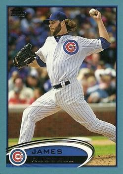
Sunday, December 3, 2017Set: 2012 Topps Update - Walmart Blue Border (Rate) “ I know most people complain about them (constantly) but I love parallels, and the changing of a normally white border to some other color just "works" for me. ” -Billy Kingsley
“ Oh great, the infamous Wal-Mart Blue Border. As if there aren't enough parallel's already, we now need to distinguish by store. Has anyone ever said, "I've got the base set, but I won't be happy until I get that coveted Wal-Mart Blue?" I doubt it. On the plus side, I really liked the look of 2012 Topps. Wish I had re-entered the hobby earlier so I could have gotten in on these. ” -muskie027
“ I just can't get into the retail game. ” -carthage44
“ Not impressed Topps. ” -parsley24
“ Dang, I miss baseball season. lol ” -Doe MG
“ Ah the "surfboard" set as some have dubbed 2012 Topps Baseball in the blogisphere. In general I like the set design the back like it or not is the standard Topps back design for the last decade or two. I tend to get confused with the update sets and then they have all the different parallels like this one the Wal-Mart Blue Border which is a lighter blue than their regular blue border parallel. I really wish they would stop with all the parallels and the short printed just to be short printed and annoy set collectors. ” -captkirk42
“ Love the blue borders on cards. ” -MLBaseball
“ That is indeed a blue border. Not exactly sure why this parallel would be needed, but whatever. ” -kents_stuff
“ This border looks real good on Royal cards. Got a few of these, wouldn't mind completing the team set. ” -RoyalChief
“ I've always liked the 2012 Topps design, even if the foil surname in the black doesn't show up in a scan very well. ” -olerud363
“ One of the main color parallels I collect, decent color and usually plentiful to find. I like them! ” -Joshua825
“ I actually miss these easily found parallels. ” -rmpaq5
|
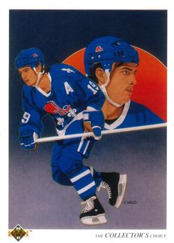
Saturday, December 2, 2017Set: 1990-91 Upper Deck (Rate) “ I prefer team cards to be more than just a team checklist, but at least the artwork was nice on these early UD ones. ” -Billy Kingsley
“ I miss these cards so much. ” -beansballcardblog
“ If this isn't my all-time favorite hockey set, it is definitely top 5. This set was awesome, from the bright white cards with the great hockey photos, to the awesome black package wrapping. I loved the art on the team checklist cards. This set was just all-time great! ” -muskie027
“ The Upper Deck checklist cards from this era are probably the nicest and most collectable checklists ever produced. Still love my 1989 UD Canseco As checklist. ” -tbshaw
“ Did not like these checklists with drawings on front. ” -NJDevils
“ Red Sun? ” -carthage44
“ Beautiful checklist cards that highlight team leaders on the front. Surely this has become the bar others are measured to. ” -Sportzcommish
“ Classis Upper Deck ” -kirkscards
“ Cool Nordiques card. I love cards of defunct teams, and always hope those cities eventually get a new team with that same name (without stealing a team from another city!) ” -switzr1
“ Loved the Collector's Choice checklists as a kid, and I love them now! It looks like they didn't credit the artist on the backs for the first edition. ” -DanD
“ One of the very best, classy guy . I really like this set , this was before U.D. thought more was better. ” -uncaian
“ As much as I think the early Upper Deck sets are boringly dull I have always liked these Team Checklist portrait cards. ” -captkirk42
|

Friday, December 1, 2017Set: 2015-16 Panini Excalibur (Rate) “ I believe he's the oldest player currently in the NBA...a future Hall of Famer for sure. Unquestionably the best Argentinian player in NBA history, he's won multiple championships and played a vital role in getting the national team from his home country into Olympic contention. Part of the Spurs' "Big Three" with Tim Duncan and Tony Parker that made them a powerhouse in the past decade and a half, he's unique in being the only member of any Big Three on any NBA team to not be a starter for much of his career. ” -Billy Kingsley
“ It's Manu, the ageless wonder. What's not to like? ” -Sportzcommish
“ Why is manu playing in front of a giant bathroom floor tile? ” -rmpaq5
“ Is that a napkin behind him? Weird, distracting background. ” -switzr1
“ Oh, Panini. You do love your graphics, don't you? ” -Brimose
“ Looks more like a board game. ” -carthage44
“ So whose idea was it to put the basketball player on the wedding invitation? ” -NJDevils
“ Kind of neat design. Reminds me of a playing card. ” -olerud363
“ this is such a dumb name for a card set ” -Bargunmaster
“ I'm not a basketball collector, but this is a good looking card! ” -Doe MG
“ I don't like this hi-end set much. The background for something so simple is too busy. Back is OK for some kind of insert but not base. Oh it does have some stats I didn't see the career stats line at first. ” -captkirk42
“ I just don't like it. I guess this is what happens when you have way too many sets put out by one company. Just weird nothing backgrounds and not much to celebrate on the back of the card. Manu is awesome though. ” -muskie027
|

Thursday, November 30, 2017Set: 1992 PYQCC Muscle Cards II (Rate) Card: #177 1973 Ford Mustang Mach 1 “ Loved this car, but I owned a '65 Mustang at the time, which was followed by a '57 Chevy a year later. ” -Sportzcommish
“ Cool, if you are a gear head. ” -carthage44
“ Awesome. I love these cards and I remember buying them in packs when they were new...came fairly close to completing it at the time. I should find a cheap box on eBay and try and complete the set and replace the cards that got damaged from being in pages. There was a time in my life... around the time of this set's issue actually...where the Ford Mustang was my dream car. Then I was introduced to the El Camino and later I discovered the Edsel. I was 8 years old when this set came out. ” -Billy Kingsley
“ True muscle in this muscle car. Nice. ” -kents_stuff
“ Now we're talking. I wouldn't mind having some cards of cars like this. Although the car might stand out more in a lighter backdrop. ” -switzr1
“ Very nice change of pace. And, of course, very nice card. ” -NJDevils
“ Not my thing as it pertains to carDs, but it's a cool car. ” -beansballcardblog
“ i think this is just an up close photo of a hot wheels car ” -Bargunmaster
“ Nice looking Non-Sport set for gearheads that are into muscle cars. 1950s - early 1970s in my book were the "muscle car" days. ” -captkirk42
“ "Thumbs up!" --gene siskal ” -parsley24
|


Tuesday, November 28, 2017Set: 1996 Upper Deck Road to the Cup (Rate) “ Yawn. Zzzzzzzzz. ” -Sportzcommish
“ One of the strangest headshots I've seen. Looks like he's happily being swallowed. ” -olerud363
“ I'm not huge into auto racing, and less so into auto racing trading cards, but I do appreciate both. But my opinion of the best design of racing card is driver on front, car on back. Having two 'candid' shots of the driver with no 'action' doesn't seem as exciting to me. ” -Brimose
“ Never saw such a bland, nondescript card before. ” -NJDevils
“ I'm guessing this is a racing card. WHERE'S HIS CAR? ” -captkirk42
“ Good photos, but hard to red the front. ” -kents_stuff
“ this guy has raced on more races then most of us will ever see, retired from nascar but still running his dirt car every week ” -Thunderfoot
“ Hey, I got another RCOTD! To be honest I didn't like this set that much, but glad I got it. I loved NASCAR so much more back at this time. ” -jupiterhill
“ I thought it was a non sport card. Nothing about this says Racing to me. ” -switzr1
|

Monday, November 27, 2017Set: 2008-09 Upper Deck Artifacts (Rate) “ Only 5 years of stats? Only 5 years of stats! Oh, wait, he was a 5th year player. Never mind. ” -switzr1
“ Another hockey card, excellent! The design on these is pretty good but Artifacts is not my favorite brand. Although not shown on the front of this card, the Senators have my favorite team logo in all of sports. I'm a huge fan of ancient Rome and the team plays that up quite a bit. ” -Billy Kingsley
“ i dont see an artifact ” -Bargunmaster
“ Love the football Artifacts sets but not these. ” -carthage44
“ Good looking card. Really like the back. ” -NJDevils
“ Nice looking card but player name should be more prominent, they have team name but team logo would be great to help identify quicker. Back oh there is the team logo back is pretty good. Overall it could do with better coloring. I guess this is supposed to look like leather? ” -captkirk42
“ One of the most underrated hockey players . Not the prettiest , not the ugliest. ” -uncaian
“ I bought my first packs of Artifacts this year and I am not sure if I am committed to collecting them. They look nice, but I like the regular standard Upper Deck sets so much better. This looks ok at best. ” -muskie027
|

")