
Random Card of the Day |

Thursday, December 21, 2017Set: 1991 Impel Marvel Universe II (Rate) Card: #152 Avengers West Coast “ Although I prefer DC over Marvel, they have always had better cards than DC. Apparently the guidelines stating properly cropped does not apply to whoever posted the scan. There is no white border on the top of the card. ” -Billy Kingsley
“ One of the few non-sport sets I still own. And West Coast Avengers #6 was the first Marvel comic I ever bought (excluding licenced properties such as Star Wars, GI Joe, and Transformers). Impel would of course change its name to Skybox about a year after this set came out. ” -bevans
“ I prefer the East Coast Avengers. ” -carthage44
“ No.... This was when there were just too many weird parallels and cards and card sets. ” -parsley24
“ Cool Non-Sport. Ah The Avengers West Coast. When this title first started I was still majorly into comic books. I have quite a few of the first few issues. I'd have to check the box they are in to see which ones I actually have. The Marvel Universe card series is pretty good. If I recall it was pretty well balanced, not Spider-Man heavy or Capt. America heavy like other Marvel Comic sets are. Impel was a good card company. It was bought out by Skybox which in turn, as many card collectors know, got bought up by Fleer. ” -captkirk42
“ Thank the lord the MCU didn't use "classic costumes." ” -rmpaq5
“ Don't confuse us with those East Coast Avengers - we want NOTHING to do with those guys. ” -royals
“ Who's the guy in pink? ” -Sportzcommish
“ Hmmm. Nope. Prefer East Coast Avengers. ” -Joshua825
“ I had NO IDEA about the annual softball game! Do they still do that now, 25+ years later? What's the series record? ” -kents_stuff
“ Um, maybe the East Coast was cooler? I am unfamiliar. I am not opposed to comic stuff, just to be clear, I even like a lot of it, I just don't know this bunch, except for maybe is that Iron Man in the back? ” -muskie027
|

Wednesday, December 20, 2017Set: 2000 Donruss - Dominators (Rate) “ Not bad. Not great, but not bad. ” -switzr1
“ It's finally NOT a hockey card! That was a weird streak of same-sport cards. As for this card, not bad but also not great. Awesome pic on the front, nice pic on the back and an SN on the card. But the design is weak and there are no stats at all. If I was rating this card on a 10-point scale, it would get a 5. That is ONLY because of the pics though! Otherwise, I'd rate it lower, ” -spazmatastic
“ Not a bad insert design, but why is DOM so big and bold? It looks funny. Weird funny, not haha funny. ” -Billy Kingsley
“ It's Emmitt. He dominated. Could be a 1-card set. ” -Sportzcommish
“ Best all-around running back of all-time, PERIOD! ” -carthage44
“ Ok looking card. Probably not a parallel that is needed though. ” -parsley24
“ Nice insert card. Far from being my favorite team or player. Back is nice. Oh the days of super sized serial numbers numbered to the thousands. ” -captkirk42
“ Might as well title this set “DOMinators,” if I could make the other letters any smaller, I would. But I like this design, other than the title on the side. ” -IfbBirdsCards
“ One of the greatest players ever ” -MLBaseball
“ Not too bad of a card. Would like some stats, but the front is pretty decent, despite the blurry font. ” -kents_stuff
“ A true great. The pose and look has that greatness look. The Dominators thing going on isn't cool, nor is the decreasing font, actually, that's bad. This would be great without that stripe on the left. ” -muskie027
|
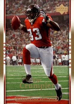
Tuesday, December 19, 2017Set: 2007 Upper Deck - Gold Predictor Edition (Rate) “ He seems excited about something. Did he score a touchdown? There are no other players or officials visible on the field, so it seems unlikely. I have no idea what makes this a Predictor Edition. ” -switzr1
“ Great photo! The colors work wonderfully well together. The frame with player info is sufficiently sized that it doesn't overwhelm. ” -Sportzcommish
“ No idea what Gold Predictor Edition means, but I like this card. Great design, and it looks like the name and UD logo are in gold holofoil, which looks great in hand. ” -Billy Kingsley
“ Merry CRUMPmas everyone!!!! ” -parsley24
“ "Like OMG! I just got me a touchdown!" ” -olerud363
“ For some reason I like the 2007 Upper Deck sets. Even though the player's name is often hard to read and the team name and player's position vertical. You can tell this is the gold parallel edition because of the hint of gold on the side borders and the player's name in gold foil, plus the back has some gol... OK maybe the back doesn't have any gold on it. A least it looks like full stats on back. ” -captkirk42
“ The Crump's was a very good TE for a long time. ” -carthage44
“ Not sure I understand the "predictor" aspect. But good design. ” -cjjt
“ "What does the random name generator have for me today? Predictor Edition it is!" - guy at Upper Deck probably Alge looks particularly lineman-ish here. If it weren't for the #83 I'd not have guessed it was him. ” -OCHawkeye
“ Ew. ” -beansballcardblog
“ With a name like that, he could be Aquaman's nemesis. ” -DanD
“ Not a fan of this one. Hard to read players name. Back is OK. ” -KMack
|

Monday, December 18, 2017Set: 1999-00 Upper Deck Ovation (Rate) “ I liked the Ovation brand because it always featured texture/embossing. The sides here are made to feel like a basketball. ” -Billy Kingsley
“ Love the leathery feel to these, but wonder how they'll last over time. ” -Sportzcommish
“ I like this set. The surface feels like a basketball. ” -switzr1
“ Hope he's not trying to call a timeout. SO COLD! ” -carthage44
“ Chris Webber, I forgive you (and Jalen Rose). I attended the University of Michigan. During grad school, the Fab Five arrived on campus. I admit that I was skeptical of them but grew to love their brashness. Then came the Final versus UNC. For the longest time, I blamed Chris Webber the loss, but also Jalen Rose. Webber did travel then called a non-existent time out. I blame Rose because after Webber got the rebound, Jalen should have take the ball out of Chris' hands and dribbled up the court because that is what point guards do. I thought Jalen wasn't there to do that because he was at the other end of the court waiting to score the winning basket. Or so I thought. Then I saw the tape recently. Jalen was there for the ball. Webber failed to give it to him, and thought people on the bench were calling for a time out. Chris Webber was 19 YEARS OLD. He messed up, but he was 19. I messed up at 19 and most of us do but never in such a public way. I forgive you. Much Love. ” -cjjt
“ I both like and hate the Ovation designs. It is real cool they use the ball background and in some years textured the cards to copy the feel of that sport's ball. Other than that the design is just plain dull. I see some will be upset with the back using just one photo. ” -captkirk42
“ The Ovation baseball designs worked well with the ball seams on the front, but the concept doesn't translation well to basketball. ” -olerud363
“ great looking card but the basketball was too much IMHO ” -parsley24
“ Fleer did a better ball background in the 1994-95 NBA All Stars insert set. No ovation here. On second look, the card is plain ugly. ” -NJDevils
“ Meh. I did like the football and baseball versions so I suppose if you're a basketball collector, it's probably a card you like. ” -beansballcardblog
“ The leather background is cool, but what is the deal with the wider of the two rectangles behind CWebb? Is there something in there that didn't scan well? Also I find the name too small for my liking. ” -kents_stuff
“ I like this even though it is a lot of space dedicated to the basketball. If the basketball portion of this card had a leathery grooved surface that felt like the ball, this would be cooler. I am unfamiliar with this card, so I am not sure if it does or not. ” -muskie027
|
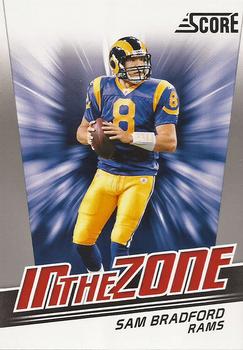
Sunday, December 17, 2017Set: 2011 Score - In the Zone (Rate) “ Ok for an insert. If this was a base card it wouldn't be good, but, since it's not, good enough. I think I actually have a card from this set, kind of rare for football. ” -Billy Kingsley
“ Zoned out by the overindulgence in graphics and fonts and limited focus on the player. ” -Sportzcommish
“ Forgot he ever "played" for the Rams. ” -carthage44
“ Score was always fun to open but nothing I ever collected. Decent player, don't think he ever truly reached his potential. Hope his knees allow him to play for longer. ” -JoshReese92099
“ Looks like a box of laundry detergent. ” -NJDevils
“ Whoa! I didn't know Sam Bradford was in the last 20 minutes of "2001: A Space Odyssey." ” -Vvvergeer
“ Not a bad design overall, but would be improved with less card company stuff (e.g., "Score" and "In the Zone") and more player and team stuff. ” -kents_stuff
“ This uniform color and combination are my favorite of the Rams. ” -RoyalChief
“ it looks like the packaging for a card set. ugly ” -Bargunmaster
“ mr. injury ” -Thunderfoot
“ Look out Sam! You're about to be sucked into the nothingness void of a Black Hole! I seriously thought this was a packaging image at first glance. ” -rmpaq5
“ This looks like a box cover or one of the ad cards in every pack telling you that you have a code, or can win Kid Reporter at the Super Bowl or something. I don't think it is bad, there is something catchy to it as an insert, but just a weird feel to it, like it isn't really a card. ” -muskie027
“ Well....it looks like the zone he's in might be the neutral zone. I think he might be with the federation! ” -Joshua825
“ Nice looking card. I enjoy the Score sets, even though I think they use too much white. ” -switzr1
“ Nice insert card. If I don't have this card I should have it. Life long Rams fan since Gabriel's days. ” -captkirk42
|
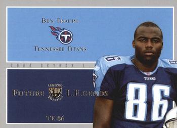
Saturday, December 16, 2017Set: 2004 SkyBox LE - Future Legends (Rate) “ So, football fans, is this guy a legend? I always laugh when the card companies predict future stuff, because they are usually well off. I can think of only one prediction in the NBA that actually came true, and that was Hakeem Olajuwon being named Playoff MVP. ” -Billy Kingsley
“ Future Legend? Nope. ” -royals
“ Somewhat unprophetic. ” -Sportzcommish
“ This guy played forever! Like the card design and I honestly don't remember him playing for the Titans. ” -JoshReese92099
“ Turned out he was not a Future Legend. ” -carthage44
“ Boring.... ” -jayoneill
“ Not a horrible design, but something about it just says, "Meh." ” -olerud363
“ Future legends and Ben Troupe... Never thought i would hear that together. But anyways, a nice-ish design. I wish these designs and special parallels would be reserved for truly special people. ” -parsley24
“ Nope on the design...nope on the legend. ” -cckeith
“ They had 25 cards in this set. This one was a miss on their "legend" prediction. I wonder how they did overall. I like the use of team colors--makes for a sharp card. But I'm not pleased with all the wasted space. ” -kents_stuff
“ Boring. ” -cjjt
“ I know Guppy Troup. I don't remember Ben Troupe. Maybe I would if I had this card. ” -switzr1
“ WE'VE FOUND IT! THE MOST BORING CARD EVER PRINTED! ” -beansballcardblog
“ wow soooooooooooooooooooooooooooooooo much blue ” -aussiewayne
“ A Rookie business card? Not sure what to think about this one. ” -captkirk42
“ Future legend eh? ” -IfbBirdsCards
|
Friday, December 15, 2017Set: 1994 Cardz The Mask (Rate) “ I fell in love with Cameron Diaz in this movie. I didn't know there were cards. Does she still make movies? I quit watching them. ” -switzr1
“ When I think of 'Exciting!' I think of this card immediately. ” -mkaz80
“ This card just SCREAMS "zany Jim Carrey comedy", doesn't it? ” -kents_stuff
“ Without some kind of labeling on the front, I had no idea what it was until I turned it over. Not sure what makes a good movie card, but it isn't awful. ” -muskie027
“ I do not remember this guy from the movie at all. ” -carthage44
“ No banners on front. No like. ” -Sportzcommish
“ Not a movie buff, but I don't consider this a memorable enough film to justify a trading card set. ” -dilemma19
“ This one surprised me. At first glance I thought it was some vintage US Presidents set. I almost started to try to figure out which POTUS it was. LOL. Been ages since I've seen the movie. One of Jim Carrey's best films if not the best. ” -captkirk42
“ I dont like that there is nothing on the front of this card stating what it is. ” -parsley24
“ I have no idea what this is. He looks like he'd make a great Bond villain. ” -beansballcardblog
|

Wednesday, December 13, 2017Set: 1980-81 O-Pee-Chee (Rate) “ The OPC set that year was so much better than the Topps set. I like the green and yellow color scheme on the back, my two favorite colors. ” -Billy Kingsley
“ Looks vaguely like the 1963-64 Topps hockey card design, except that design was actually kind of cool looking. I wonder why they put his name on a SweeTart. ” -revnorb
“ Wow. He looks so small compared to today's goalies. ” -olerud363
“ Oh how I wish today's cards had an ounce of character and charm such as this... ” -mkaz80
“ I love the old brown pads and helmet that looks like something from “The Mighty Ducks.” ” -beansballcardblog
“ Goalies of the past must look at today's counterparts in their full body armor and just laugh. ” -rmpaq5
“ Nice set here, and OPC to boot. ” -IfbBirdsCards
“ This is what makes vintage cards so appealing. Easy design, pushing the edges of graphic design at the time. ” -parsley24
“ Very cool Hockey card. Neo-Vintage. I had plenty of Topps cards from this year/design but not any OPC that I am aware of. I also don't recall getting any of the All-Star cards. ” -captkirk42
“ Cool goalie stick! ” -carthage44
“ I like how the French word for goalie is gardien. Kinda reminds me of the Simpsons episode. "English side ruined. Must use French instructions. Le Grille? What the hell could that mean?!?" ” -Brimose
“ Awesome! 1979-80 and 80-81 Topps/OPC are my fav vintage hockey sets. ” -wax_house
“ Love this card! Notice how much "thinner" the goalie was back then? Now they wear enough padding they look like sumo wrestlers. No way to get a puck by them. ” -NJDevils
“ Anyone who knows me know what to expect on this one! LET'S GO BUFFALO!!!!! Another beautiful Sabres card of the early 80's era. I love the older hockey cards. I really my parents would have bought me cards starting when I was born, I would have so many more of that late 70's early 80's era that I love. I am sure everyone think the era they collected was the best, but man, I love those mid-70's to about 1987 cards. One more thing on the card....that is what goalie equipment should look like. Hockey was so much better when goalies didn't look like giant bionic statues that should be competing in a Yokozuna tournament. ” -muskie027
“ I like the concept for the swoosh, but there shouldn't be any overlap of it onto the puck. ” -Sportzcommish
“ Great looking card! I want one!! ” -switzr1
“ Those pads are incredible. ” -royals
“ I love this set. They were some of the first cards I ever owned that were older than I am. Don't have this one though. ” -DanD
“ Love this set !!! Edwards was a pretty decent goalie. ” -uncaian
“ I'm a little confused by the inconsistent capitalization. On the front the English and French on the all-star comment are both capitalized, and both are all lowercase for the player's position. On the back, the English is capitalized for both items, but the French (french, in this case?) is lowercase for both. Is there some linguistic rationale, or just sloppiness? ” -kents_stuff
|

")