
Random Card of the Day |
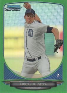
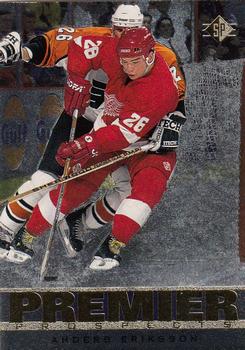
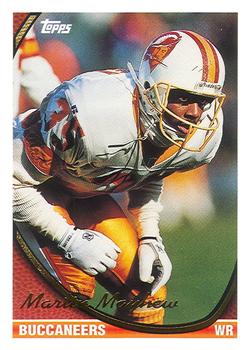
Wednesday, April 26, 2023Set: 2013 Bowman Chrome Mini - Green Refractors (Rate) “ Cool green border. Cool last name. It's worth 28 points in a Scrabble game. 8o) ” -CollectingAfterDeath
10
“ Color clashing numbered card of a guy who never had a cup of a coffee...... in triple A. Better put this one in the safe. ” -chvlDm
6
“ His head looks photoshopped onto a bigger person's body. ” -rmpaq5
19
“ I've never been a fan of the mini cards! ” -tinyshogun
2
“ Nice green variant. I am tired of mini cards though. ” -captkirk42
2
“ Bowmans are nice cards, but they bore me . . . ” -georgecf
3
“ Very cool card, Bowman mini refractors are awesome :) ” -NeverDie
3
“ Oh good, it's green. ” -jackal726
3
“ I've never really been a fan of mini versions of base cards. They're a blatant cash grab with nothing new added ” -ketchupman36
4
“ That's one ugly card. Good thing it's little. ” -Sportzcommish
4
“ Good color. Good scan. ” -cjjt
2
“ I don't know if it the scan or if the card just makes it look like he is a cartoon, but either way this is a no go for me. ” -yokonashiwa
4
“ Is it just me or does that look like someone badly photoshopped his head onto his body? ” -TripleLSupreme
4
|
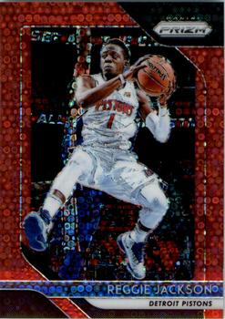
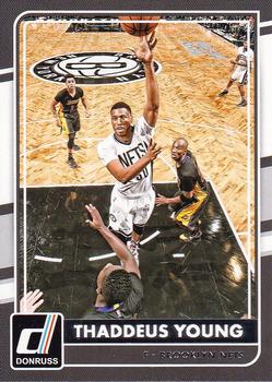
Tuesday, April 25, 2023Set: 2018-19 Panini Prizm - Prizms Fast Break Red (Rate) “ Same picture on the front and back, LAZY.
Not the baseball hall of famer who said "Sometimes I underestimate the magnitude of me" and "I was reminded that when we lose and I strike out a billion people in China don't care." ” -jdogg1228
4
“ Reggie "Kung Fu" Jackson's flying kick surprisingly wasn't outlawed by the NBA until 2021. ” -Tscastle
5
“ I hate when the same variation has different names across sports/products. I believe this pattern is called Quick Pitch in baseball products, and I've also just seen it called Donut Circles. ” -jackal726
4
“ Another Prizm variation, Panini really goes ham on all the variations. ” -NeverDie
1
“ I liked Reggie Jackson in Detroit. This is a cool parallel. Panini could get rid of all non-numbered parallels and would make me like it better. ” -pjdionne12
2
“ The Hunt for Mr. Red October. ” -tenlbpain
4
“ What an odd looking action shot If I hadn't seen the card name/title I wouldn't have thought it was a Prizm card. ” -captkirk42
1
“ Ugh. The whole concept of so many parallels makes me sad & upset. 37 parallel sets for Prizm!! 37!!
Also, using the same shot (albeit a good) on both sides is poor & lazy. ” -cjjt
2
“ Cards from this subset and similar ones look all right in front of you, but the scans make them look like the card is glitching out. ” -Theron_Nett
2
|
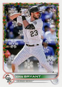
Monday, April 24, 2023Set: 2022 Topps Holiday (Rate) “ I'm not sure what the point of a "holiday" set is for other than to give one of the card designer's nephews a chance to Photoshop snowflakes into the background and add holly to the border.... ” -Theron_Nett
21
“ Merry Krismas! ” -tenlbpain
15
“ I really like the way they are doing the Holiday sets. The image variations are fun instead of tedious. ” -jackal726
6
“ I like the idea of Topps Holiday more than I actually like it. I wish it was its own set that looked different than the flagship more than just some clipart added. I do enjoy chasing the short prints. I know they are cheesy. ” -pjdionne12
5
“ Holiday edition. No thanks. ” -captkirk42
3
“ At first glance the snowflakes look like spiderwebs. Not a fan of the Topps holiday but they DO hold their value. I'd like to know the true print run of the holiday cards. ” -CardFlipper1974
1
“ Just the base set with some snowflakes for added holiday cheer :) ” -NeverDie
4
“ In Colorado, this snowflake card doubles as part of the Opening Day set. ” -Tscastle
3
“ Ho ho ho! Merry pointless parallels! ” -ketchupman36
5
“ So cheesy they're cool. Love them. Metallic are even better. ” -chvlDm
3
“ I really liked the design of last year's Topps. It was subtle and stylish. The holiday treatment really undoes all of that. But hey, who am I to question Topps for reusing the same card over and over in different sets? Can't wait for the 35th anniversary chrome version of this one. ” -DarthTempest
3
|
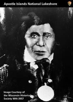
Sunday, April 23, 2023Set: 2011 National Park Service Civil War to Civil Rights - Apostle Islands National Lakeshore (Rate) “ that is one scary card ” -Tmac7
7
“ This card just states the facts of recorded history, and allows room for thought. It provoked in me a want to know more about who Great Buffalo was, and where the Ojibwe tribe called home. ” -CollectingAfterDeath
8
“ I'm not sure that I've ever seen such an obscure card on RCOTD ” -Lennoxmatt
3
“ This is cool as hell! Would love to have this card!! ” -tinyshogun
2
“ Nice historical non sport card. Even if they make 1,000s each year for about 20 years without changing anything about the cards. ” -captkirk42
1
“ This is cool! I never knew the National Park Service made these! ” -NeverDie
2
|
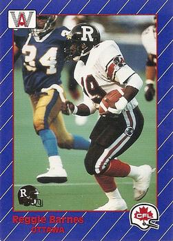
Monday, April 17, 2023Set: 1991 All World CFL French (Rate) “ I always found it odd the CFL had two teams with similar names, the Roughriders and the Rough Riders. I never remember which one Teddy Roosevelt played for. ” -Tscastle
11
“ Nice CFL card. I enjoy this set. I got it sometime within a year or two of it's original release. I recall that THE PLAYER was Raghib "The Rocket" Ismail. So much so he is all over this set. He has 7 cards throughout the set. ” -captkirk42
3
“ Reggie was chess champion at West Philadelphia High School. His chess club went on a cruise to celebrate winning the city wide championship. During the cruise he got C6. I do like the card design even though the card dimensions are in metric. ” -CardFlipper1974
3
“ Is the border giving anyone else a headache looking at it? Especially when trying to make out the guy's name and team in the lower left? ” -Theron_Nett
6
“ Not crazy about the front but like the back , , , ” -georgecf
2
“ These HAVE to be more valuable than the English equivalent because this set makes up at least 98-percent of all CFL cards in existence. ” -DanD
1
“ Ahh the other Rough Riders (9 team league - 2 had the same name). This was the Rocket Ismail rookie year set and was mass produced in both English and French. Reggie bounced around the CFL and wound up back in Ottawa to finish his career. ” -BuccaneersDen
2
“ Fun Fact -- American football was invented in Canada. ” -Philliesphan
3
“ I can barely read the name on this card. Other than that this card is a very cool. ” -Philliesphan
1
|

")