
Random Card of the Day |
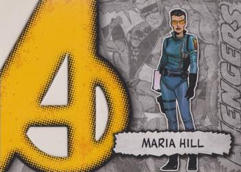
Saturday, July 31, 2021Set: 2012 Upper Deck Marvel Beginnings S2 - Avengers Die Cut (Rate) “ Nice comic card. ” -captkirk42 |
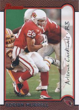
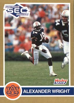
Wednesday, July 28, 2021Set: 1991 Hoby Stars of the SEC (Rate) “ This is an ok design. I like the picture on the front, but the lack of stats on the back reduces my impression of this card. ” -Brendan Barrick
“ Nice 1990s College Football Card. Interesting photo makes him look real small with a GIANT Blocker. ” -captkirk42
|
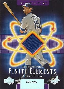
Tuesday, July 27, 2021Set: 2003 Upper Deck Finite - Elements Game Patch (Rate) “ This is a pretty nice card. One problem is that for some of the other Upper Deck releases, you could barley see the serial numbering on the back because it was so dark. This isn't a problem with this card because where the serial numbering is, it stands out. ” -jdogg1228
2
“ "Up and at them!"--Radioactive Man ” -rmpaq5
8
“ Gross ” -parsley24
2
|
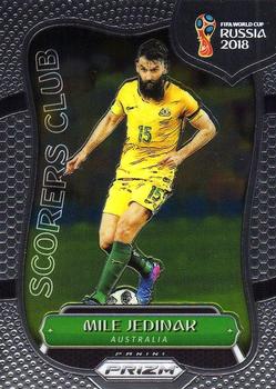
Sunday, July 25, 2021Set: 2018 Panini Prizm FIFA World Cup - Scorers Club (Rate) “ Prizm always looks cool in hand. ” -muskie027
2
“ Hey a Panini Prizm card that doesn't look exactly like all the other Panini Prizm cards. I still don't like the chrome Prizm design but this one you might be able to identify more easily. Biggest problem though is the border design looks like a basketball not a soccer ball. ” -captkirk42
2
|
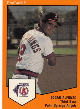
Saturday, July 24, 2021Set: 1989 ProCards Minor League Team Sets (Rate) “ These are ok. Nothing special, but I do like that they were made. ” -muskie027
“ Since the team name is on the back, does that mean one of his two first names is on the front? ” -jackal726
“ Edgardo’s older brother! Might count as a decent coincidence with Edgardo being the RCOD open for comments a few days ago ;) ” -stevejrogers
1
“ There's something about ProCards that i've always been drawn to. Not to the point of seeking them out but when I happen upon them in mixed bag cards I get pumped. They cover so much ground for players that would likely never get any love. ” -Madden95
“ Nice looking Pro Cards card. ” -captkirk42
|
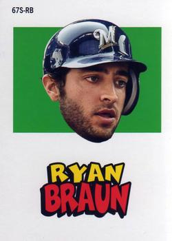
Friday, July 23, 2021Set: 2012 Topps Archives - Stickers (Rate) “ This looks so weird plainly because of the fact it's just Braun's head and nothing else. ” -jdogg1228
2
“ ARGGGGHHHHH Floating Head RUNAWAY! ” -Gunny
2
“ Goofy floating head and an eerie blank back (with copyright info at the bottom). Not the best design, but still had to add my team to my wantlist. ” -Tscastle
1
“ Nothing like seeing a decapitated head floating in space. ” -hamrlik22
“ Oops I was going to talk about this one as if it were the Heritage version, but it is Archives UGH so confusing now days. Anyway I do like that they recreated these things, but I think for these retro ones they made them cards not stickers. I may be confusing these with the "stand ups" for Heritage around that year that were just regular cards, not die-cut so you couldn't wreck them like the originals. ” -captkirk42
“ I'd equate this to a "bobblehead" card, just without the "bobble"! ” -bkklaos
1
“ Yikes! A disembodied head with a very unimaginative background. Not much of a fan of this insert even if it is a sticker. ” -koloth42
1
|

")