
Random Card of the Day |
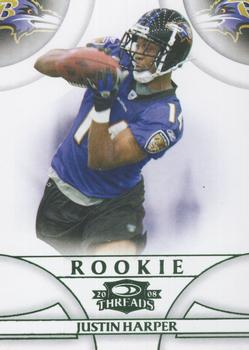
Sunday, February 21, 2021Set: 2008 Donruss Threads - Retail Green (Rate) “ Green foil is cool. We need more green foil lettering. Also, LOL @ the SN being off center. ” -Billy Kingsley
1
“ This is pretty boring, I wonder why this is an SN. ” -pugchump
1
“ The layout of the border almost completely hides the fact he's sporting those practice threads. Very clean back to boot. Very nice! ” -Madden95
“ At the time I really liked 2008 Donruss Threads but soon tired of the plain white design. ” -captkirk42
“ not a bad looking card. Like a low budget flawless. ” -parsley24
“ I like this card. ” -Brendan Barrick
|
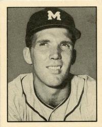
Saturday, February 20, 2021Set: 1952 Parkhurst Frostade International League (V338-1) (Rate) “ I could be wrong, but I don't think we will ever see replica 6 shooters marketed to kids ever again. ” -abide
5
“ simpson, simon, here it is, SAMSON... ” -parsley24
2
“ Wonderful! ” -cjjt
“ I like the back even more than the front. How did I not become a criminal with all the advertisements for plastic guns that I saw in the 50s? Try google mapping the address and see what you come up with. Only thing I found was "Duke Mews" which was interesting. ” -NJDevils
3
“ Any card that says "Hey Kids!" and has a picture of a revolver on it is good in my book. ” -UKboogie
2
“ This is going to be a weird comment, but I like for this card would depend on its actual size. I did like reading the back with the plastic gun and the "5 swell flavours." ” -muskie027
1
“ Based on his face I feel he heard the cameraman tell one of the female staff a corny pick up line. ” -Madden95
1
“ Nice vintage. ” -captkirk42
“ never heard of Parkhurst ” -crashdavis28
“ Simple. ” -Phil
|
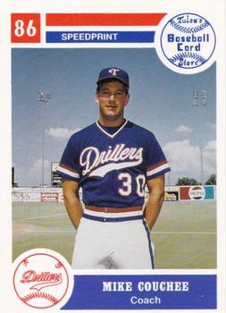
Friday, February 19, 2021Set: 1986 Tulsa Drillers (Rate) “ Couchee on the drillers.... Im not going to comment today. ” -parsley24
15
“ SPEEDPRINT! (dont know what that means but sounds neat) ” -DarkSide830
“ Fantastic name. ” -Brimose
“ Nice 1980s Minor League Coach Card. ” -captkirk42
“ Koo-shay? Kow-chee? Koo-chee? How is this guy's name pronounced? ” -pugchump
“ Solid mid-80s MiLB card...love it. ” -wjhipwell
“ Very clean classic card. Love the design, would love to see more classic and clean designs like this come back to the market. ” -OverkillKid
“ I hope I'm pronouncing his last name incorrectly. ” -UKboogie
2
“ Major Leaguer with the Padres in 1983. Also the Angels bullpen coach for part of 1996. ” -trauty
|
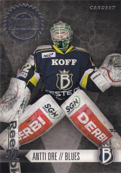
Thursday, February 18, 2021Set: 2012-13 Cardset Finland - The Wall 2012 (Rate) “ Another cool European hockey card...and this time an insert! ” -Billy Kingsley
1
“ Nice Finnish card. That's a name I haven't heard in a long time. Started his Liiga career as 32 years old after long career in lower leagues. Played great playoffs in 2012 and is gone in couple years. ” -SharksAttack
3
“ I always appreciate foreign-language cards like this. I like the helmetless profile on the back, too. ” -pugchump
2
“ not a bad hockey card. ” -parsley24
“ Once again, I love the International flavor! ” -bkklaos
1
“ I don't know the set, but this is a great image to go with for a goalkeeper. ” -Corky
1
“ Nice Hockey goalie card. Another European League card? ” -captkirk42
1
|
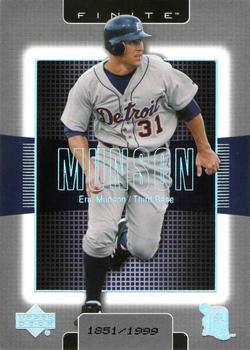
Wednesday, February 17, 2021Set: 2003 Upper Deck Finite (Rate) “ They used the same design in the NBA, but instead of holofoil for the name and logos, they used standard silver foil. The baseball version looks much better.
Every card in the set is serially numbered. ” -Billy Kingsley
“ “Without me these kids would have been Munsoned” ” -BrewerAndy
5
“ Yay one of my Tiger's scans is finally picked up as COTD! Look modern card makers...a different photo on the back! The name placement is kinda weird, it's like they are trying to go for the look of the trailer of an upcoming action movie starring "Munson." ” -rmpaq5
6
“ The beginning of the weird SN at the bottom of these cards. Great looking card, too bad his career got Munson'ed. ” -parsley24
“ It's as though someone created a background that has nothing to do with baseball and then slopped a player's picture on top of it. Totally incongruous. ” -NJDevils
“ OK if you want that film slide look. Hard to read his name, that light blue font must be foil. ” -captkirk42
“ I really dont like to have to focus my eyes in that area, to read his name. Maybe the worst set design I've ever seen. ” -switzr1
“ I'm actually digging this design even though it reminds me of a back-lit processor on a motherboard. ” -Madden95
|
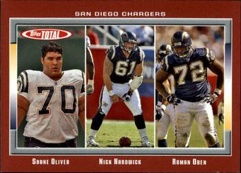
Tuesday, February 16, 2021Set: 2006 Topps Total - Red (Rate) Card: #35 Nick Hardwick / Roman Oben / Shane Olivea “ Red? Looks more like brown...appears to match the color of a football, which is actually a nice touch if planned. ” -Billy Kingsley
1
“ Wouldn't it have been great if Hardwick was #71 than #61, so the numbers would have gone 70, 71, 72? ” -nkandy11
10
“ Considering this card includes three players, this design's layout is quite efficient. Cool card! ” -CollectingAfterDeath
2
“ Shane Olivea: Buckeye! ” -Brimose
“ Glad to see lineman getting a card, but probably a set that is not needed. ” -parsley24
1
“ I like Topps Total. Don't like trying to complete any of the sets even if it is just a team set, but I like the sets. ” -captkirk42
“ I really like Topps Total. The only chance to get cards of back up players. Great stuff! ” -cjjt
1
“ This is one of the many color variations for this set. I like the concept of Topps Total. It was a good set for team collectors to pursue. The set consisted of many players you won't find in other sets such as offensive linemen. For the record I like this card. ” -Brendan Barrick
1
“ Roman Oben is an NFL employee now IIRC ” -pugchump
“ usually im not a fan of multi player cards, but i really liked the topps total sets ” -Thunderfoot
“ Ah yes, Topps Total. The 2006 Chargers were amazing in the regular season and lost in the Divisional Round to the Patriots. I like the card, it's just the players shown are extremely irrelevant due to them being Offensive Linemen, although Nick Hardwick did make the Pro Bowl that year. ” -NickyCollects
1
“ I like that Topps did the total sets, it was a way for every player to get a card. ” -Corky
1
“ Never got into Topps Total. It was gone before I got back to collecting. This looks ok. ” -muskie027
|
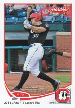
Monday, February 15, 2021Set: 2016 Grandstand Chattanooga Lookouts (Rate) “ Cool team name. In Baltimore, there is a team called the Lookouts, too. The players stand on the street corners, and when an unmarked police car approach, they start yelling "5-O!, 5-O!" Anyways, this is a nice card. ” -CollectingAfterDeath
12
“ Nice Minor League Food Issue card. ” -captkirk42
1
“ Not too bad for a minor league card. Especially because it uses the design from 2013 Topps. ” -mkb
1
“ That sea turtle looks familiar. I like when minor league sets borrow design elements from the big companies. This one was three years later too. And the logo of the eyeballs for the Lookouts is great. ” -switzr1
“ Great card front and back. ” -NJDevils
“ Nice-looking template . . . Would have liked the team logo in the left-hand bottom corner, so the eyes are looking in-toward the card, rather than focusing away from it . . . Good design on the back . . . ” -georgecf
2
“ thE foNt fOr THe NaME CouLD hAVe BeeN DIFfErenT ” -parsley24
|
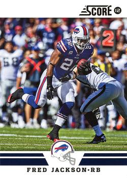
Sunday, February 14, 2021Set: 2012 Score - Glossy (Rate) “ Really nice design on the front. Quality photo too. Back is nice as well. If I were a football collector I would really like this set. ” -Billy Kingsley
2
“ Hay ay ay ay!!!! Wish the Bills had made the Super Bowl. Would have loved the shot to beat Brady in the Big One. Fred was a most underrated player and a really great Bill. Let's Go Buffalo!!!! ” -muskie027
1
“ Yeah! #billsmafia *leaps through flimsy card table, breaks bones I never knew existed* ” -buckstorecards
2
“ I like it that we can see that Fred was handed the ball on a second down play. ” -abide
“ i usually like the simple white border score cards, but this year was one of my least favorite designs, also for a guy that loves parralells the score glossy just annoyed me ” -Thunderfoot
“ Good picture. Other than that, very boring! ” -cjjt
1
“ I like the 2012 Score even though most of the Panini Score (and Donruss) sets I don't like the Panini touch of. ” -captkirk42
|
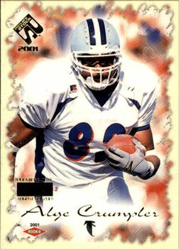
Saturday, February 13, 2021Set: 2001 Pacific Private Stock - Premiere Date (Rate) “ His name is Alge? I hope that isn't pronounced like the slimy stuff that grows on stagnant water. Design of the card I like. I would have guessed 1998 instead of 2001. ” -Billy Kingsley
3
“ I remember Alge. Had some big games. Cool card and effect. ” -muskie027
2
“ There's a lot going on here ” -pugchump
“ I love the name! Yes, I could get into collecting these, even with the "busy" front of the card! ” -bkklaos
“ That card needs Crumpling. ” -NJDevils
“ Good looking card. Private Stock was a good Pacific product. I like the Pacific "rookie" red diamond. Never understood why the "Premiere Date" parallel is called Premiere Date. Whenever I hear the name Alge Crumpler, I always think of Alger Hiss [ traitor ] for some reason. ” -abide
“ This is an ok design. Pacific released too many parallels to keep track of. ” -Brendan Barrick
“ Really good Pacific set. I like this card a lot. ” -switzr1
“ I am surprised this is a Pacific set. I usually like their designs. This one not so much. ” -captkirk42
“ non licensed cards really frustrate me. ” -parsley24
|
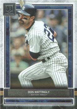
Friday, February 12, 2021Set: 2020 Topps Museum Collection (Rate) “ Interesting photo of Donnie Baseball. I'm going to say he was pulling away from an inside pitch, his back leg collapsed a bit, but it was a breaking pitch that broke back towards the plate, and he's looking at the ump hoping to see that a ball was called? Don't see many images like this on cards. ” -abide
5
“ Legend. Great photo. The player name and team name are a little small for my liking but overall a great card.
Wish they would have used long hair mattingly. ” -parsley24
“ I'm more familiar with this set on Topps Bunt (the digital app). I feel like they zoomed in the picture a little too much on almost all of these. And not enough info on the front of the card. I do like Mattingly as a player though. His stance and swing always creates a positive memorable card. ” -MTHRILL22
1
“ Museum collection always remind me of 2012 Topps Football. This set though breaks that trend a bit. Still a neat design though. ” -DarkSide830
“ Nice card for what it is a "Museum" portrait type card. Now the front image is not flattering at all. He has a goofy look on his face. Back low end of OK. ” -captkirk42
“ Don Mattingly has a disproportionately high number of cards where he's making some goofy face like this ” -pugchump
“ The Museum Collection cards are always nice. At least last year's didn't have any issues with foil peeling away like 2019. ” -IfbBirdsCards
“ Some will probably like the puffed-out cheeks as part of his expression, but it mars this whole card, which otherwise is OK, but not exceptional . . . The idea of the set is good, but some of the choices are highly-questionable . . . ” -georgecf
“ Mattingly and the chipmunks. ” -Blargh
“ I missed this release altogether. Nice looking card, but the print seems awful small. ” -switzr1
|

")