
Random Card of the Day |
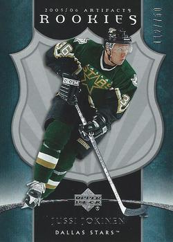
Wednesday, March 3, 2021Set: 2005-06 Upper Deck Artifacts (Rate) “ Yes. Nice card. Rookie way back then and still playing in finnish league this season representing Oulun Kärpät. This is propably his last season though, because he has slowed down quite a lot and his shot is not so threathening for the goalies. But he managed to produce nice penalty shot few days ago. ” -Duke
3
“ I was just getting back into the hobby around this time. I wasn't aware of Artifacts but if I had been I would've bought it. Jussi was one of my Mom's faves when he played for the Flightless Birdies. ” -Gunny
“ Sharp card! It's weird flipping it around and not seeing panini anywhere, lol. Oh the good ole days. Great stuff upper deck! ” -Madden95
1
“ This is a good opportunity to talk about serial numbers, since I don't know anything about hockey or hockey cards. Serial numbered cards have a special place in my heart, it gives me a feeling that I pulled something special, not some manufactured base garbage. The first one I got was a 2019 Topps Advanced Stat Miguel Sano, and I didn't even notice until I logged it to my collection a year later. By then I had already gotten A Big League Baseball Rainbow Refractor /100 and a 2019 Topps Heritage Stamp Relic /50. I don't purchase high end, so these serial number cards are pretty cool when I pull them. ” -NickyCollects
1
“ A great looking hockey card until you flip it over and its the same photo. dang. ” -parsley24
“ Nice looking design, but not for cards. ” -captkirk42
“ This is an ok design. ” -Brendan Barrick
“ Very early #'d card. If only upper deck was allowed more than hockey. ” -OverkillKid
1
“ The first year of Artifacts - very nice cards ” -suomibear8
“ Pretty plain, only 3 colors and they used the same photo on both sides ” -pugchump
|
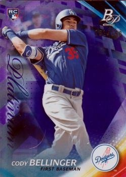
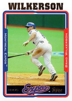
Monday, March 1, 2021Set: 2017 Bowman Platinum - Purple (Rate) “ that's a pretty RC card of the 2019 ML MVP ” -abide
2
“ Bowman Platinum always just looks ugly to me. I don't understand the appeal. It's a low-rent set that is trying way too heard to be upper tier. Hard pass. ” -ketchupman36
2
“ Card doesn’t look too bad.
Nice rookie card of a star. ” -mkb
1
“ A pretty nice card here! Sure it's not exactly cheap, either. ” -IfbBirdsCards
“ Oh dang it is a parallel, I was beginning to think that maybe Bowman Platinum was getting away from the boring silver foil/chrome looks. ” -captkirk42
“ I have been a fan of the various Platinum sets released through the years and I dig this one too. ” -Corky
1
“ Ooh, Bellinger Rookie Card. I like the card art and value is probably great. ” -NickyCollects
“ Love me some Bowman Platinum! Clean and classy in my humble opinion. ” -Madden95
|
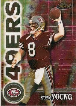
Sunday, February 28, 2021Set: 2008 Topps Chrome - Xfractors (Rate) “ Scan make it rough, but I'll bet it is pretty cool in hand. ” -muskie027
1
“ I like the design of this card. ” -Brendan Barrick
“ Probably “Not Quite” but a Bucs card opening for comments a few weeks after their Super Bowl win 🤔🤣😉 ” -stevejrogers
“ Like the 2008 Topps Design. Won't comment about not liking Chrome. Black background I forget is that just for the X-Fractors? ” -captkirk42
“ BUCKEYE!! Joey was a helluva player for years. Just shy of HOF worthy, but in my opinion, not by a whole lot. And since his playing days he's joined a huge list of former OSU players to move to the broadcast studio, and in my opinion has done well for himself there as well. Joey is my third highest total in my Buckeye PC, behind only Cris Carter and Eddie George. ” -Brimose
“ Can't stand 2008 Topps. ” -DarkSide830
|
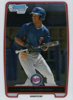
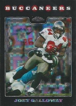
Saturday, February 27, 2021Set: 2012 Bowman Chrome - Prospects (Rate) “ Maybe it's just me but I don't think the team logo should be smaller than the Bowman Chrome logo ” -pugchump
3
“ Either Daniel was planning to bunt and said "NO" or the photographer caught him just as he was starting to show a bunt. Either way, I like the photo and the design. Bowman tends to have nice designs overall, but Topps destroys that with multiple versions of EVERYTHING! I'd bet that there are 4-6 versions of this card before you even get into the parallels of this card. I still like the general design of this specific card though. ” -spazmatastic
4
“ This design is almost too basic. I dont like all the wasted space on the border. ” -parsley24
“ Solid! As a collector from the 1900's I've always had a thing for these shiny cards. ” -Madden95
“ I think I've mentioned my love/hate with Bowman sets many times. I like the designs for the most part. I recall in 2012 I got plenty of these cards and probably have a Nationals team set maybe, maybe not. I really hate the Prospect aspect of the set particularly the numbering system that Topps uses for Bowan flagship and Chrome. First they use BC# for the very base chrome cards which are the regular guys and vets, then they use P =Prospect well really BCP# Bowman Chrome Prospect, then there is I think BCPD which is Prospect-Draft or is it BCDP? see I'm confused already. Then when I look on the checklists to see if my card for some guy who was only drafted by the team with a minor league contract and never made it to the Big team is in the set that is called "Bowman Chrome Drafts and Prospects" or just "Bowman Prospects". I never know which "set" to look under. ” -captkirk42
“ yeet ” -Buckeye Fan
“ That's a good scan for a chrome card. I used to love them before I began scanning my entire collection. Not so much anymore. ” -Billy Kingsley
“ I never got into Chrome, but liked the few i pulled as inserts. They have a fun cool look to them. ” -muskie027
|
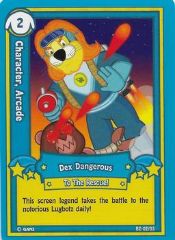
Friday, February 26, 2021Set: 2007 Ganz Webkinz Series 2 (Rate) Card: #B2-02 Dex Dangerous, To The Rescue! “ the statistics on the back are disappointing ” -abide
9
“ ? ” -muskie027
1
“ FRICKING WEBKINZ LOL
Doesn’t look like that bad of a design tho ” -mkb
2
“ "Screen legend". weird ” -cjjt
“ 0 people have this card on their wantlist. Shocker. ” -parsley24
3
“ Probably one of the few non-sports sets I haven't heard of, but it must have been popular, seeing as this is Series 2! ” -bkklaos
“ A lion flying around, looking to taser a teddy bear, who is suffering with a bad case of pink eye. GRRRREAT! ” -CollectingAfterDeath
4
“ Nice kids non sport card. A TCG? CCG? ” -captkirk42
“ Hate these non-sports cards . . . but those who like them, enjoy . . . ” -georgecf
1
“ Webkinz seem to be a bit more deadly than I remember. ” -rmpaq5
3
“ Webkinz! My kids used to be into those. ” -trauty
|
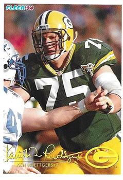
Thursday, February 25, 2021Set: 1994 Fleer Shell FACT (Rate) “ Overall I like this design, but for someone who doesn't really know football, the names can be somewhat hard to read. The printed version below can blend into the background pretty easily, even the foil version on the base cards. ” -Billy Kingsley
3
“ Three different photos on one card is a nice touch, but I can't read the name at the bottom because it doesn't contrast well with the white and yellow on the uniforms. ” -pugchump
“ Another Fact: Ken went to USC, not Rutgers. ” -buckstorecards
6
“ Absolutely love the photos used for this card. So much action and the old school feel of a sideline profile. ” -Madden95
“ Never heard of these, but I like it! ” -bkklaos
“ Graphically, a beautiful card . . . The use of pictures is outstanding, and it is very pleasant to look at . . . I can do without the signature on both sides, and make the nameplate easier to read, as well as adding the position . . . But those, despite seeming major, do not detract from the beauty of the card . . . ” -georgecf
“ The 1994 Fleer regular was a nice product. This particular set is ok. ” -Brendan Barrick
“ Nice Fleer card. Ah I miss Fleer. The thing I don't like about 94 Fleer is the faux auto in foil lettering at least they "printed" the name as well. ” -captkirk42
“ Great combo of trivia and a good trading card. Love the 2 different photos on the back as well. Wish we had more like this in modern trading cards. ” -OverkillKid
“ i liked this design, also wish promos like this were still a thing ” -Thunderfoot
|
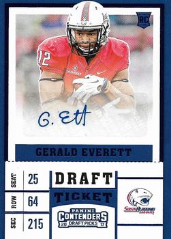
Tuesday, February 23, 2021Set: 2017 Panini Contenders Draft Picks - Blue Foil (Rate) “ Wow, that's a lot of effort on that signature. I know they are asked to sign a lot of stuff, but it must have been a disappointing pull for whoever was the first to Gett this. ” -Billy Kingsley
14
“ I think he missed a few letters in his last name lol ” -pugchump
1
“ I love Draft Tickets across all sports! The way they put the seat as their....uhhh...is that supposed to be jersey number? Age? Birthday? I don't know but I do know that the row represents his height and the section represents his weight. Great card. ” -NickyCollects
2
“ NICE auto card even if it is a stickergraph and a college card. OMG this guy is on the Rams. Nice to know he got somewhere. That is my biggest beef with these "draft" college cards they produce them before the draft so you don't know if the guys made the pros or not. It is assumed since they are in the set they made it but that isn't always the case. ” -captkirk42
“ A bit weak on the (sticker) autograph, but I still like it! I know, they could have used a different picture on the back (and I do agree), but still would be collectable for me! ” -bkklaos
“ I like the color of the card. ” -Brendan Barrick
“ Enjoy this card. Sincerely yours, X ” -volbox
“ Basic Signature. Basic Design. Blue foil has always been one of my favorites. Great card overall. A- ” -OverkillKid
“ Really never have been a fan of the Ticket design. Especially detest same front/back photo; laziness. ” -SFC Temple
|

")