Random Card of the Day |
Tuesday, February 21, 2023Set: 2010 NECA Twilight Eclipse Series 2 (Rate) “ Teenage vampire angst. Who knew? ” -CollectingAfterDeath
1
“ I need sideburns, maybe them big lambchop ones, but alas it will never be. ” -Gunny
2
“ I love reading. I love movies. I love cards. I love my wife. This franchise is a blight on everything I love. ” -jackal726
22
“ NNNNNNooooooo my eyes are burning!!!!!!!!!!! ” -tinyshogun
3
“ If you were a 300-year-old immortal vampire, would you enroll in a local high school? I know I wouldn’t. ” -Musclebeech
2
“ UMK. a Twilight card. NO Thanks. ” -captkirk42
1
“ Cringe ” -parsley24
3
“ Give me a break . . . ” -georgecf
2
“ ugh ” -freakizon
3
“ I'd watch that movie under one condition: it has to be the Rifftrax version ” -DanD
4
“ My daughter just started reading these books and would probably love these. ” -muskie027
1
|
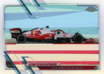
Monday, February 20, 2023Set: 2021 Topps Chrome Formula 1 - Refractor (Rate) “ That is possibly the smallest image of the subject of a card that I have ever seen. I had to go to Google just to see if Kimi was the driver or the car. ” -hiflew
4
“ Torille! Fantastic card. Best motor sport and finnish Iceman Kimi the Great himself. ” -Duke
2
“ Beautiful car, the card is fine but Kimi's name and team are a bit hard to read. Oh jeez, the new season starts soon I had better go and read up on any rules changes. ” -Gunny
2
“ That just screams speed! This card gets two green flags. ” -CollectingAfterDeath
1
“ Sorry but this is the ugliest racing card I have ever seen. I take that the back the scan of the "base" chrome card of this card is worse in all black the way chrome scans. All in all it looks like the base of the normal set looks the best, but still is awful looking. Very poor subject matter a striped guard rail taking up a third of you photograph. ” -captkirk42
“ This card design being the same as baseball for that year is just another reason why I wish card companies didn't have exclusive rights to certain sports. I'd love to see a frankenset of multiple sports for one year that all use the same design. ” -Bowersbird
2
|
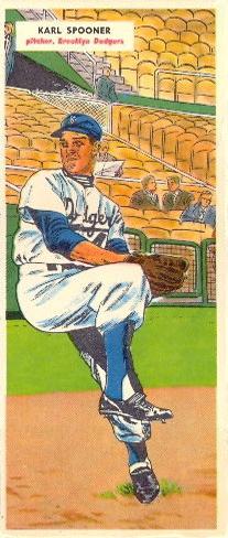
Sunday, February 19, 2023Set: 1955 Topps Double Header (Rate) Card: #19-20 Karl Spooner / Jim Hughes “ I am not a big fan of comic looking art for cards. ” -muskie027
1
“ Neat concept using the double header theme. Poor Jim got the short end on this card though. ” -CollectingAfterDeath
1
“ How is every one of these cards not already creased in half to so the kids could "flip" between the two double heads? ” -Tscastle
1
“ The front is awesome! ” -pjdionne12
“ One of my favorite all-time sets. The backgrounds of the cards line up perfectly when placing the cards next to each other numerically. ” -jayoneill
1
“ I wonder if non-standard sized cards made a different sound in bike spokes back then. Like, was there a size that made kids really excited because it sounded more like a rocket bike (or something)? ” -jackal726
“ I had no idea Topps did this first. I always thought it was a Fleer creation in the early 2000s. ” -hiflew
“ B-E-A-utiful card! Lovin’ the artwork on this vintage set. ” -Musclebeech
1
“ This card is cool as hell. I think I need one for my collection!! ” -tinyshogun
1
“ Nice "tallboy" card, but I'm not sure why they had the picture of the guy on the back upside down.... ” -Theron_Nett
“ Fun looking odd sizes cards. ” -Derek McDonough
“ Very very cool vintage. ” -captkirk42
|
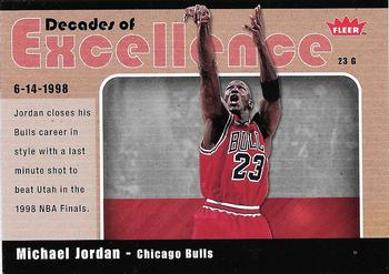
Saturday, February 18, 2023Set: 2007-08 Fleer - Decades of Excellence Glossy (Rate) “ Meh! Not an impressive card at all and well after MJ retired. Just not needed and clearly just a ploy to get people to buy more Fleer cards, even though Upper Deck owned the name at that time. UD didn't make NBA (or MLB cards) much longer after that year and poor designs was a big reason for their loss of licenses. I wouldn't care to have it in my collection, even as a trader. ” -spazmatastic
1
“ Not glossing over the fact that creative excellence went out the window with these inserts. ” -Sportzcommish
5
“ Great. Wonderful card. ” -Duke
1
“ Two three-peats in the 1990s, is a definition of excellence. And with MJ on the front, being the main man during that time, is fitting for this card! ” -CollectingAfterDeath
“ The true GOAT ” -Lennoxmatt
1
“ Ah, Fleer and their crooked insert cards. Finding a card that had been cut properly was difficult in the early 2000s. ” -hamrlik22
“ Wonderful, a card with TWO backs. [/sarcasm] I am not much of a hoops collector but if this were my first introduction to an insert card I would have to pass on it. ” -captkirk42
“ I never grew up during the Jordan era, but this is probably the greatest NBA Player ever. Those 90's Bulls were always a dominate team and ruled the 90s ” -michael1206
“ Stuart Scott: "Once and for all, did you push off of Bryon Russell?"
Michael Jordan: "What'd they call? Whatever they called, I did" ” -nkandy11
2
|
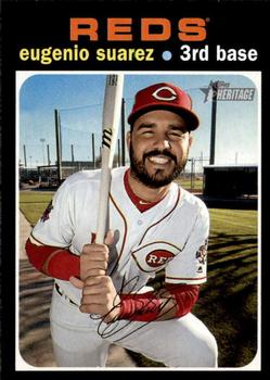
Friday, February 17, 2023Set: 2020 Topps Heritage (Rate) “ "Eugenio and his wife, Genesis, costumed themselves as Superman and Super-girl last Halloween."
-2020 Topps Big League
Random fun fact for you. ” -jdogg1228
2
“ Eugenio is one of my favorite players. I hated losing him to the Mariners. This guy is always smiling!! ” -tinyshogun
3
“ Not a fan of reusing retro designs. Makes it more timing consuming to flip through bargain bins at card shows looking for older cards because you keep having to do double takes. ” -lildog7
3
“ This Heritage card Almost got me at first.(the trademark by the team name is tiny and I didn't notice it at first) His beard is a giveaway, for many years beards were not allowed, trimmed moustaches yes, beards no. Plus the pose is a bit more modern at least the camera angle of it. OH yeah and the Heritage logo when you get around to seeing it. ” -captkirk42
“ "Eugenio! THAT'S fun to say!!" - Buddy ...probably ” -jackal726
1
“ As a Reds fan, I was absolutely devasted when Suarez got traded. I hope him and the M's make another playoff run this year. ” -Bowersbird
1
“ Nice throwback . . . not one of Topps' better backs . . . ” -georgecf
“ I really like this retro design reboot. That design stands the test of time. ” -Derek McDonough
1
“ I really enjoy Heritage. The irony is that the past designs and cardstock make it one of the best modern day sets going. ” -muskie027
4
“ The sun must have been in his eyes when this picture was taken. ” -fedoratipper
1
“ Ah there's not a woman that can handle a man like me, that's why I juggle two or three. I ain't one to commit, you can omit that bit, you pop the question that's it. {ave maria} ¡RICO! {ave maria} SUAVE ... ” -BuccaneersDen
“ Horrible design in 1971. Horrible now
” -cjjt
1
|
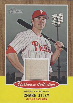
Wednesday, February 15, 2023Set: 2011 Topps Heritage - Clubhouse Collection Relics (Rate) “ Just completed the 2011 Heritage base set last week...I have a lot of subset cards to this set, but no relics...nice simple design that ties nicely to the original era. ” -dettigersmlb
1
“ Ah a Heritage Relic. Isn't that sort of being repetitive?
Ah a Heritage Relic. Isn't that sort of being repetitive? ” -captkirk42
8
“ Pretty straight forward relic card with a nice retro feel to it!
I love Topps Heritage! ” -Bs Cards
5
“ Nice looking card (of a great player on a pretty cool team - lol). The design ias nice, incorporating the Heritage design of that year as well as using a good photo (nice pose) for the placement of the relic. The back is your standard for relics, and no need for stats because if I want stats, I have the base card / flagship card that has the stats. That's noit the purpose of inserts. ” -vrooomed
2
“ Between the grin on his face and the placement of the relic, it looks like that card is censoring something. ” -lildog7
2
“ Great... modern relics. Not from any specific game, event, or season. Not even a guarantee the player was ever 10 feet from this random piece of material. There should be a class action suit against these companies for this farce.
I have a civil war relic card that is just dirt from New Jersey that is probably more authentic. ” -TripleLSupreme
1
“ Decent card if not for the relic. ” -Sportzcommish
“ Love the back with the cartoon picture, and with Chase posing with the bat over the shoulder, gives it a comic book style superhero feel. Awesome card! ” -CollectingAfterDeath
1
“ Look at all that wood. ” -astrosammy
1
“ At first glance, I thought this was a cereal box card. It is cooler after I kept looking. ” -muskie027
“ Great looking set. Not a Chase Utley fan! ” -pjdionne12
“ I don't know why, but for some reason I LOVE the missing light bulbs on this card. Maybe it is because it feels real, which doesn't usually happen with the Heritage line ” -hiflew
2
|
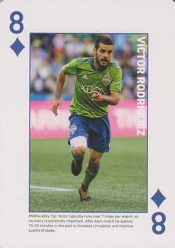
Tuesday, February 14, 2023Set: 2018 CHI Franciscan Seattle Sounders FC Playing Cards (Rate) “ Never seen the diamond suit in blue. This looks good for a playing card. ” -CollectingAfterDeath
3
“ Ole Ole Ole! ” -Bs Cards
2
“ Nice soccer PLAYING card. ” -captkirk42
2
“ This is an okay-looking playing card. Doesn't help that the text for his name is partially obscured by the background. ” -Theron_Nett
2
|
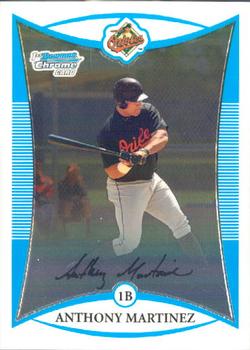
Monday, February 13, 2023Set: 2008 Bowman - Chrome Prospects (Rate) “ This was not a bad year for Bowman ” -tinyshogun
2
“ Bowman Chrome just highlights the mostly awful designs of regular Bowman. ” -hamrlik22
4
“ Does an Oriole named Martinez opening for comments on the an El Presidente card is the Card of The Day count as a RCOTD coincidence? ;) ” -stevejrogers
2
“ OK design nice O's card. ” -captkirk42
1
“ The facsimile looking signature right over the top of the name plate may be a bit too much here. It over lays the area of the batters cleats digging into the ground, and ruining the full effect of the torque he is generating. There are times when a picture needs to be given a chance to speak its thousand words, and this card front needed to say them words, but was somewhat muted. ” -CollectingAfterDeath
1
“ I like the simple designs of most Bowman cards dating back to 1992. This one is no different. It has all the elements, however, it is counter-intuitive for me to look for the team logo at the top center. I think that is kind of a unique feature. Another Martinez for you, Joshua! ” -RonEaston
“ Who? ” -curling2019
2
“ Ok design, but I hate the numbering system. ” -cjjt
6
|

