
Random Card of the Day |
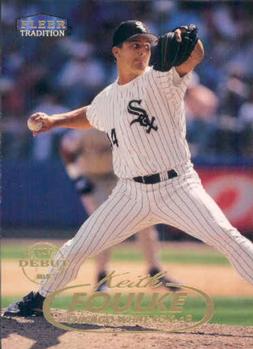
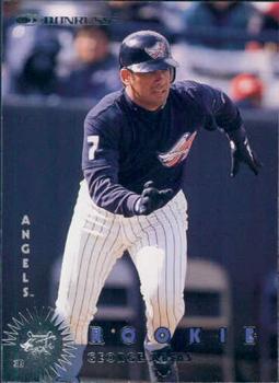
Monday, March 28, 2022Set: 1998 Fleer Tradition (Rate) “ Loved this guy in Boston. He was so underappreciated during the 2004 season. He kind of fell off afterwards but I always appreciated how much he loved pitching even when he was awful. He always got a bad rap that I feel was undeserved. As for the card, I love the design on this one. ” -pugchump
3
“ The front is not really a design I like, but the back is great . . . ” -georgecf
1
“ Not the worst set. Another random player though. ” -BigBoyOnWheels
2
“ Great photo. I love edge to edge cards. But that back, that back just screams late 90s fleer and I want to burn it. ” -parsley24
“ Simple, elegant design. Probably could have made the stats on the back a bit larger ” -Musclebeech
“ surely im not the only one that thinks the white sox logo looks like a skunk right? ” -Thunderfoot
3
“ I like this design other than the fact that everything is foil lettering on the front. ” -captkirk42
|
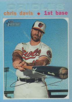
Sunday, March 27, 2022Set: 2020 Topps Heritage - Chrome Refractor (Rate) “ This probably looks really cool in hand ” -pugchump
1
“ Honestly overrated for a while. Went 0 for 54, and retired last year. Really not worth the lucrative contract. I also am not a fan of the baby blue-on-baby blue look for the team name and card border. You really can't read it very well, or that's just the scan.... ” -BigBoyOnWheels
1
“ Bet this looks awesome in hand. His batting average, however? Not sure chrome makes that any better. ” -muskie027
2
“ I know it's because of the way Refractors scan and it looks different in person, but that Orioles is hard to see in scans. Cool perspective on photo. ” -Billy Kingsley
“ It's 1971 in BizarroWorld! ” -Ken Kinsey
1
“ I wish the SN was in a better spot ” -parsley24
“ Dang I hope in hand you can read the team name better than this scan. Sheesh. One of many reasons I dislike Chrome cards. ” -captkirk42
1
“ Talk about a player that fell off the face of the earth. ” -TwinKiller
1
“ This guy was so good and then the Orioles signed him to that big contract and he hits .179. ” -jdogg1228
1
“ He seems threatening in this pose, but luckily we all know he can't hit ANYTHING with his bat. ” -Musclebeech
1
|
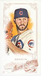
Saturday, March 26, 2022Set: 2015 Topps Allen & Ginter - Mini (Rate) “ Love the classic look on these, but I hate storing the odd shaped cards. ” -muskie027
4
“ Cool design, not a fan of minis though ” -pugchump
3
“ My favorite part of Allen & Ginter is how there are no numbers on the back. Plus, they make some pretty cool designs. ” -TwinKiller
3
“ Nice A&G but years ago I got tired of retro minis. ” -captkirk42
1
“ I hate these things. They don't fit in regular sleeves. I really like Allen and Ginter though. ” -BigBoyOnWheels
2
“ Back when Jake was good! ” -cckeith
1
|
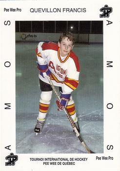
Friday, March 25, 2022Set: 1992 Quebec International Pee-Wee Tournament (Rate) “ Who would've thought a children hockey card was a good idea? And how does one become a Pee Wee pro? ” -TwinKiller
1
“ I am shocked that it looks like this entire set has researched PIDs! ” -rmpaq5
1
“ How i get my child's card on here? ” -parsley24
3
“ I remember we had one of these months ago. Maybe it was a year or more ago, but we did have one of these kid hockey cards. I didn't check on this one but the previous one was a typical kid who didn't pursue hockey after being in the kid league. ” -captkirk42
“ Wow, I'm 5'5" and 157 lbs. I'd be a king in that league!! ” -DanD
1
“ Would be awesome if this kid was a member and saw himself on the RCOTD. This is great! ” -muskie027
1
|
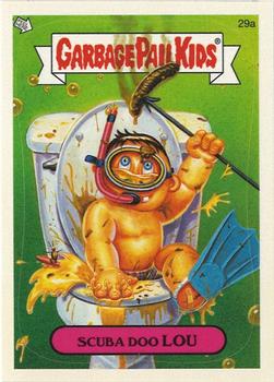
Thursday, March 24, 2022Set: 2005 Topps Garbage Pail Kids All-New Series 4 (Rate) “ these things are why I can't tell people that I collect non-sports, only SOME non-sports. ” -Billy Kingsley
11
“ These cards are really weird. ” -jdogg1228
2
“ I've never understood the appeal of these card ” -tinyshogun
10
“ This is disgusting, and I will probably avoid the website for a day, when this is showing on our home page. Just awful and embarrassing. ” -switzr1
6
“ Nice modern GPK sticker. I am not familiar enough with the series to know if this is a reused picture or a "new" one. Some of the modern series used old images and just gave them new names. ” -captkirk42
1
“ What a crappy card. ” -kirkscards
4
“ Thankfully i wasnt named lou. ” -parsley24
1
“ Now this is great! ” -muskie027
4
|
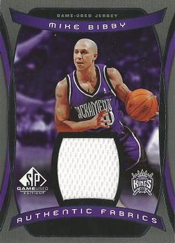
Wednesday, March 23, 2022Set: 2004-05 SP Game Used - Authentic Fabrics (Rate) “ I agree with all the negative comments about this card. ” -NJDevils
3
“ I should be excited to see a storied former AZ Wildcat as RCotD, but his off-court "exploits" are just gross. ” -jackal726
3
“ Very nice insert. Just needs a different photo for the back side. ” -pugchump
1
“ Purple… SO…MUCH…PURPLE ” -Musclebeech
3
“ This is a good example of one of the many reasons I don't like relic cards. The dreaded ALL WHITE SWATCH. The step-brother of the ALL GRAY SWATCH. Back to the card design itself. The front is OK even though they matched team colors with the design when I see a purple NBA card I think The Raptors. Back is minimal since it is a relic card, but they used the same photo tighter cropped. ” -captkirk42
1
“ Looks like a Prizm design. I like the colors on this one. ” -muskie027
|
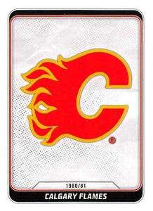
Tuesday, March 22, 2022Set: 2019-20 Topps NHL Sticker Collection (Rate) Card: #570 Calgary Flames Vintage Logo “ I LOVE team logo cards. I wish they were more prevalent. I have not been able to figure out how to search for them on COMC either, I'd like to add more to my collection. ” -Billy Kingsley
3
“ Love a good team logo card. This is no exception. ” -scottwalker29
3
“ To me, the Flames logo always looked like someone with a not so sharp machete hacked up the left side of a capital C. Even with that, I do REALLY like these Topps stickers. They always run out of them at my LCS. ” -Gunny
1
“ Interesting... ” -TwinKiller
“ Now the Atlanta Flames would be a Vintage Logo. ” -kirkscards
1
“ Nice looking sticker. Never could find those "Sticker Albums" though. ” -BigBoyOnWheels
“ I love logo, stadium, even mascot cards. I wish Flagship (or some set) would include them every year. ” -jackal726
1
“ I haven't figured out how Topps can make NHL stickers, but not cards. But I'm fine with it. Competition and variety are good in this hobby. ” -switzr1
“ Great looking sticker. ” -parsley24
“ What a waste of cardboard ” -tinyshogun
2
“ Nice team logo sticker. ” -captkirk42
“ A good example of a great logo. More teams should just make there logos this nice & simple. ” -OverkillKid
“ Straightforward enough ” -pugchump
1
“ I am happy that Topps started to reissue NHL stickers. This is a nice sticker. ” -Brendan Barrick
“ Vintage logo?!? It looks the same today as it did then. Now if it was the Atlanta Flames logo, then we'd be talking vintage. ” -BuccaneersDen
“ 80's hockey logos were the best! ” -muskie027
|
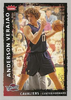
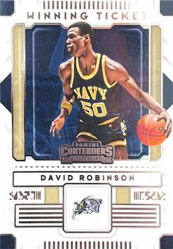
Saturday, March 19, 2022Set: 2020 Panini Contenders Draft Picks - Winning Tickets (Rate) “ Love the Admiral in the Navy duds! ” -muskie027
3
“ It seems like awhile since we have had a college BB card on here. ” -TwinKiller
2
“ Hmm today's (12 Mar 2022) posted random card was a basketball card, although it was an auto card, and today's comment card is also a basketball card. I am not a big fan of draft cards. ” -captkirk42
“ I'm over the "ticket" aspect of Contenders, after about 20 years of it, but I do like the vintage Navy photo of The Admiral. ” -switzr1
2
“ Typical boring Panini. A bit better than they usually do, at least. ” -pugchump
2
“ I'm a fan of college uni cards, probably because I'm a bigger fan of college basketball. ” -jackal726
1
“ The Admiral! Very cool. ” -crushnmove
2
|

")