
Random Card of the Day |
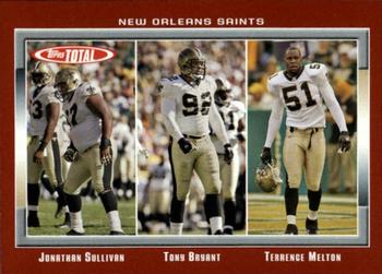
Thursday, March 3, 2022Set: 2006 Topps Total - Red (Rate) Card: #386 Johnathan Sullivan / Terrence Melton / Tony Bryant “ Love Topps Total. They should've gotten some action shots instead of these boring photos but it's a nice design overall. ” -pugchump
4
“ I love the concept of putting offensive or defensive groupings together , but the colors were pretty bad. ” -BigDaddy
4
“ I really like the Topps Total sets. ” -captkirk42
5
“ This looks like progress pictures from a weight loss ad. ” -Musclebeech
4
“ Not a fan of topps total, but do like the look of this card. Would like a little more. For ex if these are the DEF anchors say something that this is a def card or something. Kind of just rando players. ” -parsley24
1
“ Total Topps Total was a good concept. They had a lot of players you wouldn't find in other issues. The 2006 Topps Total issue had a lot of parallels which you can easily tell apart. This is a very nice red card. ” -Brendan Barrick
3
“ i usually don't like multiple player cards but, but in total it worked for me, loved this set every year it was made ” -Thunderfoot
1
|
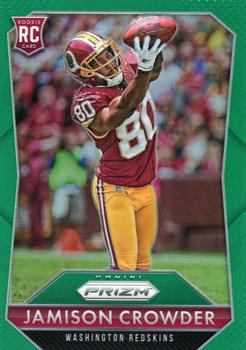
Wednesday, March 2, 2022Set: 2015 Panini Prizm - Green Prizm (Rate) “ Prizm is very cool, albeit very pricey. ” -muskie027
3
“ Panini Prizm is probably the best looking recurring Panini set, and this one is no exception. Could use a team logo on the front though. ” -pugchump
6
“ Right sport. Right division. Wrong team. Go GIANTS! ” -freakizon
3
“ Great Photo and overall a good design
” -parsley24
1
“ Not a fan of Prizm but MAN This is a SWEET looking card. It helps that it is a Redskin. The green works well as a border. ” -captkirk42
1
“ 2015 was my favorite year for Prizm. I like this card. ” -switzr1
1
“ It's always interesting to read the backs of rookie cards - at least those that include a written section.
I can't comment on this player, but I'm guessing some of those comments age much better than others. ” -dilemma19
“ Nice card design, but it seems blurry to me. ” -BigDaddy
1
“ Meh! When I first glanced at this image, I thought it was Jerry Rice. I guess any receiver is a let down after that. ” -tinyshogun
1
|
Tuesday, March 1, 2022Set: 2000 Pacific Private Stock - Retail (Rate) “ Another neat design from Pacific! ” -muskie027
1
“ The back is cool, but the art on the front looks like a mess. ” -pugchump
2
“ Another of Barry Sanders' endless supply of replacements. ” -hamrlik22
4
“ Ahhh those great late 90's early 2000's pacific sets.... wow. ” -parsley24
“ Just an odd-looking card. I can't think of any other way to describe it. ” -switzr1
1
“ OK looking card, not great but OK. Signature style name is a little hard to read other than that front is acceptable. Back is pretty good. Hmm OH Special set with SN base? I don't recall if I have any of these. ” -captkirk42
“ Thumbs down. The Lions sure misused his talents. ” -BigDaddy
2
“ Contributing member of New York Giants backfield in 2007. Got himself a Super Bowl ring. ” -freakizon
“ Never really liked this set. ” -cjjt
1
|
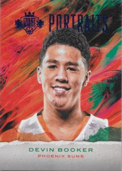
Monday, February 28, 2022Set: 2016-17 Panini Court Kings - Portraits Sapphire (Rate) “ I like Booker, but I don't like this card. ” -muskie027
3
“ A typically boring Panini parallel; at least it’s not as ugly as some of their other designs. ” -pugchump
2
“ Wow! That's awful. ” -BigDaddy
5
“ All that color and then a white box. Its like making a huge box cake and not frosting one side. ” -TwinKiller
“ Court Kings - first thing I thought was will this be a tennis player?, but basketball obviously makes sense as well. ” -Tscastle
“ I'm not crazy about this one. ” -switzr1
“ MMMKay, This is a parallel of an inserrt? Front looks awful. Back is plain but OK for an insert. ” -captkirk42
“ Ah yes. This is a good card here. If Booker keeps up his pace until he retires, he may get into the hall of fame. ” -BigBoyOnWheels
1
“ Dude can play some ball!! ” -tinyshogun
1
|
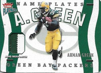
Sunday, February 27, 2022Set: 2002 Fleer Platinum - Nameplates (Rate) “ I think this is a really great card. I never saw one before. Amazed at what can be done when designers put their mind to it ” -NJDevils
4
“ Very nice patch card. The front text doesn't show up well on the scan because it's chromed but I bet it looks great in hand. ” -pugchump
4
“ I remember this guy being a fan of Batman. I will always remember an old Snickers commercial where a football player gets knocked senseless and when asked if he knows who he is replies, "I am Batman."
” -freakizon
4
“ Very Cool Card. This is a great MEM card. ” -parsley24
“ Nice looking relic card and I don't like relic cards. ” -captkirk42
1
“ A lot of Green on this card! ” -BuccaneersDen
3
“ I love the NBA version of this insert and hope to complete it some day. ” -Billy Kingsley
1
“ This is a pretty nice insert. ” -Brendan Barrick
“ Nice looking card. I liked Ahman. He was a studd in Green Bay. ” -BigDaddy
“ I need more green. Someone get me some more green. ” -TwinKiller
1
“ Lots of Green, very appropriate! ” -Tscastle
“ Card-Patch ratio is terrible. Somehow I've heard of this guy, being a Lions fan and all. ” -BigBoyOnWheels
1
|

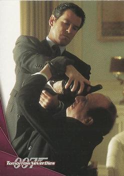
Friday, February 25, 2022Set: 1997 Inkworks James Bond Tomorrow Never Dies (Rate) “ The character is Dr. Kaufman and the actor is Vincent Schiavelli. Weird that they didn't put that on the card. Somebody should probably create PIDs for both of them, too... ” -pugchump
1
“ No ” -BigDaddy
5
“ Batting glove on left hand. ” -NJDevils
2
“ Hmm James Bond card. Not a very good photo for a card. ” -captkirk42
“ "Here comes the airplane! Open up!" ” -TwinKiller
4
“ What exactly is going on here? ” -NickyCollects
|
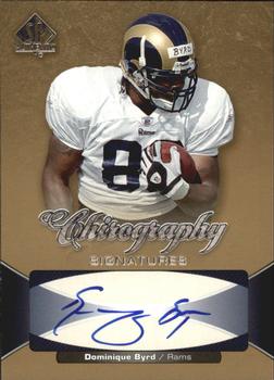
Thursday, February 24, 2022Set: 2006 SP Authentic - Chirography (Rate) “ Needs some more detail but I like it overall. Interesting name for a set too lol. ” -pugchump
1
“ Should be called a Hieroglyphics card. Not the worst looking signature I've seen, but pretty much illegible. ” -hamrlik22
4
“ Great scan and good looking card ” -parsley24
1
“ Okay. I don't remember this guy at all. ” -BigBoyOnWheels
“ There is NO WAY you get "Dominique Byrd" from that signature. "F" for handwriting. ” -Musclebeech
2
“ An OK autograph card. Somewhere I have a Dominique Byrd Signature card but I forget which year/set/brand. ” -captkirk42
“ Byrd didn't have much of a career. He need to work on his signature. This is an ok design of a card. ” -Brendan Barrick
“ This guy never turned out to be big. ” -tinyshogun
2
“ That's a cool artistic looking signature. ” -muskie027
1
|
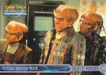
Wednesday, February 23, 2022Set: 1999 SkyBox Star Trek: Deep Space Nine: Memories from the Future (Rate) “ A Star Trek card open for comments on the same day a Star Wars card is RCOTD should be enough to make the “coincidences” list as far as I’m concerned. ” -pugchump
7
“ A Star Trek Card up for comments when a Star Wars Card is on the main page....let the fanboy arguing begin! ” -rmpaq5
4
“ What? You didn't see him grab that face mask? Are you blind? ” -hamrlik22
4
“ This is the look I get from my kids when I try explaining how I didn't even have a cell phone when I was 10. ” -jackal726
5
“ I thought this was some SNL parody of a Sci Fi movie. Those clothes! ” -switzr1
2
“ These dudes always freaked me out. Probably a big reason i dont like star trek ” -parsley24
3
“ They don't look green to me. ” -TwinKiller
4
“ That was such a good episode! I've got a few autographed DS9 cards, but should seek out some sets like this one as well. ” -DanD
|
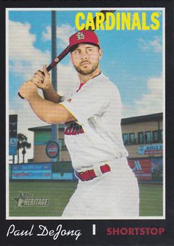
Tuesday, February 22, 2022Set: 2019 Topps Heritage - Black Border (Rate) “ I can live without the black border. ” -Brendan Barrick
4
“ I love the parallels in this set; this photo does not do them justice. The chrome ones are even better. This card's scan needs a replacement though. ” -pugchump
3
“ Very nice Cardinals card that I don't have. ” -switzr1
2
“ He's had a great career, even with me hating the Cardinals!!! ” -tinyshogun
2
“ That's what a baseball card should look like. 👍 ” -sundin
1
“ Such an odd parallel. It looks OK but that is one of the things about Heritage I don't like so much is the parallels and extra insert sets that Topps feels they have to add because current sets have them. ” -captkirk42
“ I was not a fan of this heritage set, but if they were all black i may have had a different opinion. ” -parsley24
“ I wonder when the Cardinals will move on from him... ” -BigBoyOnWheels
1
“ I like Heritage. I like how it brings the old designs back into the limelight. Originally, I hated them when I got back into collecting, but now I am hooked. ” -muskie027
3
“ I remember seeing Paul once while he was with Peoria. I had no idea them that he would become a star. ” -Derek McDonough
1
“ He was an up and coming star, but then he had a bad year and now I kinda forgot about him until I saw this RCOTD. ” -jdogg1228
2
|

")