
Random Card of the Day |
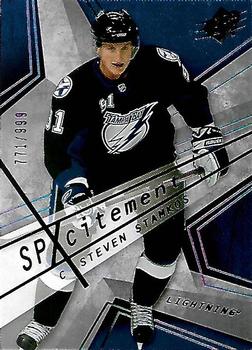
Tuesday, April 7, 2020Set: 2008-09 SPx - SPxcitement (Rate) “ OK as an insert, but that back is tough to read. Maybe better in hand? I hope so. It's interesting how quickly the Lightning went from his team to Nikita Kucherov's team. ” -Billy Kingsley
“ SPx always have nice looking sets. Even if a lot of them are similar. The back of this one should have black lettering on it so it would be easier to read. ” -Bassbunny22
“ How do you pronounce SPxcitement? ” -bpaul14
“ Odd design looks like he is skating on stone. A walk of fame of some kind LOL. Serial numbered card. ” -captkirk42
“ This is an okay design. Good player through. ” -Brendan Barrick
“ Love the look of the card, but it does look like it says spxcitement. ” -crushnmove
|
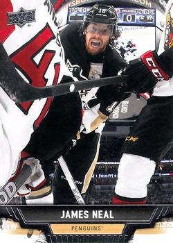
Monday, April 6, 2020Set: 2013-14 Upper Deck (Rate) “ That's a unique perspective! I guess you could say it's the Real Deal. ” -Billy Kingsley
“ Now this is a hockey card. ” -Corky
“ Love this action shot ! Great looking card. ” -uncaian
“ That is one awesome action shot on the front of this card. I'd collect this card just for that reason alone. ” -CollectingAfterDeath
“ I like the picture on the front, and the back is good too. Also, there is two different pictures on the card. ” -Brendan Barrick
“ Looks like some wild action there. ” -captkirk42
“ Great action shot. I feel like the front is lacking a logo. ” -vanstryland
“ The unique photography notwithstanding, it look as if Neal is being sucked into a vortex, despite his cries of anguish . . . Beyond that, the back is a standard Upper Deck look . . . clean and nice, but nothing outstanding . . . ” -georgecf
“ This is a great photo. All around great card. ” -parsley24
“ Love the design for this set, very nice looking cards. Also has some big name young guns. ” -jfalvo316
“ Pretty basic card, but the photography is absolutely amazing. ” -crushnmove
“ Nice action! ” -jackal726
“ Quite the facial hair difference between the front and back images. ” -Mscott713
“ Upper Deck does a great job with hockey. High quality gloss photos with great card stock, nice backs and career stats. I am somewhat glad they don't do all the other sports or I would be bucking up a lot more to collect the sets. ” -muskie027
“ Wow, that photographer really put himself in harm's way! ” -bpaul14
|
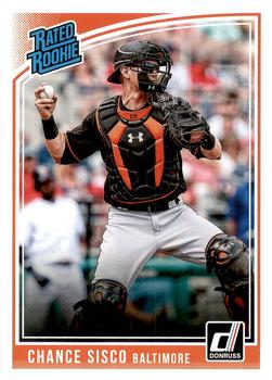
Friday, April 3, 2020Set: 2018 Panini Chronicles - 2018 Donruss Rated Rookies (Rate) “ There is something about the "RATED ROOKIE" that just always takes me back to childhood. I think it reminds me of the feeling of excitement as a kid when I would see these cards in a pack and know that most of my friends were going to want to trade for them. I'm happy they have kept the font the same! ” -Kidd Fan 5
“ Was this card selected randomly or was it selected by "Chance"? I like Donruss card designs and paper stock, but without that MLB license and team logos, I just can't bring myself to buy them. ” -bpaul14
“ Thought this was a Buster Posey card at first and was going to comment about it being on his birthday but NO not that. Oh and look it's Orioles Orange and Black not Giants. Ugh I hate this with logoless cards. I really like the retro Donruss Panini cards, but really hate the whole exclusive license thing that Topps has had for the last billion years. I LOVE CARDS WITH LOGOS. I think they should at least be able to mention the dang Team name. ” -captkirk42
“ No logos - no go for me ” -Paullilko
“ I would collect Donruss baseball if it was licensed. Alas (sigh). Stupid exclusive licenses. ” -muskie027
|
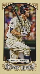
Thursday, April 2, 2020Set: 2014 Topps Gypsy Queen - Mini (Rate) “ I like the mini cards, even if they do make it difficult to stack a set...or even a random handful of new additions! ” -Billy Kingsley
“ Still haven't fallen in love with Gypsy Queen since I returned to the hobby. ” -muskie027
“ I love the tobacco sized cards. I have one binder with nothing but them in it, from all different kinds of sets. If I had this one it would be in that binder. ” -Gunny
“ Yawn. Sorry I'm just tired of minis now. Even if it is of a player from my Homie Team, and who at the time was a fave of mine. Love the throwback uni, although the big thing about throwback unis that bother me (other than the obligated Nike swoosh logo) is the modern cleats clashing with the rest of the uniform look. Even the batting helmets at time look odd with the older unis but not as much as the modern shoosh shoes in bright colors against the white or black socks with sewn on stirrups. Harper wears real stirrups when he isn't wearing his pants leg covering the top of his custom cleats of the game. ” -captkirk42
“ Me - "I prefer A&G, don't want any GQ." Also me, when I see some GQ at Target - "... better get a couple blasters... for science." ” -jackal726
“ good looking card for a set i dont like ” -parsley24
|
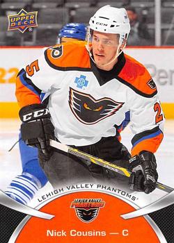
Wednesday, April 1, 2020Set: 2015-16 Upper Deck AHL (Rate) “ Not the greatest design but I do love these newer UD AHL sets, go Phantoms/Flyers! ” -jfalvo316
“ It would be hard to be cousins with Nick Cousins. It would be a whole new Who's on first?. It would be even better if Kirk Cousins was cousins with Nick Cousins. ” -davidhandberry
“ Nice card,front and back. Love the jersey. ” -uncaian
“ "Attendance for tonight's game, One!" ” -SandersFan
“ Nice Farm League Hockey Card. ” -captkirk42
“ Nice design. ” -Brendan Barrick
“ Card design is pretty run of the mill, but great photo and grea unis. ” -crushnmove
“ I really enjoy collecting lower level hockey cards. Although hockey is the 3rd sport I began collecting, it's the first that actually covers a full career on cards. ” -Billy Kingsley
“ Great looking card and a minor. ” -NJDevils
“ It's a Flyers minor league team. But I don't think orange goes with Phantoms. ” -Uncorrected Error
“ Very Niiice! A minor league hockey card.Good to see what these NHL affiliates jerseys look like. Unfortunately, the attendance or lack thereof can be seen in the tiny background. Too much dead space on back ” -baseballcardstoreca
|
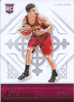
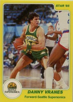
Tuesday, March 31, 2020Set: 2015-16 Panini Excalibur (Rate) “ Pretty obscure player. Retired after 1 season in NBA, due to a bad back if I recall correctly. Excalibur was the only real set that had post-trade deadline photography so I tried to collect it as much as I could, even if there really wasn't much to it. ” -Billy Kingsley
“ Slowly walking away with a stolen ball ” -volbox
“ Probably just me but when I think of Excalibur I think of medieval era things, not basketball. I like the designs, and the Excalibur logo though. I wish they hadn't made all the backgrounds white though, it just doesn't have the pop it could have had. ” -davidhandberry
“ Excalibur: Cards for fans of the NBA and the Knights of the Roundtable. ” -bpaul14
“ Is he protecting the ball from an explosion? ” -SandersFan
“ Arthur pull Excalibur from the stone. Wait? What? ” -captkirk42
“ Kind of a neat look. Boring player. ” -crushnmove
“ could there have been a better photo? Not a fan of the excaliber series ” -parsley24
“ She had a few good solo hits in the '80s, but she was better with Rufus in my opinion. ” -mkaz80
“ If you are into graphic backgrounds, this is actually nice. ” -muskie027
“ Sasha Kaun, let me rock you Let me rock you, Sasha Kaun Let me rock you, that's all I wanna do Sasha Kaun, let me rock you Let me rock you, Sasha Kaun Let me rock you, let me feel for you Feel for you ” -UKboogie
|
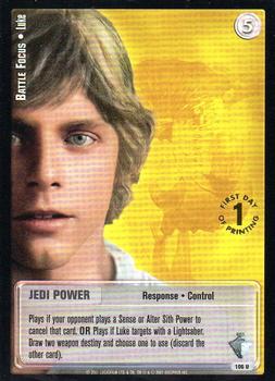
Monday, March 30, 2020Set: 2001 Decipher Jedi Knights TCG: Masters of the Force - First Day of Printing (Rate) Card: #106 Battle Focus - Luke “ I actually like the back of this card more so than the front. ” -Bassbunny22
“ If you have this card in your deck, you are ONE HAND away from winning. #nooooooooooooo ” -parsley24
“ Luke card this not need you. ” -uncaian
“ Love Star Wars, hate the card. ” -crushnmove
“ "Use the Force Luke!" OH Wait since the Mandela Effect the line is now "Lose The Force Luke" ” -captkirk42
“ May the force be with you! ” -Brendan Barrick
“ The front is lame. The back is better. ” -Uncorrected Error
“ I still can't get into the trading card games. Just not my cup of tea. I love Star Wars though. ” -muskie027
|

")