
Random Card of the Day |
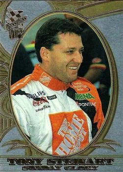
Wednesday, April 29, 2020Set: 2002 Press Pass VIP - Explosives (Rate) “ Really good scan for a mirror foil card! A one per pack parallel, how I miss those days. ” -Billy Kingsley
“ I’m a firm believer that Racing Cards should include an image of the Race Car the driver uses. ” -Derek McDonough
“ At the track Tony is known as a monster but off of the track he has one of the biggest hearts. He's a family friend and his love and friendship helped my family get through the passing of my father. The smile on this card is the Tony I know and will always respect. Thank you Tony for being apart of the family!! ” -Kidd Fan 5
“ Nice looking card. OK so I guess "Explosives" is the Press Pass version of "Chrome"? ” -captkirk42
“ Smoke! Cool looking card. He still races midget cards at a little track near where I live. He also may have run over and killed Kevin Ward Jr.... ” -crushnmove
|
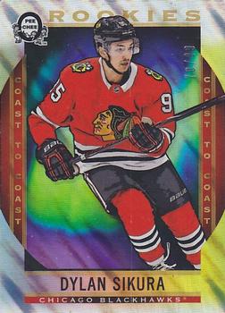
Tuesday, April 28, 2020Set: 2018-19 O-Pee-Chee Coast to Coast - Polar Lights (Rate) “ Plus one for being a numbered parallel, but total disappointment of never getting the opportunity to get these due to not being available in my country. ” -Billy Kingsley
“ Nice concept. ” -Brendan Barrick
“ Love this design, reminds me of the new sunset parallel from 2019-20 O-Pee-Chee Platinum. ” -jfalvo316
“ Yes yes. Blackhawks and SN. 5 stars out of 5 stars. Great. ” -Duke
“ Nice looking card but too typical of modern cards. ” -captkirk42
“ Interesting theme of the polar lights. At first i didnt like it, then saw what they were trying to do and i like it now. ” -parsley24
“ A really fine looking card and a nice scan. ” -NJDevils
“ Beautiful card. ” -crushnmove
“ This has a really cool look. I like the name polar lights too. A really cool card. ” -muskie027
|
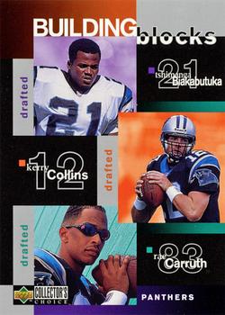
Monday, April 27, 2020Set: 1997 Collector's Choice (Rate) Card: #376 Tshimanga Biakabutuka / Kerry Collins / Rae Carruth / Sam Mills / Anthony Johnson “ Team cards are always fun, and the relatively poor design of this one doesn't even change that. ” -Billy Kingsley
“ This is a pretty good card for a subset. I have always liked Collector's Choice. The sets had large team sets at a low price. ” -Brendan Barrick
“ Sorry at first look this does not look like a trading card. It looks like some confused ad for something vaguely sports related. Good thing they are all the same team it has that going for it. I did a random look at the checklist and most of the regular base cards look OK but these I'm not a fan of. ” -captkirk42
“ As bad as they come. ” -NJDevils
“ Rae Carruth is a Murderer. ” -parsley24
“ Kind of a cool concept to put a team's offseason moves on a card, but it all seems a little too busy with the word "drafted" 3 times on the front. To me, Collector's Choice is the definition of overkill for cards in the 90s. I'd rather have quality over quantity. ” -vanstryland
“ Killer card. ” -crushnmove
“ I immediately destroy any Carruth cards I find (at least the mass produced junk era editions). Strange thing is I don’t have the same visceral reaction to other criminal athletes. I think his story just happened at a really vulnerable time for me personally. Sad story all around. And that’s not even talking about Biakabutuka who rushed for over 300 yards against my Buckeyes also on this card. No way I’d want this near my PC. ” -Brimose
“ Touchdown Tim! ” -cjjt
“ Wow, Rae Carruth. Just a terrible ordeal. ” -muskie027
|
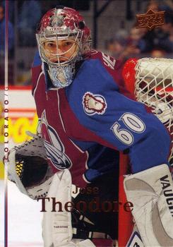
Sunday, April 26, 2020Set: 2007-08 Upper Deck (Rate) “ I like the yeti foot shoulder logo. ” -Billy Kingsley
“ Nice photo. ” -crushnmove
“ The Upper Deck cards are always so nice. This one could use a couple improvements, but still a nice looking card. ” -muskie027
“ Even though it has the sideways text for the team name (city it looks like) and the name is hard to read and there is no team logo I tend to like the 2007 Upper Deck sets. I love the backs with the complete stats and a short bio all of which are fairly easy to read and the small headshot photo. Jose is part of my PC because he was on the Capitals the following season from this card 2008-09 he was with the Caps til 2009-10 only 2 seasons. ” -captkirk42
“ I like this set. It reminds me of the 2007 Upper Deck Football Set. Upper Deck did a good job on both issues. ” -Brendan Barrick
|
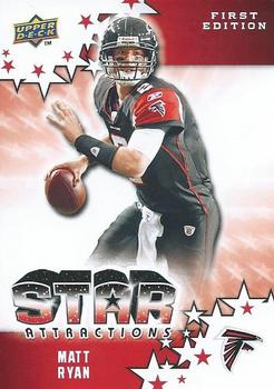
Saturday, April 25, 2020Set: 2009 Upper Deck First Edition - Star Attractions (Rate) “ Not liking this. Sad it is Upper Deck, it has the look of Panini all over. I actually would have liked it as a Panini insert. Not sure why that matters. ” -muskie027
“ For a fake background card this is actually really cool looking. ” -Billy Kingsley
“ There is nothing special about this card. ” -Brendan Barrick
“ OK for an insert card, but if it were a base card it would fail. Unless it was for a fun kids set then the stars corner design things would be fun, but as a serious collectible set NO. ” -captkirk42
“ Ughh. ” -cjjt
“ The front has promise, but the back is lacking ” -parsley24
|
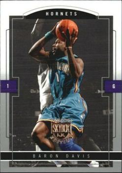
Friday, April 24, 2020Set: 2003-04 SkyBox LE - Retail (Rate) “ Baron Davis is just cool. A player I always liked. Is this the first New Orleans Hornets card to be Card of the Day? I can't recall. ” -Billy Kingsley
“ seems like they gave up on the back. So much empty space. ” -DarkSide830
“ Front OK Would like a team logo on front. Back needs full stats. ” -captkirk42
“ I like it. I have a weird emotional connection with Skybox. ” -crushnmove
|
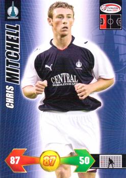
Thursday, April 23, 2020Set: 2009 Panini Scottish Premier League Super Strikes (Rate) “ Soccer CCG card How nice. Guess it had been a while since one of these popped up as a random. ” -captkirk42
“ Oooh, a soccer game card. Let the games begin!! ” -muskie027
|

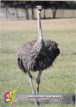
Tuesday, April 21, 2020Set: 1993 Club Pro Set Awesome Animals (Rate) “ Now this is totally random! (and quite possibly my favorite Random Card of the Day ever!) ” -Billy Kingsley
“ My kids love ostriches. There is an ostrich ranch close to where we live and they love to go and feed them. While my kids like baseball (still young), maybe I should go find some animal cards as a way to start their card interest. ” -tcarter
“ For me ostrich has always been more fabulous than awesome. ” -Duke
“ Love these pro set club cards, so many sets to get though ” -aussiewayne
“ I don't know how I missed these, nothing I was doing in 1993 could have been more important than finding these cards. ” -jackal726
“ "I swear bro!! I NEVER skip leg day!!" ” -Kidd Fan 5
“ ha ha ” -crashdavis28
“ I absolutely love these sets. ” -Brimose
“ now That iS Totally RaNdoM. I like it just for the weirdness of it. Seriously though with these animal cards I don't get what the differences are with the Bronze, Silver, Gold or whatever they have because I can't see the differences in the scans. Must be a subtle thing like a font color on one word or the text box color ” -captkirk42
“ Man, they made baseball cards of anyone in the early 1990s. I remember when the Awesome Animals traded Ostrich to the Reds for Mariano Duncan. ” -garysjne
“ Easily the best card of the day ever ” -Declan44
“ Cool card! ” -Brendan Barrick
“ His imagination resembled the wings of an ostrich. It enabled him to run, but not to soar. ” -wjhipwell
“ My starting daughter's favorite animal! What a ridiculous, wonderful card. ” -Vvvergeer
“ One of the better picture I have seen on a Pro Set card. ” -SandersFan
|
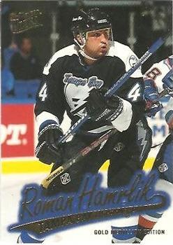
Monday, April 20, 2020Set: 1996-97 Ultra - Gold Medallion (Rate) “ This is my all-time favorite design, as is well known. I don't like the NHL set as much though, because instead of using holofoil for the name they just used plain old boring foil. The holofoil used on the NBA and NFL (and I think MLB) sets is so much nicer. The Hockey set got blue foil for the base cards and the NASCAR set got gold (but no parallel) ” -Billy Kingsley
“ This is a nice design. I am not a big fan of the Gold Medallion. ” -Brendan Barrick
“ The Lightning had a thing for strange jersey numbers when they were a new team. ” -garysjne
“ The photos are amazing, but i dont like the gold script ” -parsley24
“ Some years Ultra did a good job of gold medallion stuff. This was not one of those years. ” -cjjt
“ The picture makes it look as if Roman is strutting across the stage playing guitar . . . It's a nice action shot, and I like the back, also, although there's not much to it . . . But what is there is good . . . Overall, I like the card, which has an overall effect that is greater than the sum of its parts . . . ” -georgecf
“ Cool card. I'm guessing the actual card pops a lot more than the scan. ” -crushnmove
“ Nice card, no bio. Nice front and back though. ” -uncaian
|

")