
Random Card of the Day |

Friday, March 9, 2018Set: 2001 Pacific Crown Royale (Rate) “ It's not a tumor! ” -ShoTime
“ One of my favorite sets of all time. I have quite a few of the baseball cards and wish I had more. ” -davidhandberry
“ These are tough to scan but this is a great one. ” -carthage44
“ It’s not a Toomer! ” -sahal694
“ These really are the best die-cut cards of all-time. No contest. ” -mkaz80
“ I really like this one, especially if it is an insert. I didn't collect these, but the crown has a felt look, which is cool and in the crown it looks like threading. If it is, that is kind of neat. If it is just the effect of the card, it looks real cool and then it also was a great scan to pick up the effect. I like how you can see the sun shining on Amani and if you look close enough at his helmet, I think you can see a reflection of the sky. ” -muskie027
“ OK I will try to stay positive. I am not a big fan of the crown shaped die-cuts of Crown Royale. I am just tired of them. They spoil any good feelings I have for die-cut cards. Sorry for being negative on this, but these cards and this shape is I will say my "last liked" die-cut shape. They are distinctive so you know what they are right off I guess that is a good thing right? ” -captkirk42
“ "Its not a toomer!" -- Sylvester Stallone (First Blood) ” -parsley24
“ Why is it every time I see this guy's name I try to do an Arnold Schwarzenegger impersonation... ” -rmitchell6700
“ Another one of mine!!! Yeah! Leading Giants receiver of all time. Unsung hero. I always liked Crown Royale. At least they were trying. Hate the parallels. ” -cjjt
“ Love these cards ” -biggiofn7
|

Thursday, March 8, 2018Set: 1989 Best Riverside Red Wave (Rate) “ If Will Ferrell ever stars in a movie about a minor league baseball trainer, he will portray Jim Daniel. ” -switzr1
“ Even the trainer gets a card! I think that is actually pretty neat ” -702tpr777
“ Cards like this are great. There is more to sports than just the superstar players, and they deserve to be documented on cards as well! ” -Billy Kingsley
“ I had no clue who the Riverside Red Wave are/were. After some investigation I find they are now the High Desert Mavericks, never heard of them either. I will say that jacket that he is wearing is just covered in awesome. ” -Gunny
“ I like these sets. I know they are pretty boring, but the nostalgia gets to me. I like how the trainer and coaches get a card. I at first thought this would be a Cincinnati Reds or Boston Red Sox minor league team but turns out the Red Wave were actually a San Diego Padres minor league team. ” -davidhandberry
“ Ron Burgundy???? ” -tbshaw
“ Why aren't there anymore trainer cards? ” -carthage44
“ hahahahahahahahahahahahahahahahahahaha *Breathes* hahahahahahahahahahahahahahahahahahahaha ” -parsley24
“ I love how the minor leagues include EVERYONE on the team ! Can't wait to see the hot dog vendors card. ” -uncaian
“ Even the trainers need some love. ” -RoyalChief
“ as always love minor league logos, i like the overall design but it just needs something to give it some pop ” -Thunderfoot
“ Why do the Minor League Cards have a trainer card and the major leagues do not? ” -kirkscards
“ This guy would have two first names. ” -sahal694
“ Nice Minor League Card. A trainer card. Looks like the stadium was getting ready for opening day or a special game like a 4th of July game with the red/white/blue bunting. I wonder if any Minor League card collectors PC trainers? ” -captkirk42
“ In 1989, this dinky company found it within themselves to produce a card of a minor league ball club's trainer that has a color photo on the back -- a different photo than the one on the front, even. Yet, in 2018, we somehow have mega-million dollar sports card manufacturers who struggle--or refuse--to make a similar effort. Go figure. ” -mkaz80
“ MiLB trainer. Kinda has that 1982 Topps feel to it. ” -vrooomed
“ He looks like a gym teacher posing for yearbook staff photos ” -biggiofn7
“ Only in the minors! ” -NJDevils
“ Trainer card! Awesome! I'm also loving the classic 80s design graphics. Most impressive to me, for a minor league set of this time frame, is the colour photo on back. Well Done! ” -rmpaq5
“ Trainer cards are the bane of my collecting existence. If one of them falls within the purview of my defined objectives for my collection, I feel like I have no choice but to take them on ... even though it's pointless and I don't want them. ” -NYMHall
“ Rare trainer card... i like it ” -Bargunmaster
|

Wednesday, March 7, 2018Set: 2003 Topps 1st Edition (Rate) “ I like the blue border and the large photo. Besides that I don't see anything I really like. I don't see a point to having a second photo of just the face of a player in a mask. If they had put one of him without the mask there it might have worked, or if that picture was on the back maybe. On the back I like the bio instead of stats for football cards. ” -davidhandberry
“ This was a great year for Topps football in terms of design. It's got the whole "1983 Topps baseball" vibe to it, plus the back of the card is appealing. [insert old crotchety man voice]: Why can't football cards stick to the basic principles today?? ” -mkaz80
“ Doing the Watusi. ” -NYMHall
“ OLs should have some kind of stats. Even if it is simply how many times he gets his haircut each year. ” -NJDevils
“ Back when they used to give offensive lineman cards. ” -carthage44
“ Dark scan. I like the 2003 Topps set. But 1st Edition is a silly parallel. ” -cjjt
“ "What's that, Jack? What? You're a big, bad C.I.A. man, huh? Did they teach you *that* in the C.I.A.? They teach you that?" ” -sahal694
“ I don't remember Ross Tucker, but I do like this set a lot. And he has good speed skater form here. ” -switzr1
“ OK how can I be positive with a Cowboys card? LOL. (Life long Skins fan here OK) This 2003 Topps football shares the same general design as the Baseball during the years when Topps standardized their designs across all the sports they produced sets for. I think I have always liked the 2003 design despite thinking that the early 2000s were still part of the overproduced years when I got back into the hobby circa 2004/5. ” -captkirk42
“ Topps football is awesome! Seriously it is. It's the only brand of the only sport I collect. ” -cnangle
“ "Come on baby... Lets do the twist!" ” -YoRicha
“ Pretty sure this is an uncorrected error and that Russell Maryland is actually pictured on this card. ” -UKboogie
“ The write up on the back of this is very, very good! As for the front a nice action shot, but I'm a little perplexed as to how an offensive lineman would end up right next to the out of bounds lines. Special teams? Pregame warm up drill? ” -rmpaq5
|

Tuesday, March 6, 2018Set: 2000 Pacific Omega - Platinum Blue (Rate) “ Good photo, decent design...but is this a blue just because the company logo and text is bluish? If that is case kind of lame. ” -rmpaq5
“ SN51? How unusual. Of course, Pacific liked doing the unusual. ” -Billy Kingsley
“ Not a bad front design. Only thing I'd change would be putting the team name in black instead of white. The back could look so much better though. There's a lot of wasted space on the right side of the card. All of that info could have been put in the top-right, the written info could run across the card and there would have been more room for some stats. ” -spazmatastic
“ I don't collect football, and I only occasionally watch it except in the late playoffs, but there's something about this card that strikes me as very appealing. I do like the old Pacific Platinum Blue inserts in any case. ” -NYMHall
“ I like this card. The border is nice and it has a great action shot. The back, I know people will complain about having just a year in stats but with football stats aren't as big of a deal as baseball and basketball in my opinion. ” -davidhandberry
“ Being a former fullback, Alstott is one of my favorite players of all-time! ” -carthage44
“ Fun player to watch; Pacific cards are not fun to look at. ” -cnangle
“ At first I thought I didn't like it, but as I keep looking, the front is kind of cool. The back is ok too, but needs more stats. ” -muskie027
“ Ohhhh...one of my favorite football players in the history of the universe. Great card. I love it! (Even if it doesn't look blue to me). Pacific was so awesome despite the color parallels. ” -switzr1
“ I like, well sort of still like, Pacific products. I of course dislike the overuse of foil for everything and in the case of this parallel apparently it is the color foil or lack of color in the foil that makes these parallels. UGH. Design is OK but as I have said many times not a fan of foil lettering. Back is OK but it says 4 years totals and shows just the total from those 4 years not the individual years. UGH one year of stats or technically just the career line of stats. ” -captkirk42
“ I love these running backs.....those that put a hurt on the linebacker. FULL truck mode!!! ” -RoyalChief
|

Monday, March 5, 2018Set: 2001 Fleer Authority - Diamond Cuts Memorabilia (Rate) “ Cool card. Like the background. Players superimposed over other stuff is fine for relics. ” -Billy Kingsley
“ I like the game used bat cards more than the jerseys. ” -carthage44
“ Pretty decent. Considering there are a very small percentage of jersey/relic cards that are done well, that's a pretty high compliment. ” -mkaz80
“ ACK way too busy with that bag of balls and it's a bat card, shouldn't the background be of bat handles or bats? Back with "congratulations" is a big waste. Ah the early days of relic cards when everything was called a "game used" card, or a "jersey" card, or in this case a "bat" card. Larry Walker think of him more as an Expo than a Rockie. ” -captkirk42
“ Nice looking card. I go back and forth on MEM cards, but I like them right now. ” -switzr1
“ Nice looking card. Memorabilia cards aren't my thing, but I like the concept of them. And this one's got a nice image on the front. ” -kents_stuff
“ Not bad for an insert. Kind of neat memorabilia design and card. ” -muskie027
|
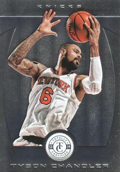
Sunday, March 4, 2018Set: 2013-14 Panini Totally Certified (Rate) “ Not bad, not great. I really can't get a true love on for Panini products. They are ok, some of them actually are really good, but those backs really prevent you from loving them. I don't know why they are so anti-statistic. This card is nice enough looking, but nothing to write home about. ” -muskie027
“ Not a huge fan of this set, but at least an NBA card will be Card of the Day, so that's cool. I believe this may be the first Knicks card to come up there as well. ” -Billy Kingsley
“ Former Bull. ” -carthage44
“ This is a nice looking card ” -kirkscards
“ Totally certified what? Looks pretty boring ” -aussiewayne
“ Totally Certified? No thanks, I'll wait for the Totally Krossed Out edition where all the players wear their jerseys backwards. ” -bevans
“ While I would rather see the full photo with background players, this is a nice action shot. Because it's cropped to just him, the background is boring, though. ” -kents_stuff
“ Great rebounder. Always one of my non-Celtics favorites. Pretty sharp card, too. ” -mkaz80
“ Pretty good looking card for a G league team. ” -parsley24
“ These cards look much nicer in person than in scan. All chrome though means put it in a penny sleeve or forever have fingerprint splotches all over. That is one of the reasons I am totally sick of chrome cards. Prefer when there is an actual background to a picture. That is another thing I am getting tired of is either no backgrounds or cgi backgrounds. I wish the card companies would get back to the basic fundementals of card making. Team logo would be nice on front. Back typical needs full stats not just one year. ” -captkirk42
|

Saturday, March 3, 2018Set: 2007 Star Wars Pocketmodel TCG Ground Assault (Rate) “ I've never understood trading card games. ” -olerud363
“ Magic wanna be. ” -carthage44
“ Nope , nope , nope the Force is weak in this one ! ” -uncaian
“ not a great card. ” -parsley24
“ Unless the Random Card of the Day is a Topps card, I probably won't comment on it. ” -jayoneill
“ As much as I love Star Wars, I just never got into game cards of any kind. Maybe somewhere in a galaxy far away, I understand how to play and love these things. ” -muskie027
“ Not my scene, I guess. ” -kents_stuff
“ I'm probably one of a dozen people in the free world that have never seen a Star Wars movie...ever ” -rmitchell6700
“ I don't remember this character. "Order! Order!" "I'll have toast and back bacon, and hold the toast, eh." ...wrong movie. ” -switzr1
“ And we are back to game cards for the Random CofD. I'm a little curious (but not THAT much) to see how many Star Wars TCGs there actually are. There are at least 2 or 3 individual Star Wars Card Games of this type. Probably a dozen more. ” -captkirk42
|

Friday, March 2, 2018Set: 1998 Pinnacle Inside (Rate) “ Did you turn your head to read the card back? I sure did. I have been known to use an odd angle when it's the only way to get something in a photo entirely- generally a car that I can't get a better angle of- but here it just seems a little forced and odd for the sake of odd. Even so, I kind of like it, and it'd be easy enough in hand to tilt the card slightly. ” -Billy Kingsley
“ Cards that came in a can? Count me in! ” -mkaz80
“ Front is ok. I wish that it had his team logo or name on the front. The back on the other hand is horrible. Everything slanted is annoying, no stats, mildly interesting facts. I believe this is the set that came in cans which was a cool gimmick. ” -davidhandberry
“ Cheezy 90s design, but I kinda like it. I can't think of any other similar cards, so great job Pinnacle for not recycling! ” -dilemma19
“ Oh Mr. Abbott, he had so much promise with the White Sox. Considering his career stats are .263, 18 HRs and 83 RBI it did not turn out so well. GO WHITE SOX!!! ” -carthage44
“ Ah 1990s Pinnacle. Lets see front design a bit odd but OK I guess needs team name and logo "rookie" could be a little smaller. Chrome lettering not bad in this case. Back? What NO stats? OH OK He is a rookie, but why not show college or high school stats? ” -captkirk42
“ Good looking card. Ruined with the pinnacle logo though. But this is that late 90s graphic look that i detest. ” -parsley24
“ Cards in a can!! ” -suomibear8
“ Not a fan of this design, looks like all of the cards were crooked going through the printer. ” -IfbBirdsCards
“ Worse "Rookie" branding ever. Abbott's name is printed too big. The whole angle thing in the name, position and whatever the heck the rookie this is gives me nausea. OMG, the back just stepped the nausea up to vertigo. Other than that, it isn't so bad. ” -muskie027
“ How many others googled Jeff Abbott to see if he was related to the great Jim Abbott? ” -bigsmooth
“ Are these the ones that came in the tin cans? Probably not the best gimmick ever. The cans took up too much room. Card looks pretty good though. ” -switzr1
|

Thursday, March 1, 2018Set: 2012-13 Cardset Finland - Signature (Rate) “ Cool! I wish they televised games from other leagues around the world here in the US. I'd watch them. At least we do get the Champion's League. I want more though. ” -Billy Kingsley
“ Since the text is in Finnish I will reserve my comments to the photo and design. Black and white is a negative with this card. Same photo on back also a negative. I can see why the set was made the way it was for the on card auto, but I'm sure we can all admit we have see much better with this concept. ” -rmpaq5
“ He looks like a sick juror. ” -revnorb
“ The serial number on the back is written on, always interesting. ” -carthage44
“ Nothing good about this card. Black and white photo is blah. Half the card is taken up by whiteness. They couldn't make it so his autograph wasn't over his name but the name of the insert is huge, like we couldn't have figured out it was a signature without it. The back is in a different language but it is obviously not stats. Luckily I don't collect hockey so I don't have to worry about ever getting one of these. ” -davidhandberry
“ Overall I like this card, lots of room for the signature which works for me. ” -Gunny
“ Very cool card. I like seeing the cards from other countries. ” -parsley24
“ Cool for a signature card ! ” -uncaian
“ Nice auto card. can't tell but looks to be a large sticker :( Like the design, don't like that the back has the congratulations you have just received an autographed card. ” -captkirk42
“ Onnittelut! This is one of the best random cards of the day I've seen in quite some time. I recognize only 4 names from the checklist, yet I'd love to own this set. ” -dilemma19
“ This is the coolest card I've ever seen. (I decided on that comment before I clicked the card) ” -switzr1
“ Yes. Nice to see finnish card as RCOTD. Is this perhaps the first time that finnish player signature card is RCOTD? He is actually quite good player and he is more famous than just an average league player. He won some trophy in finnish sports gala for fighting against disease (ulcerative colitis). And by the way, that team doesn't exist anymore. It was Blues Espoo and it went bankrupt. ” -Duke
“ He has the same look on his face as I do now looking at this card. ” -NJDevils
“ He looks cold. ” -RoundtheDiamond87
“ Finnish! Love it. Good picture and okay front -- I'm okay with the white space for an autograph. The back sucks. ” -cjjt
“ Is this the start of an autograph run on RCOTD? I loved this from the perspective that it is a foreign set and an auto. I never really get to see what the foreign sets offer in the auto department. The serial numbering is interesting too. The card is overall ok at best, but I loved seeing it more than some cards that look better. ” -muskie027
|

Wednesday, February 28, 2018Set: 2010 Topps Triple Threads - Sepia (Rate) “ Sepia really doesn't need to be a thing. At least it's numbered. ” -Billy Kingsley
“ Never understood Triple Threads. My first taste of them was game used cards and it made sense, threads = uniform cards. Then I found out that they had a base set and non game used cards and I was confused. Glad to see a former Brave as RCOD, hadn't seen one in a while, even if it is one of the worst free agent signings the Braves have ever done. ” -davidhandberry
“ Looks like a Rays player with a Yankees facade. ” -NJDevils
“ Meh. This is Exhibit A of how modern cards have gone down the crapper. ” -beansballcardblog
“ These were some high end cards back in the day. ” -carthage44
“ Where is the triple thread on this card? ” -switzr1
“ Good looking card for Upper Deck. ” -parsley24
“ Sadly this type of card is typical of modern mediocrity. I like it in some ways and don't like it in others. Front is pretty good even though it looks like some kind of movie reel trophy presentation. Back needs fuller stats, might as well get rid of the duplicate of the headshot move team logo to front. ” -captkirk42
“ Not familiar with it, but ol' Melvin had a few god seasons back in the day. This card doesn't pop special to me, but it is moderately ok. ” -muskie027
“ With lightning wrists and cannon arms, I at first assumed this was a Marvel or DC Comics card. But I'm always glad to see baseball represented. Not a bad design on the front, although a lot of unused space so that could be smaller. ” -kents_stuff
“ Stealing from the back 1) I actually like the player of the foreground in focus vs the background being out of focus. Creates an interesting effect. 2) Despite the wasted space on the bottom it works for this photo...maybe not all cards of this set but this one looks good. 3) More stats would be nice. ” -rmpaq5
|

")