
Random Card of the Day |
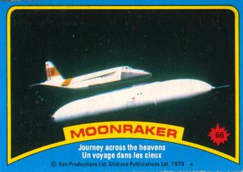
Sunday, January 28, 2018Set: 1979 O-Pee-Chee Moonraker (Rate) Card: #66 Journey across the heavens “ If you really want a good hard edged story read the book, the movie shares barely anything except the title. ” -rmpaq5
“ Love it! I chewed a piece of gum from a Moonraker pack about a year ago. And I'm still here to tell you about it! ” -switzr1
“ Moonraker. Love it. Still haven't completed the set or the stickers but what the heck. ” -captkirk42
“ I love non-sport more and more each day. Very nice! ” -muskie027
“ Had no idea what Moonraker was. I had to look it up to find out it was a James Bond film with Roger Moore. Was never a big James Bond fan and based upon the card and the brief synopsis I read, I am not in any hurry to see it. As far as cards go, not a bad design for the front but hate the puzzle piece cards on the back. ” -davidhandberry
“ Why? ” -Sportzcommish
“ Oooo, super nerdy! ” -carthage44
“ I think O-Pee-Chee faked the moon landing. There...I said it. ” -mkaz80
“ Is this Bond? Pretty cool. This is why I love RCOTD. You always come across something you never knew about! ” -RoyalChief
“ Cool, neat non sport set. I think i had this card at one time when i was little. ” -parsley24
“ That looks out of this world! Always like the OPC stuff, but that puzzle back is awful. ” -Doc Floyd
“ Ahh ,70's movie cards ,groovy ! ” -uncaian
“ My name is Bond. James Bond. Man, I keep forgetting about those card sets! ” -Joshua825
|
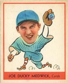
Saturday, January 27, 2018Set: 1938 Goudey Heads-Up (R323) (Rate) “ It is fantastic when something "Super Vintage," no matter the sport/non-sport, comes up as the RCOTD! ” -rmpaq5
“ Beautiful. ” -702tpr777
“ Cant believe this is a card from the 30's. Thought it was a newer card. ” -carthage44
“ I know it is vintage and old so I should and usually do love old cards but this one looks like my 4 year old made it. ” -davidhandberry
“ Corny.....vintage....LOVE IT. ” -tbshaw
“ Nice antique specimen here, plus it's a Cardinal (although you couldn't tell that from the uni so easily, could you?). Ducky's a legendary nickname. And when will you see nowadays a card as grammatically sound as this example "with which" we are blessed as RCOTD? ” -kents_stuff
“ Crazy to think these ever made it to production. There is a guy at Pier 39 in santa momica whom pretty much does the same thing now. And how come "ducky" isnt a popular nickname anymore. kind of fell out after the 70s? ” -parsley24
“ Love these - fun little cards and I hope to add a couple to my collection. ” -marcbrubaker
“ This card is just Ducky. Would love to see someone own the entire set of these and show them off. ” -rmitchell6700
“ Gotta love vintage baseball!!! ” -jayoneill
“ This is a wonderful piece of art. I almost thought this was panini triple play ” -Bargunmaster
“ I am not a fan of this card. His face on a cartoon body is not very professional ” -Jd_sports
“ I don't know if I love the card or the nickname more! ” -Sportzcommish
“ WOW! ” -NJDevils
“ Seems so odd for 1938. I lean toward liking it. Yeah, I think I give it a small thumbs up for the giant head to see. ” -muskie027
“ WOW. Awesome card! ” -cjjt
“ This is a great card but it could use a glossy holofoil parallel serial numbered to 67 to make it perfect. ” -UKboogie
“ Coll baseball vintage. Even though Goudey is a oddball size I still love them. These Heads Up cards are extra cool. ” -captkirk42
|
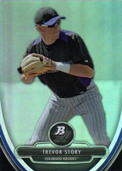
Friday, January 26, 2018Set: 2013 Bowman Platinum - Prospects (Rate) “ I really, really, liked 2010 Bowman Platinum (yes it is a Bowman product and I've voiced my opinion on that a few dozen times) but I bought a box when I first got back into collecting for rather cheap (before I guy named Trout exploded) and pulled 2 printing plates, one auto'ed, in the same box. They are long since gone, traded back when I was on Beckett and can't even remember the guys' names (the auto's last name was Wilson) so the next week I went back and bought another box. Pulled a few Prospect Trout parallels, which a year later turned into some fine trade currency. As for the design...once again it is a Bowman release but I really liked the look of these then, and still do today. Clean, space well used, etc.. ” -rmpaq5
“ Cool card. I always liked the different cards they made but never liked how many different ones. ” -Parsons0311
“ I don't care for prospect sets. Trevor Story has actually become a full time major league player but too many cards are made of players that never make in the majors. ” -davidhandberry
“ And just as quickly as he arrived, Trevor's story faded into mediocrity and obscurity. ” -Brimose
“ How many variations or inserts of these are there? A rhetorical question. ” -Sportzcommish
“ Bowman sets are so confusing now. I just can't get into them like the old Bowman. The parallels...ugh ” -suomibear8
“ One of my favorite brands. Good player photos, smart looking design. ” -KMack
“ Unpopular opinion time: I hate what Bowman has become with the prospect card sets. Just feels like it takes something away from when a guy actually makes the big leagues and has a bona fide rookie card to call his own. This card predates Story's big league debut by three years yet boldly lists him as a member of the Colorado Rockies. At least this card doesn't have him photoshopped into a Rockies uniform like the more recent releases would. Minor league cards I like, but they don't try to make any false claims about the player being a member of the parent squad. ” -OCHawkeye
“ HHHBN01 - Hate hate hate Bowman numbering ” -NJDevils
“ Nice card, and a pretty respectable scan. ” -dilemma19
“ One year wonder? ” -carthage44
“ At times I like Bowman Platinum and at times I don't. (like their numbering system and the fact they are Prospect cards yuck) They are very bare bones. ” -captkirk42
“ I don't know about the muted blue (platinum blue, I presume) background, but otherwise the front is pretty appealing to me. ” -kents_stuff
“ Dude was on major league cards in 2013, but his rookie cards are 2016, due to the BPP prefix in his card number. ” -switzr1
“ The Story is that he is just an average player. ” -kirkscards
|
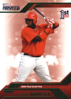
Thursday, January 25, 2018Set: 2009 TriStar Prospects Plus - Green (Rate) “ Alibaba Barkley was Charles' seventh favorite son. #WarEagle ” -UKboogie
“ One major issue I have, maybe I am missing it somewhere but I don't see the team anywhere on the front. On the back it says drafter by Los Angeles AL but too much searching for the team. Nice that the last player drafted got a card though. ” -davidhandberry
“ "Final Draft Pick?" So this is Mr. Irrelevant then? ” -mkaz80
“ No background on front. No stats on back. Not Topps. Not a fan of this card. ” -jayoneill
“ Graphic mania ad nauseum with added airbrushing to remove team logos, numbers, etc. I shall pass. ” -Sportzcommish
“ Very blah. ” -carthage44
“ Not a bad looking card. Not a fan of the airbrushed, no logo having, 3rd party sets, but this one is not bad. ” -parsley24
“ Not a fan of prospect cards. That being said. Front so-so Player's name is decent size but in foil bad for scan. OK the guy was a first draft pick. FOR WHICH TEAM? Oh the back says he was drafted by Los Angeles AL so The Angels. The back also indicates he was from George Washington U? Then they should mention the school on the front, which I am guessing is the uniform he is in on the front. Those are some of the many reasons I don't like these prospect cards. ” -captkirk42
“ Nothing thrills me about this. ” -muskie027
“ As pick #1521 in the draft, I question his status as a "Prospect." Still, kind of cool that someone made a card of him. I'll research his career later. ” -switzr1
|
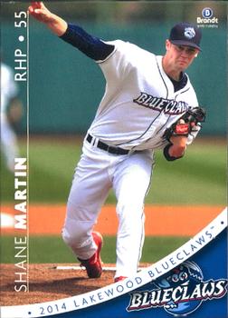
Wednesday, January 24, 2018Set: 2014 Brandt Lakewood BlueClaws (Rate) “ I decided to say something nice about tonight's card, before looking at it. Thankfully the randomizer made that easy. I love this card! Minor league baseball. Nice design. Good photo. Cool team name and logo. Nice uniform. Never heard of the Player (which is not a detriment). What's not to like? ” -switzr1
“ Nice Modern Minor League Card. ” -captkirk42
“ Full stats, team logo front and back, small manufacturer logo, position, uni #, year made, nice bios, and card numbers. Only negative - same photo used on the back as the front, just cropped a lot. All in all, a great MiLB card (and set)! ” -vrooomed
“ Pretty good for a minor league card. ” -Sportzcommish
“ Nice design and nice layout. Also, the colors pop. ” -carthage44
“ Nice minor league card. I find a lot of times they are better designs than major league of the same time period. ” -Billy Kingsley
“ Honestly not a bad card. Way better than some of the junk that is out there. And for a minor league card. Ewwwwwww weeeeee. ” -parsley24
“ Good looking minor league card. ” -NJDevils
“ Nice card for a minor league card. ” -kirkscards
“ Nice minor league card here. Simple, yet cool design. However, I've never been much of a fan of vertical text. ” -IfbBirdsCards
“ Wow, that's a really nicely done minor league card. And a great team name. ” -Vvvergeer
“ Nice looking card I think. ” -KMack
“ WHOA! That is a lot going on in a MiLB. I actually think it would be awesome if the name, position and number were written on the white stripe that says 2014 Lakewood Blue Claws. The Logo could speak for the team. Those two little changes and this would be a nice MLB card. ” -muskie027
“ nice looking card, loving seeing the minor league team names and logos ” -Thunderfoot
“ This is a nice minor league card. If I had a connection to the team I would like to have it. ” -UKboogie
|
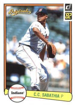
Tuesday, January 23, 2018Set: 2002 Donruss Originals - Aqueous (Rate) “ It is just confusing to me that it is a 2002 card but they would still have the 82 on it. Besides that I like the new players on the old designs especially 1982 since it is my birth year. ” -davidhandberry
“ I love practically any throwback card....often times more than the original..... ” -tbshaw
“ I actually like these. ” -carthage44
“ I got a pack of these in a repack box a few years back. Really liked the concept but that was all that I saw of them. ” -jasongerman9
“ Cool looking old school card. The photo is a little washed out and could use some more contrast if i need to find one critique. ” -parsley24
“ I guess 20 years is a milestone if you've only been around that long (in 2002). Unlike Topps and Bowman which have been around much longer. ” -Sportzcommish
“ This is one of my favorite sets from the early-'00s. This is C.C. when he was half the size he is now! ” -mkaz80
“ At first I was giddy to see an authentic '82 Donruss card featured, but alas, it's a recycled design. What makes this card aqueous I wonder? Will Sabathia get into the HOF? ” -dilemma19
“ love the old school design ” -Bargunmaster
“ Wow. For some reason I really like this card. ” -DarkSide830
“ I'm a huge fan of re-hashing the old designs. Makes me appreciate the original sets even more. ” -SFC Temple
“ Let's see--2002 would not be "original" for Donruss for baseball, so the name is ridiculous. Neither would 1982, so the choice of this design (or again the name) is ridiculous. But the good news is that other than that I have nothing to complain about that wouldn't have also been a complaint with the 1982 set. ” -kents_stuff
“ i like it, didn't realise he had been in the mlb that long ” -Thunderfoot
“ This looks more like a 1982 Donruss card than the similar throwback insert they put in 2016 packs. ” -switzr1
“ Does this card really contain water? ” -NJDevils
|
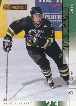
Monday, January 22, 2018Set: 2000-01 Upper Deck CHL Prospects (Rate) “ Upper Deck had great baseball, but I feel like they were made for hockey. This is cool for a CHL set. I love Upper Deck's standard hockey release. ” -muskie027
“ Cool, minor league hockey! Very much a design of it's time, I still like it. ” -Billy Kingsley
“ An almost exceptional card had the extended sidebar not been used. ” -Sportzcommish
“ It says in his one season he had 67 games played. What is that when I convert out of metric? ” -kents_stuff
“ Pretty good looking card. I used to watch a lot of the games of the CHL and minor hockey leagues in washington state. Cool to think there were cards. ” -parsley24
“ Not a huge fan of Prospects, but I am learning to like some of the uniforms. Front *sigh* you want a border go with a border, don't use all the text as a border. OK at least the player name is prominent but not super easy to read. A Team logo would have been nice. Back is typical boring UD. I can see all the complaints about using the same photo for the headshot. and only one line of stats. ” -captkirk42
“ Hockey prospects start when they are 8 years old. ” -carthage44
“ A shame these weren't part of the Pinnacle Inside sets. Then it would have really been "Prince Albert in a can." ” -vrooomed
“ The usual negatives. Same pic on front and back. Sideways name, team, position, whatever. And to make it really bad, they not only put the player's name sideways, the first and last names are facing the opposite way. "F". ” -NJDevils
|
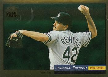
Sunday, January 21, 2018Set: 1994 Score - Gold Rush (Rate) “ I like the photo, and I know the card looks better in hand, so I give this a thumbs up. ” -switzr1
“ Not a bad looking card at all. ” -muskie027
“ I believe I have this card. I liked the base set but I am not a fan of parallels. Though this concept was new and I liked it when it came out. ” -davidhandberry
“ Should be vertically presented due to the pose. ” -Sportzcommish
“ Very poor scan. ” -carthage44
“ Good photo. good simple design. ” -parsley24
“ Good scan. ” -cjjt
“ Like the front; good action picture. Would rather see no picture on the back and make the stats bigger for easier reading. ” -KMack
“ I loved these Gold Rush cards. Except for the fact that they picked up fingerprints. ” -beansballcardblog
“ I liked the Gold Rush parallel and similar innovations from the outset of parallels and inserts in the early 90s. I wish sets, and life, were as simple as back then. ” -kents_stuff
“ uh-glee ” -NJDevils
“ Reynosos had maybe the pick-off move of any RHP I've ever seen. As for the card, this was a solid year for Score. Didn't exactly go ga-ga over these Gold Rush parallels, but they're fun to collect. ” -mkaz80
“ Oh, a card featuring Mexican League stats. Neat! ” -DarkSide830
|

")