
Random Card of the Day |
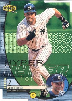
Monday, January 24, 2022Set: 1999 UD Ionix - Hyper (Rate) “ Cool late 90's insert. ” -sundin
1
“ The design is way too busy on the front. I can see they were going for a computeristic design, given the time period in which this card was printed, but there’s just too much going on. The base cards for this set look great, I wish they didn’t change the design so much for the parallels. ” -pugchump
5
“ Pretty, pretty, poor. ” -NJDevils
2
“ Decent card, but cluttered up with stuff. ” -BigDaddy
2
“ I know that they were trying to look "cool," but that backfired. ” -BigBoyOnWheels
2
“ Derek Jeter - random card.
Derek Jeter - random Yankees Great ” -jayoneill
1
“ WAY too much going on here. ” -TwinKiller
2
“ ACK! this card is way too busy. Looks like a gaming card on the front. ” -captkirk42
2
“ Wow, the world was really obsessed with computers and a digitized look to everything in the 90s, especially late 90s. So much stuff looked like this in the 90s but the first thing that comes to mind is David Bowie's Hours album cover. ” -chvlDm
2
“ not a fan of these uber digital trying to look like cards. ” -parsley24
2
“ Need this card for my Colt .45 team set build ” -dmarek
“ Something unnerving about the image being in the same spot on both sides of the card. ” -DarkSide830
1
“ Anything Jeter is freaking Awesome!!!!! Love my Yankees!!! ” -muskie027
1
|
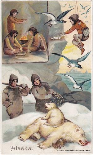
Sunday, January 23, 2022Set: 1893 Arbuckle's Coffee Sports and Pastimes of all Nations (K4) (Rate) “ I got nothin. ” -jdogg1228
7
“ This is absolutely awesome! ” -muskie027
5
“ Wow that’s very cool. 1893! ” -pugchump
5
“ This is awesome! Never seen a card like this before. ” -tinyshogun
1
“ Awesome. ” -freakizon
1
“ Great card. Great set ” -parsley24
1
“ You know, this card from 1893 looks better than some sets from 2021. ” -TwinKiller
2
“ Hmmm, I'm not sure what to say about that. ” -BigDaddy
1
“ This is from 1893. The front looks more like a postcard than a trading card. ” -BigBoyOnWheels
1
“ What a great looking 130 year old card! ” -Tscastle
1
“ The front looks good, back looks kind of busy ” -sundin
“ Holy bats**t! Amazing. I want this!!! ” -cjjt
1
|

Saturday, January 22, 2022Set: 2018-19 Choice Owen Sound Attack (OHL) (Rate) “ Very nice design for an OHL card ” -pugchump
2
“ That's a good looking card. ” -BigDaddy
3
“ Nice Hockey card. Very simple that is good. ” -captkirk42
2
|

Thursday, January 20, 2022Set: 1995-96 Upper Deck - Electric Ice (Rate) “ He’s half-Greek and half-Spanish but speaks French in Quebec. Also his dad’s name is Théodore Théodore which is pretty cool too. ” -pugchump
15
“ Nice looking card, a tad busy on the front, but has a write up and a different photo on the reverse. ” -Derek McDonough
1
“ This is an ok design. At least you can tell the card is a parallel with Electric Ice written on the front. ” -Brendan Barrick
1
“ Great photos (front and back!) but a pointless parallel which is barely distinguishable from the base card. ” -bevans
“ The card is filled with too much "extra stuff" for me. 5/10 ” -BigDaddy
2
“ Take away the left quarter junk and you would have had a nice card. ” -NJDevils
1
“ This set is a false statement. If it says electric, I WANT LIGHTNING! ” -TwinKiller
“ Pretty decent player. Like the card ” -tinyshogun
“ Text going up, down, and across. 2 logos and 6 flags, along with a left edge border. There is barely any room for a photo (and it’s so busy you are distracted from the photo) which is actually a nice action shot. ” -Tscastle
1
“ Great looking card ” -switzr1
“ ACK! Attack of the vertical writing. If not for that sideways printing the front would be pretty good. Back? OK for what it is an insert (I'm guessing from the "Electric Ice" title) so not upset with no stats. Very cool photo from net POV. ” -captkirk42
2
“ Being a junior on a UD card. Awesome!!! ” -parsley24
“ the photo on the reverse is fantastic ” -jamestagli
1
|
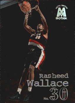
Wednesday, January 19, 2022Set: 1998-99 SkyBox Molten Metal (Rate) “ They should’ve swapped the front and back photos. Cool design otherwise. ” -pugchump
4
“ Almost looks like he is dunking at night at a playground. ” -muskie027
5
“ 4 time All-Star. Not too shabby!!! ” -tinyshogun
2
“ I love Sheed, but I'm not a fan of dark cards without a background. ” -BigDaddy
2
“ A basketball set I haven't seen because I don't do a lot of basketball. ” -captkirk42
“ Late 90s basketball cards were the best. Seems like all the companies gave a strong effort, and it was just before the super-expensive stuff started to pour in. Great photo, by the way. ” -switzr1
2
|
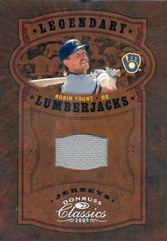
Tuesday, January 18, 2022Set: 2005 Donruss Classics - Legendary Lumberjacks Jersey (Rate) “ Thats a lot of brown and super small relic! ” -dettigersmlb
5
“ Very cool insert card. Could use some more detail on the back. ” -pugchump
1
“ Lotta brown... not much Yount.
Yount was one of my favorites. He played so hard that he was often banged up, but, man was he good. ” -BigDaddy
6
“ The amount of jersey inserts that donruss produced in the mid 2000's was absolutely ridiculous. It still is today. ” -TwinKiller
2
“ The early relic cards were fantastic. ” -parsley24
1
“ Nice relic card. A bit boring with the all gray uniform but still OK. I loved Donruss Classics back then. ” -captkirk42
1
“ I feel like real Legendary Lumberjacks should have a significant beard. ” -jackal726
2
“ i want more yount, less brown ” -jamestagli
3
“ Robin was the man back in the day! Plus he has a killer mustache!!! ” -tinyshogun
“ That's a lotta brown. Too much brown. ” -jayoneill
4
“ It's cool, but what a small picture. Could have been better. ” -muskie027
2
|
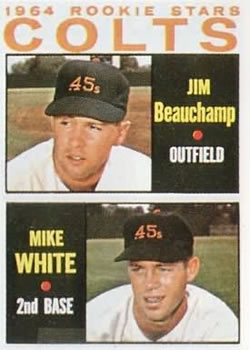
Monday, January 17, 2022Card: #492 Colts 1964 Rookie Stars (Jim Beauchamp / Mike White) “ Back when the Stros were the Colt 45's. Scan could be better. ” -jdogg1228
3
“ Typical classic Topps. The Colt .45s logo is really lame and I’m glad they completely overhauled their branding after this season. ” -pugchump
1
“ 1964 - Those were the days for baseball cards. I wonder if anyone bought these in bulk hoping one of the rookies would become the next Willie, Mickey or the Duke? ” -jayoneill
1
“ Interesting that the card just says Colts vs. Colt 45s. ” -BigDaddy
2
“ Nice card. Two players on a card is acceptable. When they put four rookies on a card....No. ” -NJDevils
“ Fantastic! ” -cjjt
1
“ Love 64 Topps. I also like defunct teams, yeah yeah yeah The Colts became the Astros but whatevers. ” -captkirk42
1
“ Some nice stars here.
Mike White has no relation to backup Jets quarterback Mike White. ” -mkb
1
“ They were not the Colts but the Colt .45s. ” -kirkscards
1
“ The change the Colt .45's in just a few years but they leave the Indians for 70 years. The 60's for you. ” -TwinKiller
1
“ What a boring hat logo. They should have used a phonograph or even a record instead. ” -Tscastle
1
“ When I was a kid, I heard that Jim Beauchamp was playing in the minors and swallowed his tongue from running into a wall . . . Someone else had to save him by pulling it out . . . That story has always stuck with me, almost six decades later . . . ” -georgecf
1
“ Well, a card from the short-lived Colt .45s. These particular prospects didn't really do much in the majors. ” -BigBoyOnWheels
“ This design looks awfully similar to an early 70s set, I forgot which one though. ” -NickyCollects
|
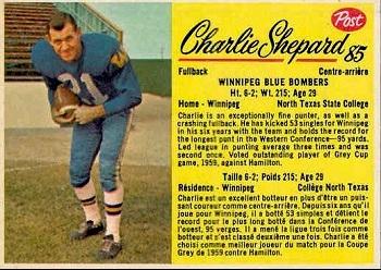
Sunday, January 16, 2022Set: 1963 Post Cereal CFL (Rate) “ Those paragraphs should be on the back rather than nothing ” -pugchump
2
“ I like the Post football issues. The cards give you more detail than you usually will find find on football cards of the same time period. ” -Brendan Barrick
2
“ this is glorious! excellent font, great colors, this is as good as it gets ” -jamestagli
3
“ Not having cards on/in cereal boxes right now during this hobby surge is a huge whiff. ” -pjdionne12
1
“ Nice! ” -BigDaddy
“ What's not to love about Post Cereal cards (please don't tell me). Baseball or football, I think they are great. Was always fun seeing who was on your box. ” -NJDevils
2
|

")