Random Card of the Day |
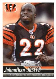
Wednesday, January 5, 2022Set: 2010 Panini NFL Sticker Collection (Rate) “ Not a bad looking sticker for an album. ” -muskie027
1
“ I was never a huge fan of stickers that are just cards but smaller. I think it’s a missed opportunity, they could have shaped them like the Bengals logo or a football or something. At least this one has a good photo and a decent design. ” -pugchump
2
“ That’s a nice smile Johnathan. And this is pretty nice for a sticker. Well done! ” -Tscastle
1
“ OK design, but the stickers that Panini makes rarely "stick" to anything for very long. ” -hamrlik22
1
“ Very nice Panini Sticker. ” -captkirk42
“ Decent layout, but all that orange make me think of deer season. ” -BigDaddy
3
“ Great photo.... but the font for the team along with the afc north is tooo much
” -parsley24
“ I never really liked sticker cards. I never had anything to either use them on (The weird four-team 1990s fleer stickers) or I could never find the albums. ” -BigBoyOnWheels
1
“ Not bad for a sticker. ” -Brendan Barrick
1
“ B all that you can B with the Bengals! And as Borat would say "the back is ah quite nice". ” -BuccaneersDen
1
|
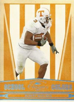
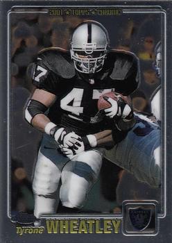
Tuesday, January 4, 2022Set: 2007 Donruss Classics - School Colors (Rate) “ Decent pro career, a nice college insert. ” -muskie027
1
“ The chrome on the front is hard to read in contrast with the yellow. The back needs some more detail too. Overall a cool design though, I like that they used the school colors. ” -pugchump
1
“ That is an overabundance of orange. ” -rmpaq5
9
“ Even though I don't like College card sets, I do tend to like some of these School Colors inserts. ” -captkirk42
1
“ That's one ugly design! ” -BigDaddy
2
“ Neat concept, wish there was a card for my school. ” -jackal726
1
“ For those in Montreal, Il est horrible. ” -NJDevils
2
“ I get that Tennessee's colors are white and a horrible shade of orangey-yellow, but really? The card is ugly. No way around this one. ” -BigBoyOnWheels
1
“ This is an ok design. There is not much information on the back. ” -Brendan Barrick
“ I was surprised he never turned out to be a better NFL player. He flopped. ” -tinyshogun
1
|
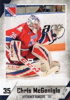
Monday, January 3, 2022Set: 2017-18 Extreme Kitchener Rangers (OHL) (Rate) “ The font is kind of hard to read but the design is pretty awesome overall, especially for a minor league card ” -pugchump
5
“ "Well, McGonigle, Billy is DEAD! They slit his throat from ear-to-ear." "Hey, I'm trying to eat my lunch here!" Close enough. ” -DanD
7
“ Nice action shot and decent photography for a minor league card. ” -hamrlik22
5
“ Fine looking card. No wasted space ” -NJDevils
“ Don't much card for the frame. ” -BigBoyOnWheels
1
“ The Storm is better. ” -sundin
|
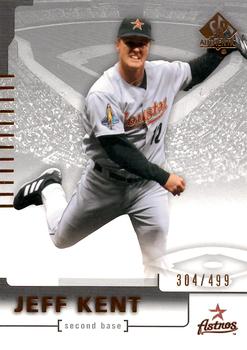
Sunday, January 2, 2022Set: 2004 SP Authentic - Silver (Rate) “ That's a lot of gray. ” -chvlDm
8
“ I don't know why, but the design and photo on the front of this card is bizarre. IMO
” -abide
5
“ Very cool. I imagine this one will attract a barrage of negative comments because of some arbitrary nonsense but from an objective point of view this is a really cool design. ” -pugchump
6
“ Haven't heard his name in ages. Nice card. ” -muskie027
“ Weird pose for a 2b. Looks like he’s doing the Carleton. ” -parsley24
“ Too grey. It's practically black & white. ” -BigDaddy
2
“ If I knew what not to say about this card, I wouldn't say it. ” -NJDevils
2
“ Wow very VERY unbalanced set. Only one Montreal Expos in the set and a few other teams only had one card. WT? ” -captkirk42
“ And this year's nominees for Awkward Pose on a Baseball card lacking context are... ” -Blargh
2
“ He may make the Hall in the next few years. This year it doesn't seem that he'll get in this year. ” -BigBoyOnWheels
|
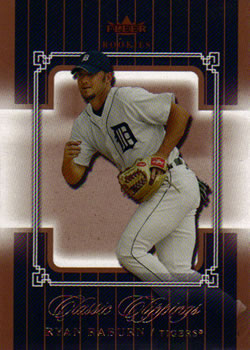
Friday, December 31, 2021Set: 2005 Fleer Classic Clippings (Rate) “ Needs a better scan. Cool card design though. ” -pugchump
“ I like the set. Looks better in hand than in the scan. Fleer had so many of these 100-200 card sets in 2000's. Hard to keep track of them all but most look pretty good. ” -chvlDm
“ Classic Clippings - sounds like it should be a memorabilia insert for a famous barbers set. ” -Tscastle
2
“ Good looking card but bronze color is not so nice ” -parsley24
“ Say this guy's name five times fast lol ” -domentho
“ A Motown fan favorite for some. I enjoyed Classic Clippings but I am a big fan of framing. Go Tigers! ” -pjdionne12
“ An age long question on TCDB. Is it the scan, or the card itself? ” -TwinKiller
2
“ Jim Leyland loved him. Tiger fans, not so much. ” -BigDaddy
1
“ It's simple. There's just WAY too many different sets in this era. Not to mention the parallels... ” -jdogg1228
2
“ This guy was the true definition of a utility player! ” -tinyshogun
1
|
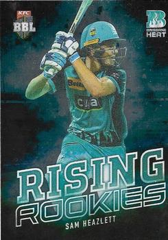
Thursday, December 30, 2021Set: 2018-19 Tap 'N' Play CA/BBL/WBBL - Rising Rookies (Rate) “ I am disappointed that this cricket card, unlike the cricket card RCOTD before it, neglects to mention his beer drinking preferences. ” -rmpaq5
7
“ Needs some stats, I guess ” -pugchump
2
“ His hands are backwards. Do all cricket players hold the "bat" like that? ” -Tscastle
3
“ Played for Australia back in 2017 but hasn't been able to break it through to the international side since. Just too many good players at the minute. You could probably argue he has officially 'risen' since this card was released. ” -scottwalker29
1
“ Cricket cards? Who knew??? ” -tinyshogun
1
“ No wonder I didn't recognize the uniform on this card, it's a CRICKET Card. I thought it was a minor league baseball card. For some reason I thought a cricket batting stance was closer to a golf swing. Also the bat shown looks more like a rounded baseball bat rather than a flat cricket bat. ” -captkirk42
1
“ I've never seen a cricket card.
Too cluttered for me. I'm old school. I like he words and logos small & the picture big. ” -BigDaddy
1
“ Everybody else's heart jump seeing the backwards hands at first? ” -pjdionne12
1
“ Very cool. I don't think I've seen a cricket card before.
” -crushnmove
1
“ What's with the RCOTD KFC cricket cards? There's also too much green. ” -TwinKiller
“ Huh. Second KFC Cricket card in a month. That's nice. ” -BigBoyOnWheels
“ That's some strange looking baseball gear. Hehehe! ” -Godzilla8you
“ I really like this design! Especially for a sport which I'm not familiar with, this is a fantastic card. ” -IfbBirdsCards
2
|
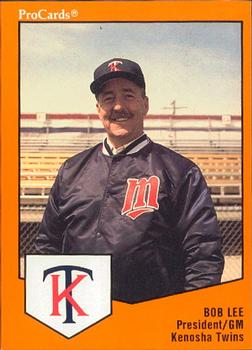
Wednesday, December 29, 2021Set: 1989 ProCards Minor League Team Sets (Rate) “ Oh... apparently that minor league team existed! ” -jdogg1228
4
“ That Kenosha Twins logo is awfully ugly. T and C are close enough to being vertically symmetrical that they look pretty cool laid over one another like this in the Minnesota Twins logo. The letter K is not symmetrical at all though and it doesn’t even look centered here. ” -pugchump
3
“ Nice to meet you, Bob. Seems like a nice guy. ” -NJDevils
6
“ Looks like I'd expect a minor league President/GM's card to look. ” -BigDaddy
“ Cool address. ” -parsley24
“ Now that's a baseball card! ” -jayoneill
“ Nice minor league card. ” -captkirk42
1
“ I'd probably have the same look on my face if I ended up on a legit card. ” -jackal726
2
“ Nice minor league card. Not often you see a GM card. ” -Tscastle
1
“ Ah, a MiLB president. Makes sense that this is ProCards. Really, we need manager cards back in newer sets though. ” -BigBoyOnWheels
1
“ IT is nice to see a GM get a card. You don't see this often. ” -Brendan Barrick
2
|
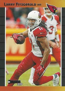
Tuesday, December 28, 2021Set: 2019 Donruss - Retro 1989 (Rate) Card: #RET-22 Larry Fitzgerald “ Nice, looks even better than the original 1989 set ” -pugchump
4
“ Fitz is awesome, but I don't like the design at all. ” -BigDaddy
2
“ Larry Fitzgerald is one of the best wide receivers of all time, (I think so at least)
Also Josh Rosen cameo ” -mkb
4
“ Great retro look. Nice action shot. Larry was phenomenal - look at those arms for a wide receiver! ” -Tscastle
2
“ It didn't look good in 1989 either. ” -hamrlik22
“ I don't mind the 1989 Donruss throwback design. I just don't like how glossy they feel in person. ” -BigBoyOnWheels
1
“ Nice retro card, but I still prefer the original Donruss cards. Modern Panini retros don't have the same aesthetic feel as the originals did. Not to mention the card stock and inking used without added gloss. ” -captkirk42
1
“ disapointed this was only used as a insert set design, and not a base set ” -Thunderfoot
1
“ I like the Retro Inserts that Donruss puts out. The 1989 baseball design was a good design to use. Larry Fitzgerald is a sure first ballot HOF selection. He is one of the best wide receivers to ever play the game. ” -Brendan Barrick
3
“ Kind of like the old Donruss design on football. ” -muskie027
2
|

