
Random Card of the Day |
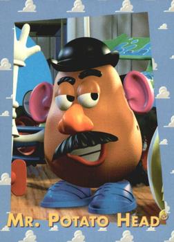
Friday, December 10, 2021Set: 1995 SkyBox Toy Story (Rate) “ RIP Don Rickles. Toy Story is one of the best animated movies of all time and I'm glad they made this card set even if it's just a promotional thing. Pretty cool design too. ” -pugchump
6
“ Try and guess how hard I am holding the urge to make this my new PF picture. He looks so... questionable. ” -TwinKiller
13
“ My granddaughter would love this ” -NJDevils
3
“ Really? I'm not surprised that its Skybox... ” -BigBoyOnWheels
1
“ Gotta love Mr. Potato Head!!!!! ” -tinyshogun
“ LMAO ” -mkb
“ Mr. Potato Head. Nice. ” -captkirk42
1
“ Not 👏 every 👏 show 👏 needs 👏 a 👏 card 👏 set ” -parsley24
3
“ "cantankerous spud" ” -freakizon
“ Hasbro just recently dropped the Mr. and Mrs. from the Potato Head family, even our childhood toys are no longer safe from today's woke culture. ” -bigsmooth
4
“ Nice "Porn-Stache". ” -BigDaddy
1
“ It's true they really make cards for LITERALLY EVERYTHING. ” -jdogg1228
1
“ Love the character and love Toy Story, looks like a fun set. ” -muskie027
“ so long old friend, another taken by cancel culture ” -Thunderfoot
6
|
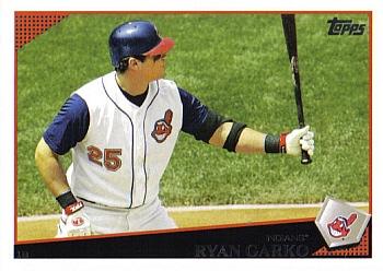
Wednesday, December 8, 2021Set: 2009 Topps Cleveland Indians (Rate) “ I like the back design for 2009 Topps. I like the top 3/4 of the front design. This particular card, using horizontal orientation for a nice picture during an at bat. But not a fanof the bottom front on this set. Horizontal cards even worse than vertical cards. ” -abide
5
“ Back when they used to wear those tank top-style unis. ” -jdogg1228
5
“ I like the 2009 Topps design a lot, but I don’t like how during this time period each team would have a team set with the exact same designs, sometimes even with identical cards to the base set. Seems a little redundant but I guess the unique ones and coach/manager cards make up for it. Hate that awful Chief Wahoo logo too, but that’s not Topps’ fault. ” -pugchump
6
“ I just wish that team sets were more distinguished from the base set now instead of a non shiny Topps logo. ” -TwinKiller
3
“ Who is this team? The Indians? They should probably change that. ” -TwinKiller
2
“ not too bad of a design. Love the landscape use of this photo. ” -parsley24
“ Nice card. Good picture. Solid back--tons of information & stats. ” -cjjt
“ Chief Wahoo not cancelled on TCDB today! ” -bigsmooth
5
“ I like the 2009 design. I didn't used to as much as I do now. I never really disliked it but during the late 2000s and early 2010s all the Topps designs tend to look alike and are not too exciting. ” -captkirk42
1
“ I, for whatever reason, like this design. Its probably because this set (Topps 2009) was one of the first that I started collecting. Anyway, this is a card from the team set of a slightly above average 1B for the Indians (Now Guardians), Rangers, and Giants in a 6-year MLB career. Nothing really special about it. ” -BigBoyOnWheels
“ I like it but the bottom seems tough to read. ” -BigDaddy
2
“ This could make the Top 100 worst card list ” -NJDevils
1
“ I like this design. ” -muskie027
|
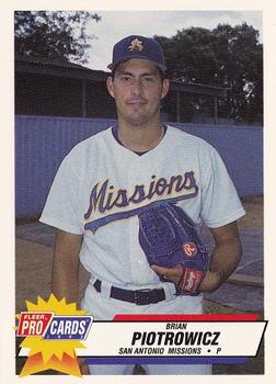
Tuesday, December 7, 2021Set: 1993 Fleer ProCards (Rate) “ Where is this photo taken?
Some random facility with weird blue fencing around it?
Just not a very fitting background. ” -jdogg1228
5
“ The back is pretty plain but overall this is a very well-designed card. Even better considering it’s a minor league set with like 4000 cards in it. ” -pugchump
4
“ A lot of dead space... on the back of the card, not in his eyes. ” -parsley24
3
“ Very nice minor league card. But a card set of over 3000 cards? Full league(s) ” -captkirk42
“ The guys shadow on the back is funny. ” -TwinKiller
2
“ Oh, look...a card. Nothing else to say. ” -domentho
3
“ Pretty boring. ” -BigDaddy
1
“ I forgot how bad the old ProCards logo looked. That and the old Pacific logo. The player himself never made the majors. ” -BigBoyOnWheels
3
“ Love these minor league cards. Their Ballapeño mascot is pretty funny and they used to have another mascot called "Puffy Taco". ” -tinyshogun
1
“ Great set. Has all the stats ( that you can actually see.) But a humongous set to collect. ” -Bassbunny22
“ Nice card . . . It's good to see Minor League cards that look nice . . . Great picture . . . The back s rather lacking but the front looks very good . . . I hope the rest of the set was as good . . . ” -georgecf
|
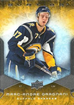
Monday, December 6, 2021Set: 2008-09 Upper Deck Ovation (Rate) “ Needs a different picture on the back but a cool card otherwise. ” -pugchump
2
“ Very nice card. Looks modern but didn't go overboard crazy ” -NJDevils
1
“ Ok. The card design sans the player is actually quite good. Could they bother to take a better picture of the guy though? It is quite evident on the back of the card that the current photo is quite bad. ” -BigBoyOnWheels
4
“ 2 guys with Marc-Andre for a first name is strange. I know that this guy is in some other league right now and the other's career is getting turned upside down in Chicago. I do like that Sabres logo. ” -TwinKiller
“ This set has that Topps Fire or UD Ice look to it. What is so wrong with just having an untouched action picture or a simple portrait on a card now days? ” -captkirk42
1
“ This is an ok design. ” -Brendan Barrick
“ All Buffalo cards are good cards!!!! ” -muskie027
“ That guy has a neck like a giraffe. ” -BigDaddy
1
|
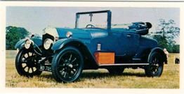
Sunday, December 5, 2021Set: 1976 Craven Black Cat Vintage Cars (Rate) “ Not a car guy, but I love the thought of a set of nice classic autos like this. ” -muskie027
3
“ These cards pop up a lot on RCOTD, but somehow I'm always surprised when I think:
"Wait, people collect this stuff!" ” -jdogg1228
3
“ All that comes to mind is what a bumpy ride this must be and how hard it must be to turn the wheel. ” -chvlDm
1
“ This card needs a higher-res scan. I bet the back is really interesting but I can't read it. ” -pugchump
“ Nice ” -cjjt
“ Err... I'm really not sure about this one. I guess that it's a nice picture of a classic car? ” -BigBoyOnWheels
1
“ Nice more modern mini card. At first I thought it was an old tobacco card but saw the title it was from the 1970s. ” -captkirk42
|
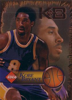
Saturday, December 4, 2021Set: 1998 Collector's Edge Impulse - KB8 (Rate) “ RIP. The front has a pretty cool design on it but the back is pretty loud. The back doesn’t need that much detail and design, it needs some more legible stats instead. ” -pugchump
2
“ May he R.I.P. along with his daughter. ” -TwinKiller
3
“ I wasn't a huge Kobe fan, but I'm sad he is gone. One of the all time greats!!!!! ” -tinyshogun
3
“ Ok. How can you not love a Kobe Bryant card?
(RIP Kobe Bryant: August 23rd, 1978- January 26th, 2020) ” -BigBoyOnWheels
1
“ One of the all time greats. ” -jdogg1228
2
“ RIP Kobe! ” -bkklaos
1
“ Glad I'm not a huge basketball fan. This design just looks "blah" to me. Sorry. ” -captkirk42
2
|
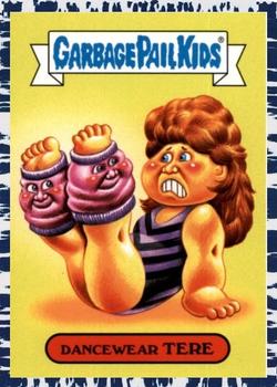
Friday, December 3, 2021Set: 2018 Topps Garbage Pail Kids We Hate the '80s - Bruised (Rate) “ I don't collect these, but I did when they first came out and I can't tell you how much I love 'em as a kid. They were definitely something that got me into the card collecting hobby. I wish I knew what I did with the originals. ” -muskie027
3
“ Garbage Pail Kids are usually pretty cool but I have no idea what the joke is supposed to be on this one ” -pugchump
2
“ Is this set stating that everybody hates the 80's? ” -TwinKiller
4
“ Reminds me of the good old days when my kids collected these. ” -NJDevils
“ I'm amazed at how popular the Garbage Pail Kids are! These are some crazy leg warmers. LOL ” -tinyshogun
1
“ Iconic garbage pail design. ” -parsley24
“ These cards are so weird and freaky. ” -jdogg1228
1
“ Hmm a more modern Garbage Pail Kids. These often disappoint me either because the either reuse the older ones or they come up with something that is 10 times grosser than the originals were and that is saying something. ” -captkirk42
|
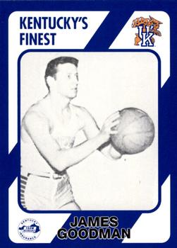
Thursday, December 2, 2021Set: 1989-90 Collegiate Collection Kentucky Wildcats (Rate) “ I think they could've managed a better quality camera in 1989. Also the text at the bottom clashes with the blue pretty badly. ” -pugchump
5
“ His stats don't look, "fine," to me. ” -TwinKiller
3
“ Kentucky's Finest:
James is definitely a good man. ” -jayoneill
4
“ I like the concept of the card . . . It could be designed a little better, but it is OK . . . ” -georgecf
“ Never seen these cards! Looks like early 1900s snapshot. ” -tinyshogun
2
“ Nice College team card. ” -captkirk42
|

")